Watch faces for less able eyes
-
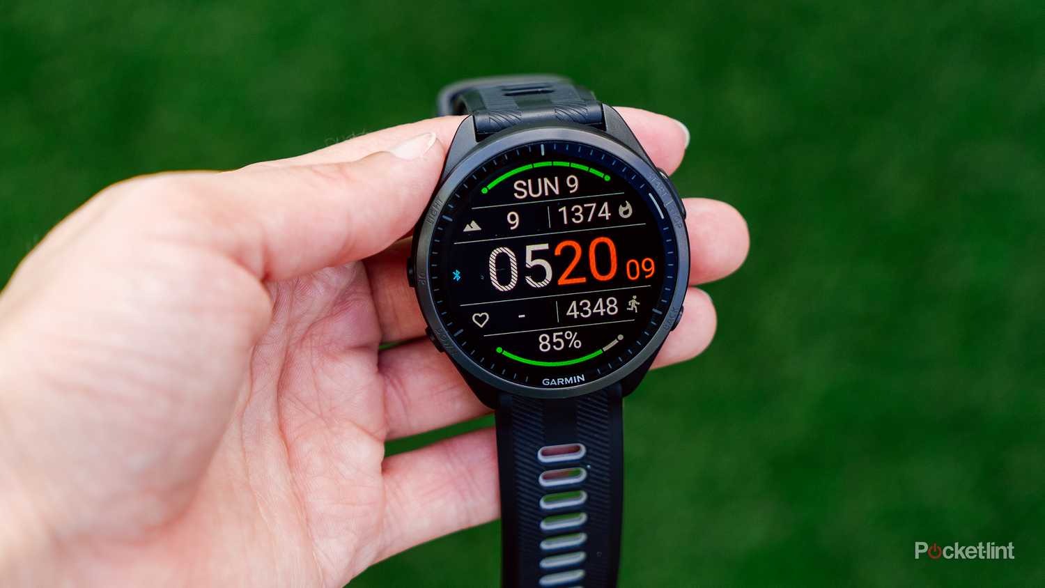
I just got a Race S and I find the size etc just fine, but the number of watch faces is quite limited and there’s not a lot for those with less than perfect eyesight.
I’d like to see some different layouts that don’t have a digital clock that you can see from the moon with tiny font complications around it, how about reducing the clock numbers and making better use of the edges of the display, and making fonts larger and bolder?
-
wow, my eyes are bleeding

SVTS - 2.50.28
SSSWHR BARO Amber - 2.8.32
Samsung A5 2016 - Android 7.0
Samsung A33 2022 - Android 16 - One UI 8.0
Suunto App Android 6.8.9 beta
Suunto App IOs 3.8.1 (21743) beta on MBP M1 Max -
I just saw the watch face for the new Race 2 and that looks just about perfect with thicker fonts and better use of the watch’s screen real estate.
-
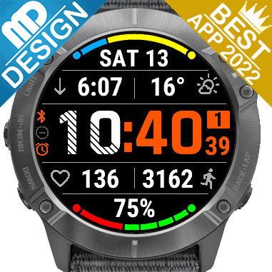
@sartoric Mine aren’t because they’re actually legible.
I used those to highlight how larger fonts can make things easier for those that struggle to resolve tiny text on the watch face.
-
Psychedelic techno watch faces


 ️
️ -
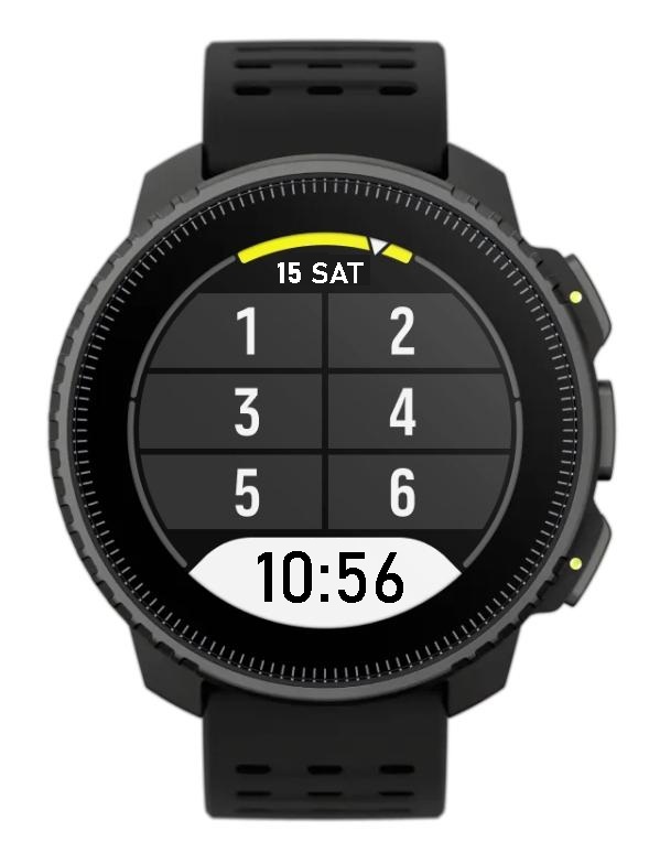
Clear and legible.
-
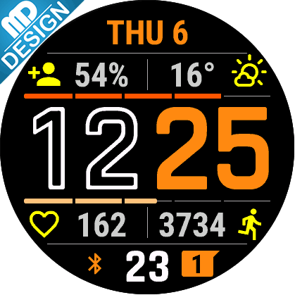
@Steven-Hambleton I Up Vote this. I just got my Race S a week ago and still struggling with the lack of “perfect” watch faces to choose from. Especially when in dimmed view (with the AOD turned on). I put a couple of examples here: https://forum.suunto.com/post/178368
-
@tailwind_mrs I really love the Vertical Week one. Great as AOD with Suunto’s tag line…
-
@2b2bff vertical week does look cool! I would need to get back into trails to make it worth it
") It’s a good carrot to have, total weekly ascent.
It’s a good carrot to have, total weekly ascent. -
@Steven-Hambleton said in Watch faces for less able eyes:
Clear and legible.
Main big time field with six small data fields. Love it.
I am big fan of simple desigm + data-rich watch faces.
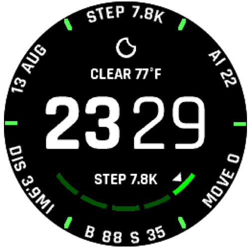
@suunto could you please add watch face for Vertical which looks exactly as activity 7-fields screen. With clock on the bottom field, day of month+day of week on the top and 6 customable fields in the middle. Five hr zone bars can be also set (only top one is also enough - for battery level). Should be easy to prepare because it already exists. Just like screen below:
-
Like I said before - it is already there, only to put it in Suunto App. Once you look at it and you know it is Suunto watch.
Let’s call this face “So Suunto”.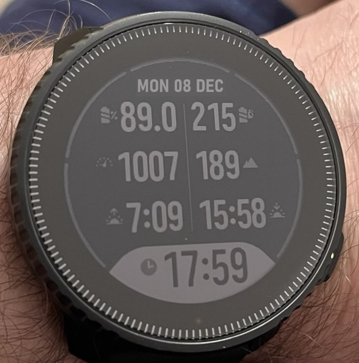
Vertical Solar
-
@pacuro PERFECT!!!
-
@pacuro said in Watch faces for less able eyes:
Like I said before - it is already there, only to put it in Suunto App. Once you look at it and you know it is Suunto watch.
Let’s call this face “So Suunto”.That’s great !!
-
@pacuro One thing I still don’t understand though - why is battery percentage shown with one decimal place when it’s always .0? I have a similar set up for my ultra trail runs and I’ve always wondered why it so. Either it should actually change by .1 or just be rounded to the full integer
-
@kriskus said in Watch faces for less able eyes:
why is battery percentage shown with one decimal place when it’s also .0?
Because it is bad design if the numbers jump around. And mathematically 89.0 is something different as 89, precision wise…
Race S
-
@kriskus said in Watch faces for less able eyes:
Either it should actually change by .1 or just be rounded to the full integer
Right, if the battery meter has a resolution of 1%, having any decimal places is pointless. In that case, .0 is not a significant figure and is just taking up space.
-
@2b2bff It is bad design when it is the only number with one decimal place surrounded by numbers without decimal places (see picture above). And anyway it is always set to .0
-
@kriskus said in Watch faces for less able eyes:
why is battery percentage shown with one decimal place when it’s always .0?
Good question. To Suunto. I hope someone from Suunto read suggestions and will correct this point in next firmware. Anyway, to save one data field, I see battery level on one of five outer ring bars. Next 1/5 bar coud be steps to target. There are so many possibilities to make great face, without creating completely new from zero.
-
@kriskus said in Watch faces for less able eyes:
And anyway it is always set to .0
Ok, in that case it is strange…
-
I think anyone interested in having clear and data rich watchface in his suunto watch, should vote for first post in this thread to make it visible on threads list. I did this just before a second