Watch faces for less able eyes
-
@pacuro One thing I still don’t understand though - why is battery percentage shown with one decimal place when it’s always .0? I have a similar set up for my ultra trail runs and I’ve always wondered why it so. Either it should actually change by .1 or just be rounded to the full integer
-
@kriskus said in Watch faces for less able eyes:
why is battery percentage shown with one decimal place when it’s also .0?
Because it is bad design if the numbers jump around. And mathematically 89.0 is something different as 89, precision wise…
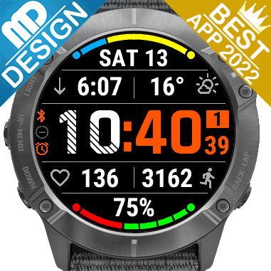
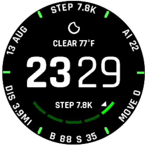
Race S
-
@kriskus said in Watch faces for less able eyes:
Either it should actually change by .1 or just be rounded to the full integer
Right, if the battery meter has a resolution of 1%, having any decimal places is pointless. In that case, .0 is not a significant figure and is just taking up space.
-
@2b2bff It is bad design when it is the only number with one decimal place surrounded by numbers without decimal places (see picture above). And anyway it is always set to .0
-
@kriskus said in Watch faces for less able eyes:
why is battery percentage shown with one decimal place when it’s always .0?
Good question. To Suunto. I hope someone from Suunto read suggestions and will correct this point in next firmware. Anyway, to save one data field, I see battery level on one of five outer ring bars. Next 1/5 bar coud be steps to target. There are so many possibilities to make great face, without creating completely new from zero.
-
@kriskus said in Watch faces for less able eyes:
And anyway it is always set to .0
Ok, in that case it is strange…
-
I think anyone interested in having clear and data rich watchface in his suunto watch, should vote for first post in this thread to make it visible on threads list. I did this just before a second
")
-
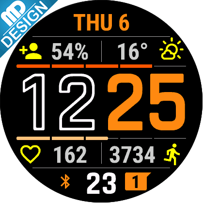
@pacuro sorry, but none of the watch faces shown are looking good IMHO.
Race S
-
@2b2bff I regret some of my choices so I’ve removed them, but the ones left show how complications can be legible and not tiny fonts all the time.
-
@2b2bff said in Watch faces for less able eyes:
none of the watch faces shown are looking good IMHO
And this is OK. Above watch faces are just samples of what are the possibilities. I think this thread is not about one proper vision of simple watch face. I and probably others too need some watch face which is not another one with weird big font clock and two or three ultra tiny font complications. Are not there any regular medium font? I hope suunto is going to make watch faces creating open.
-
@pacuro That is exactly my point! Sure make the time bold but it doesn’t have to be massive at the expense of complication fonts.
Come on Suunto, you can do it!
-
@Steven-Hambleton this is one reason why I moved back to vertical 1 from Amoled since the watchface when dimmed the font are outside in sun unusable with today’s small fonts.