Suunto app Forum Suunto Community Forum
    • Recent
    • Tags
    • Popular
    • Users
    • Groups
    • Register
    • Login

    Incompetent graphs

    Scheduled Pinned Locked Moved Suunto app - Questions & Feedback
    74 Posts 16 Posters 3.9k Views
    Loading More Posts
    • Oldest to Newest
    • Newest to Oldest
    • Most Votes
    Reply
    • Reply as topic
    Log in to reply
    This topic has been deleted. Only users with topic management privileges can see it.
    • ? Offline
      A Former User @Dimitrios Kanellopoulos
      last edited by

      @Dimitrios-Kanellopoulos said in Incompetent graphs:

      above is FullScreen FYI

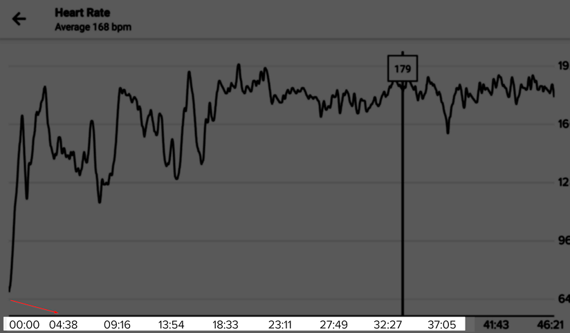
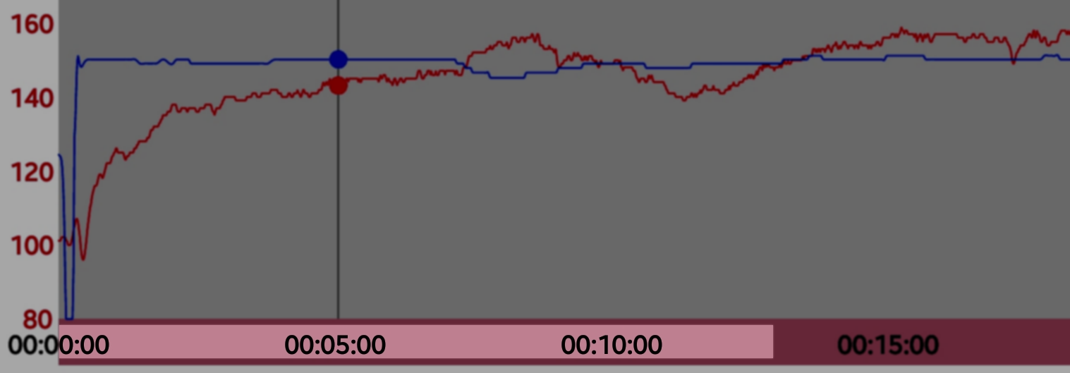
      cool, goes into right direction, suggestion: can we normalize the x-scale to full/rounded integer instead current granularity of e.g. (your example here) 23:11 as half/50% of the total training duration? This didn’t add any value to an end user glacing on a 5 inch screen and creates unnecessary noise on the x-axes labels. Rather would prefer normalized value on x (aka comparable buckets of the plot) like 5/10/15min or 2/4/6/8min that is easier for comparing and didn’t add this noisy level on the graphs with the 4 digits , if I want second-to-second accurate data I would go anyway into the detail map view

      Polar flow or movescount web/old mobile app does this as well *see below some examples)

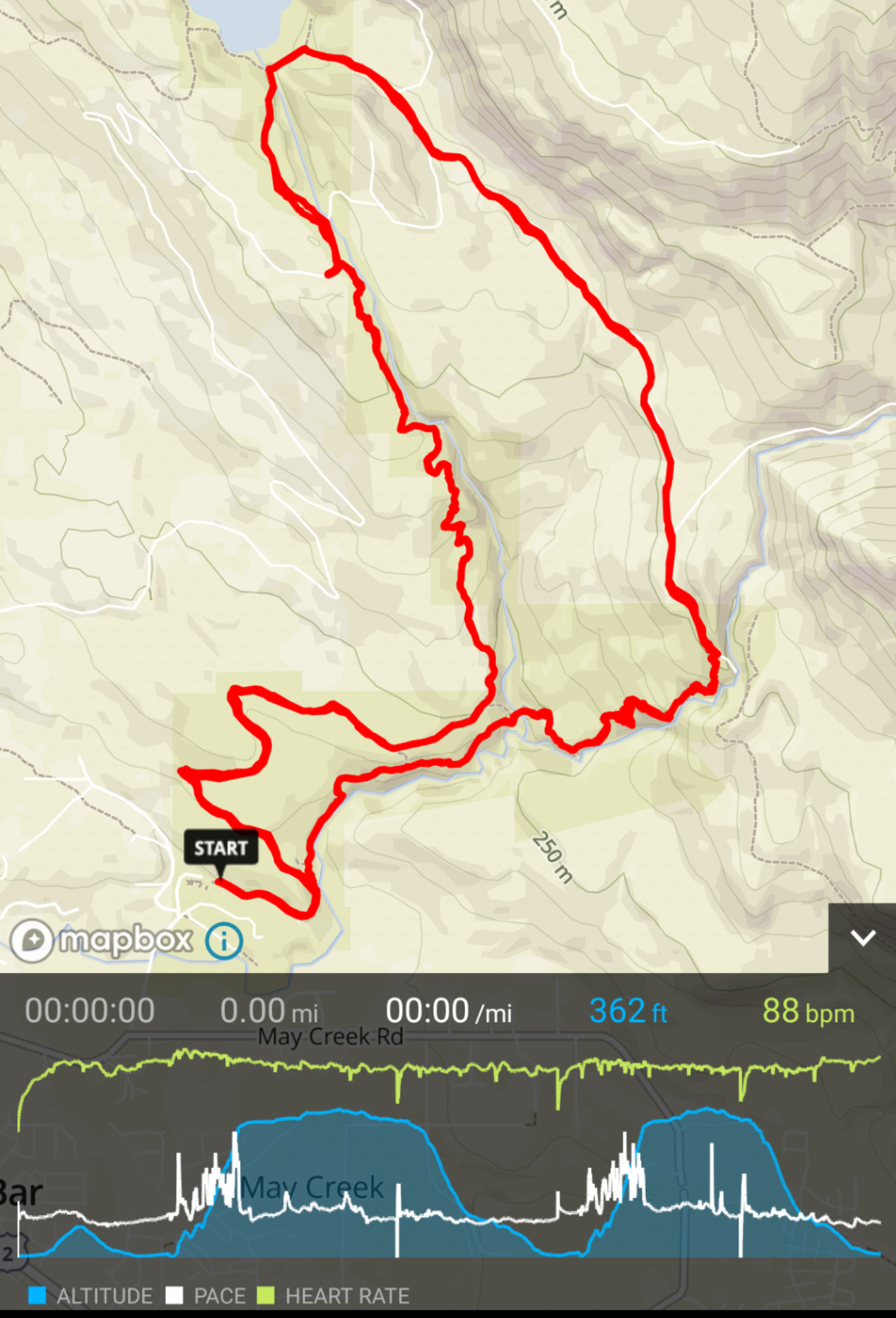
      current SA (lot of digits on axes, not normalized):
      844c03c4-b8ca-4d95-a8ec-12419eac6291-image.png

      movescount web (rounded full integers, normalized):
      cea899e4-8fe0-444e-91bf-e97f1e10f59e-image.png

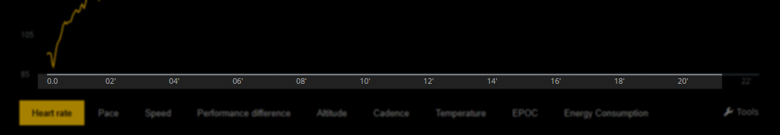
      old movescount mobile app (normalized):
      4006213b-7dbb-45c9-815e-63e1831f8147-image.png

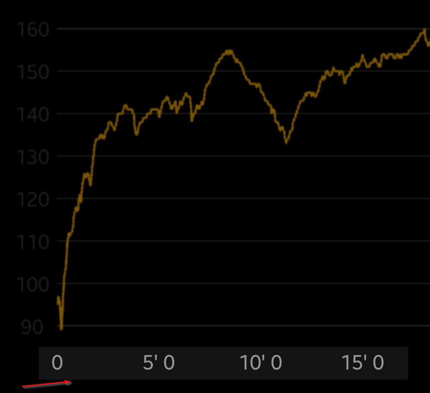
      Polar flow (normalized):
      03097373-e5b2-4592-9fcf-771cf06653f7-image.png

      ? 1 Reply Last reply Reply Quote 6
      • ? Offline
        A Former User @Guest
        last edited by A Former User

        @Tobias-F Great idea about the normalized number on x axis. I wanted to suggest the same this morning but didn’t have time. In addition to removing clutter that would also make it easy to estimate values in between by glancing at the graph. For example you know instantly that there is 7:30 between 5:00 and 10:00 but the same isn’t true for arbitrary time labels. It would be great if numbers on y axis were normalized too.

        ? 1 Reply Last reply Reply Quote 2
        • ? Offline
          A Former User @Guest
          last edited by

          @silentvoyager said in Incompetent graphs:

          make it easy to estimate values in between by glancing at the graph

          fully agree!

          1 Reply Last reply Reply Quote 2
          • Dimitrios KanellopoulosD Offline
            Dimitrios Kanellopoulos Community Manager
            last edited by

            Yeah good points here. Ill pass those to the developers asap. Thanks guys. Good morning from here.

            Community Manager / Admin @Suunto
            Creator of Quantified-Self.io
            youtube.com/c/dimitrioskanellopoulos
            https://instagram.com/dimitrioskanellopoulos
            https://www.strava.com/athletes/7586105

            ColdBeerC 1 Reply Last reply Reply Quote 0
            • ColdBeerC Offline
              ColdBeer @Dimitrios Kanellopoulos
              last edited by

              @Dimitrios-Kanellopoulos said in Incompetent graphs:

              Yeah good points here. Ill pass those to the developers asap. Thanks guys. Good morning from here.

              Take note of those last things for your QS too, good notes for both QS and SA.

              var Watch="Garmin Forerunner 735XT", WatchFw="9.40";
              var Phone="Samsung Galaxy S8", PhoneOS="Android 9.0.0";

              1 Reply Last reply Reply Quote 0
              • ? Offline
                A Former User
                last edited by A Former User

                Today I saw one fairly high profile athlete posting a picture generated by SA - one that shows elevation profile on top of a photograph. That was shared with a pretty wide audience of trail and mountain runners - more than 4000 people. And while the picture looks pretty cool and features Suunto logo, it does show the same incompetence. The profile is from out and back Grand Canyon R2R2R run and therefore it should be symmetrical. But on the picture the descent from the north rim looks quite a bit longer than the ascent. That wouldn’t make any sense to anyone who’d pay attention. Please fix this sooner.

                Dimitrios KanellopoulosD 1 Reply Last reply Reply Quote 0
                • Dimitrios KanellopoulosD Offline
                  Dimitrios Kanellopoulos Community Manager @Guest
                  last edited by

                  @silentvoyager You are talking about time vs distance axis right?

                  Community Manager / Admin @Suunto
                  Creator of Quantified-Self.io
                  youtube.com/c/dimitrioskanellopoulos
                  https://instagram.com/dimitrioskanellopoulos
                  https://www.strava.com/athletes/7586105

                  1 Reply Last reply Reply Quote 0
                  • J Offline
                    johann.fuehrer Bronze Member @Guest
                    last edited by

                    @silentvoyager I like to come back to the initial thing and wanted to ask, if you had some breaks at about 1:35, 2:15 and around 3:25? I have seen a similar issue at the Polar Vantage, it seems that the time spent in the breaks are influencing the lap overal time (becomes longer) the lap data is the expanded before representation to the longer lap time but squeezed later in the real active lap time. Someone understood this (except me)? 😉

                    Dimitrios KanellopoulosD 2 Replies Last reply Reply Quote 0
                    • Dimitrios KanellopoulosD Offline
                      Dimitrios Kanellopoulos Community Manager @johann.fuehrer
                      last edited by

                      @johann-fuehrer yes that is a known issue.

                      Community Manager / Admin @Suunto
                      Creator of Quantified-Self.io
                      youtube.com/c/dimitrioskanellopoulos
                      https://instagram.com/dimitrioskanellopoulos
                      https://www.strava.com/athletes/7586105

                      1 Reply Last reply Reply Quote 0
                      • Dimitrios KanellopoulosD Offline
                        Dimitrios Kanellopoulos Community Manager @johann.fuehrer
                        last edited by

                        @johann-fuehrer On iOS fixed on 1.9.0 and higher, on Android should come with the same iOS lap table that we are building.

                        Community Manager / Admin @Suunto
                        Creator of Quantified-Self.io
                        youtube.com/c/dimitrioskanellopoulos
                        https://instagram.com/dimitrioskanellopoulos
                        https://www.strava.com/athletes/7586105

                        1 Reply Last reply Reply Quote 0
                        • First post
                          Last post

                        Suunto Terms | Privacy Policy