What do you love about the Suunto app?
-
- Clean interface;
- Route planning;
- Laps info;
- Sync.
-
@surfboomerang
it works surprisingly well… but in my first steps testing the routeplanning I had to undo sometimes as I was lazy zooming in and out and picked the wrong trail (also because of the trail/road issue…).
I would not want to miss the mobile routeplanning, as it is really really useful on the go. however, when I am at a desktop, routeplanning could be done a lot easier and quicker.
(sorry, dimitrios, to mention this here again) -
Hi
- White theme

- Background sync: really works well
- Route planner
- Sports Customization
- 3rd Party synchronization (Runalyze, Training Peaks…)
- ‘Day view’ day steps + calories + sleep ( could be absolute fantastic if there where sleep trend)
- User profile map: see all my workouts all around the world (now it is not working, but I love it)
BR
- White theme
-
- Reliable background sync
- Fast sync compared to MC App and roughly on par with cable sync
Nothing else I really enjoy or like about it, all negatives from here on and this is not the place for it.
SSU + Android beta app just for reference purposes.
-
Mobile route planner, although it still lacks few important features, but I hope suunto will improve it. Still I’ll probably use it with my a3p (when and if SA supports my watch) only if I have no access to my pc. Taking a wrong path can put you in real danger in mountains in my country. We still have mine fields unfortunately.
-
@surfboomerang said in What do you love about the Suunto app?:
Funny how a while ago a lot of people claimed that route planning on a mobile screen was impossible and now i see a lot of positive votes

It isn’t great compared to the desktop version, but a lot better than anything I’ve seen from other mobile apps. For example, route planning on Garmin Connect mobile app is just horrible in comparison - completely unusable.
Still, I don’t use SA route planner for my watch because that would disable MC sync. It is quite bad that we have a dilemma - either use some features from from SA or some other features from MC, but not both at the same time.
-
- Fast sync
- Interval lap view
- fast sync to Strava (yes !), Runalyze
- Route planner (love to have it working offline)
- Sport modes customization.
-
- Reliable and fast sync (instant, in the background, all synced before I even get my post-workout coffee!)
- Route planner (like but not love, could be better but nice it’s there), I don’t use it a lot, only in the emergency but it does work, it’s in the app, that’s a good thing.
- Summaries with filtering. I use it a lot and I like I can filter out workouts based on the description (for example, I can check how many times I visited a particular climbing gym this year as it’s a part of description )
- Custom sports modes, easy and quick setup, syncs quickly (although, why not add the ability to name them, what are “Other” modes? )
- Upload of GPX routes, With apps like Komoot or AllTrails I can export GPX files and instantly get them on the watch (with Movescount that one thing was a bit of a chore without access to the PC)
- Clear and readable interface, easy to use. I don’t have a feeling I fight the app when using it.
- Uploading photos and videos into the recorded sport. I know it’s more a social media thing but I have a different use for it. That’s in fact became useful in rock climbing when I wanted to add more details about routes and problems I have climbed. Especially, if I take on the competition walls (would be nice to have a timeline so I could see when exactly I took a photo or shoot video, this would be useful with outdoor climbing so I can pinpoint the crags in space)
To be honest, as the owner of SSSWHRBaro, I don’t have connectivity and syncing problems. All works quick and out of the box and the app development gained quite a steady pace, not much to complain assuming waiting patiently for things to roll out. It always could be more (POIs) but I believe things will eventually happen.
-
The summaries with filter are so good!
-
- iOS ability to open a GPX and have it import to routes
- Videos on activities (not just images)
- Adding stats to images when sharing or downloading
- Custom modes to watch from app
- Route trends - for same route shows histogram of pace
-
Comments from SA Android + SSU + Stryd user:
- heatmaps are good for stalking local people’s route choices and finding potential running routes when traveling
- route planning helps with estimating workout duration and length when venturing into new places
- workout data summaries and views give me good visibility into what I’ve been doing
- searches and filters do help me find workouts I’ve done in the past when adding future workouts to calendar
- it’s handy to get automatic description for workouts done in interval mode
- quick and reliable sync of workout data from watch to phone
- Sport mode customization is useful once you understand how it works and have used your watch and SA for a while to know what you want to see during workout
- clutter-free and responsive user interface
- shows running power data for workouts - yay
-
In Rank Order for iOS
- Drawing routes and synchronization of routes
- Import gpx and synchronize routes
- Offline syncing of exercises.
- Heatmaps
Really tough to order the above 4 as all are critical! - Watch customization.
- Stats…all day, all week, all month, all year by sport
- Ease of forgetting and adding watches (would rather have multiple but at least it is easy).
- Notifications
-
@Dimitrios-Kanellopoulos
I love about SA that it is still improved by Suunto and that we can contribute… and this forum to give us an easy way to vote for requirements and place feedback
…and exchange experience!…and the fact that there’s the chance to have more graphics (progression curves and values on long press?), improved yearly comparisons, icons of sport modes to filter, summary and sort by alti values… and better ambit integration…


-
- Reliable background sync.
- Sync to other services.
- Goal setting.
-
The best regarding the Suunto App is @Dimitrios-Kanellopoulos
…and syncing to other services. That‘s all I need from the app.
Route planning is nice as long as you follow the trails/paths/roads.
-
The interface - both in watch and the app. This is, in fact, main thing that got me to buy Suunto 5 as I was comparing it to Garmin and Polar watches that have route navigation and wasn’t satisfied with what I’ve seen. Being a graphic designer I’m also happy to see that so many users in this thread are also pointing out that the interface is great.
Route planning experience - this works really well and I believe that having this feature in mobile app and not online is a big plus. Yes - I haven’t had a chance to experience Movescount so I can’t compare it but being able to create a route while being on holiday somewhere foreign and unprepared (ie. having done no scouting before the trip) is great as I don’t have to carry a laptop with me. The route creation experience, heatmaps and instant synchronization are a big deal and I really love it. I’m missing POIs though. I have a friend who owns Fenix and route planning compared to Suunto is bonkers (upload gpx file to watch via cable).
Instant synchronization - I had TomTom before and synchronizing workouts was a bit of a ritual, especially in more modern Android versions (8+). The screen couldn’t go to sleep and in certain stubborn occasions I had to clean the cache to let it continue. Also, the sync took minutes to complete. With Suunto it’s instant. So you’ve just run a marathon? Ok, here’s it synced in no time - to Suunto App, Strava, Endomondo and Relieve.
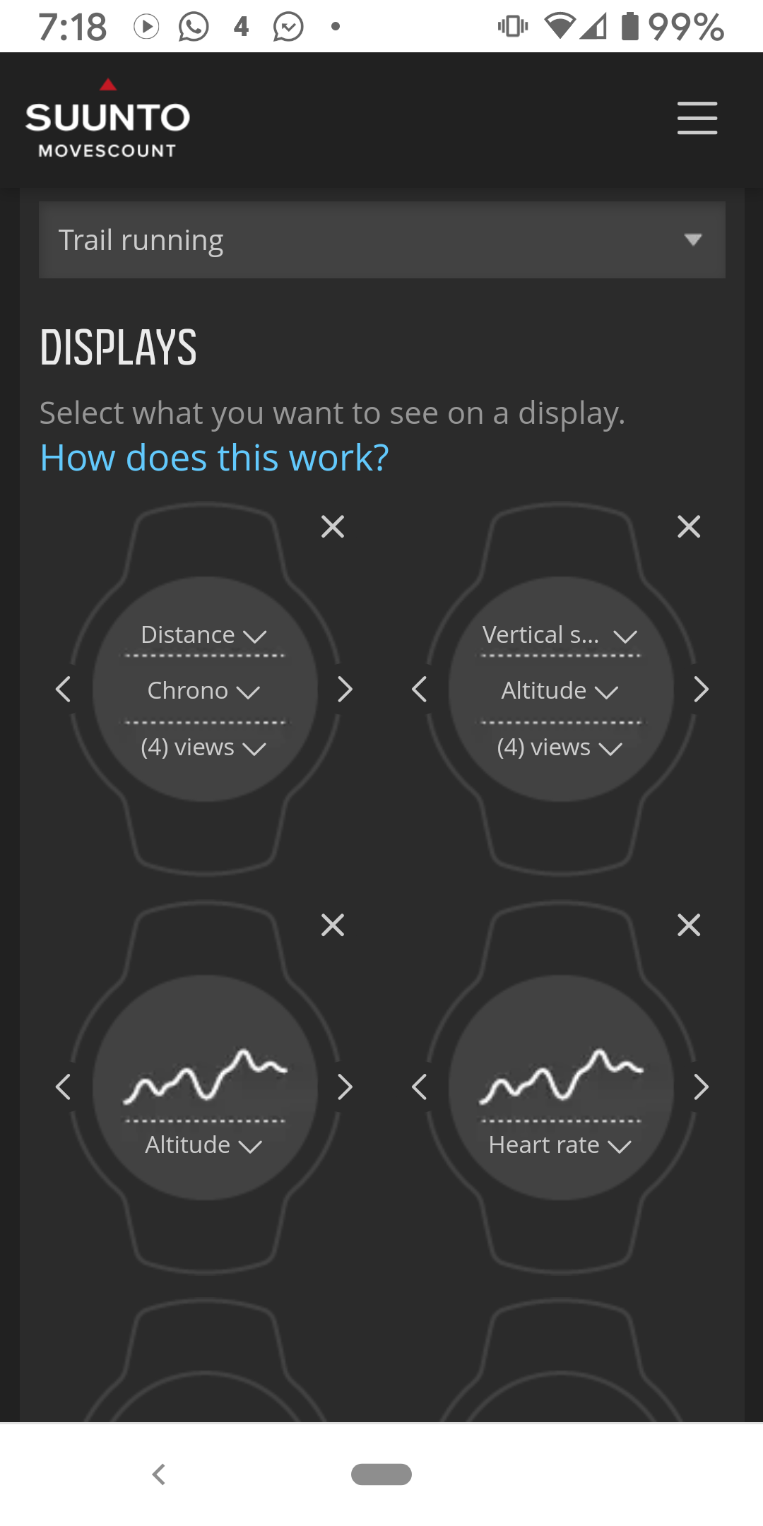
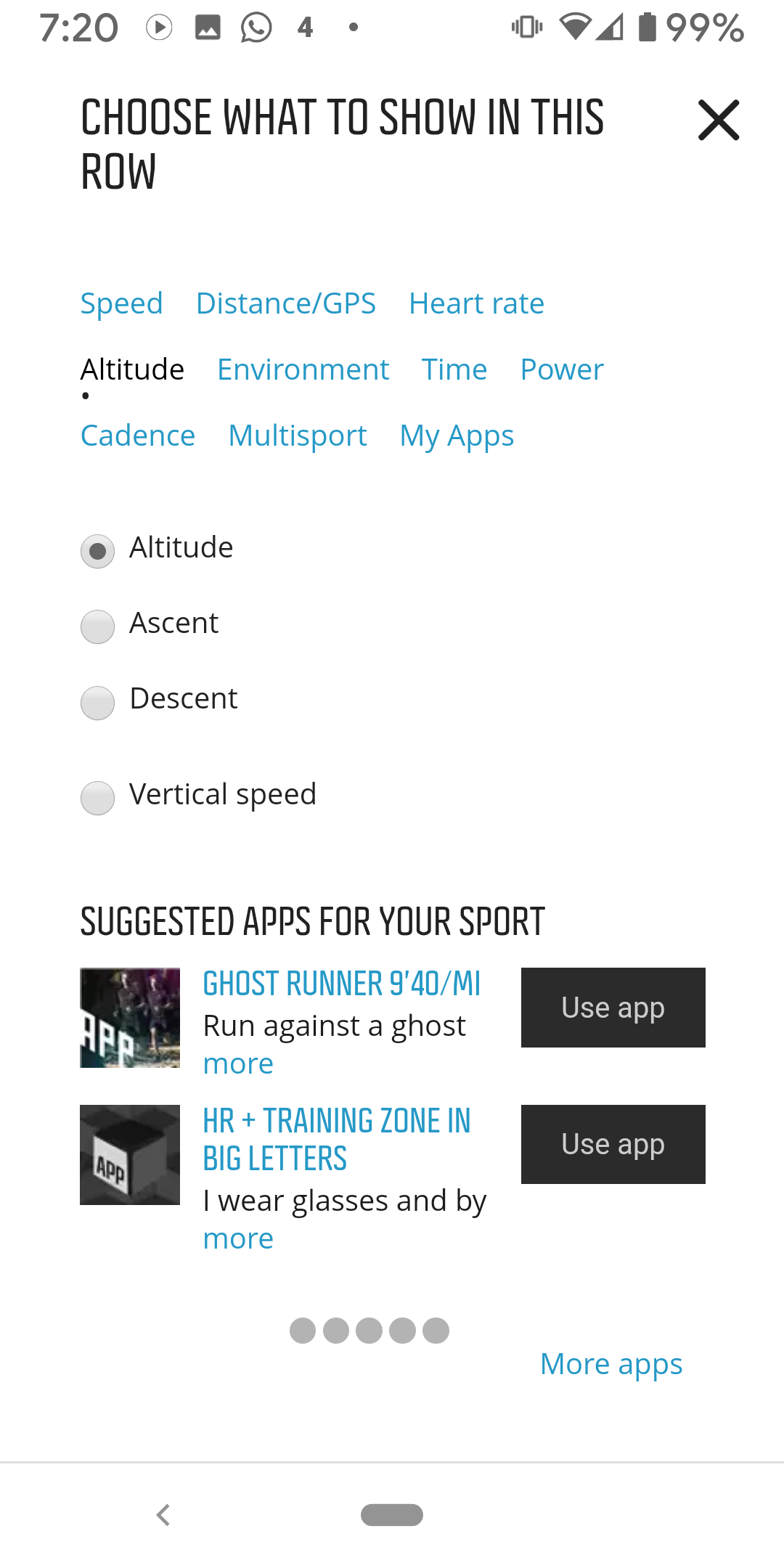
Watch customization - While I believe it’s better to have it done via mobile app instead of watch itself, the user experience might be better: I’d like to see a “demo” being played constantly in the app while creating a sports profile (watch face). Also, lists are fine if there aren’t too many elements in them to choose from. Currently the list is absurdly long and there are no shortcuts to certain categories or icons for quick navigation. Nevertheless, it’s still easier and faster to create watch faces in the app than in the watch itself (also, compared to Fenix, for example).
-
@Łukasz-Szmigiel said in What do you love about the Suunto app?:
Watch customization - While I believe it’s better to have it done via mobile app instead of watch itself, the user experience might be better:
Watch customization is much better on Movescount web, even when running in mobile browser. Too bad Suunto didn’t reuse some of the old design ideas such as categorization of fields, which makes field selection very quick.


-
@silentvoyager that’s why I believe that the interface and the user experience in regards to workout watchface configuration could be improved. However, it’s still far better and faster in my opinion than having to click bulky buttons on the watch itself in order to configure the screens.
-
@silentvoyager
I really disliked the popup window with the different pages… it was tidy but still not so easy to setup…
I like the number field and the scroll down menus…
even better would be selecting favourite values and the drag and drop…
hmm… I’m placing suggestions offtopic again
-
Lets stick to the subject people. Consider this as a survey.