SSU 2.5.18 - ON AIR
-
By waiting this update, i was waiting the S9 watchface. I find it’s a really nice one.
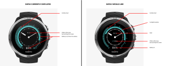
But i was expected something a bit different. I give you a picture below with the comparison of what are currently displayed and what i would like…
-
@Tim4c good points let me tranfer those
-
@Tim4c
Well done Tim, I agree with you -
I would like also that clock hands are behind values to be more readable!
-
-
just to throttle this, you should have seen the debates on the test groups when this was first introduced
-
@Václav-Král come on, its my favorite. Take it or leave it

-
@Tim4c said in SSU 2.5.18 - ON AIR:
I would like also that clock hands are behind values to be more readable!
Digital hour?
-
@suzzlo Why not

-
Good job!
What is “Sleep data insights”?
-
@dimangi you can see the details of the prev days of sleep (before you could only see the current)
-
I’ve just seen that instant HR monitor is locking on HR faster, around 10 sec.

-
@Tim4c I totally agree with you to see more/different data on the watch screen like and also no duplicate information like twice battery level or sunset information. I think the default watch face you pictured looks nice, but I noticed another flaw: the hour hand is pretty thick. Not a really big problem at some hours of the day, but between 11:00 and 13:00 it can become really tough to read the data field as the color of the text is the same as the hour hand and the text becomes invisible.
-
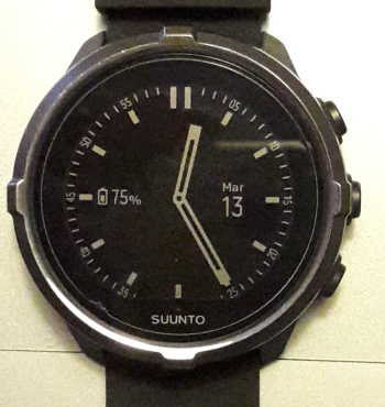
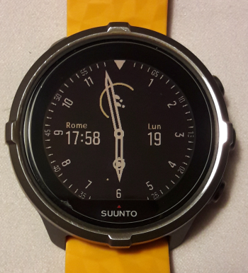
I like the little update on “chrono” face … there’s only one drawback imho, once in “energy saving” mode the outer numbers are barely readable.
BEFORE

AFTER

-
wow, nicer than before!
-
Does “New options for configurable tones (for alarms) in your settings.” mean that silent wakeup alarm is now possible? Thanks
-
@Gerbow
Yep
-
Awesome! Can’t wait to try out the new glonass settings!
Good work all.
-
@stromdiddily About Glonass, my vague memory was that it was not improving the GPS accuracy in most cases, only for some (very) specific regions. E.g. in Western Europe activating Glonass would result in a less accurate trace than without.
Am I wrong thinking that? I actually never tried it myself, no facts being my vague memory
-
I, too, am loving the updated chronograph-style watch face. That the step counter and the recovery time rings persist now is great. Especially the recovery time. Not having to scroll down a couple of screen displays and tap the screen to bring that up anymore is awesome.

