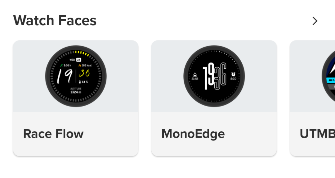
Race Flow & MonoEdge
-
I just noticed 2 new watch faces in the app

-
@SamuelP
Yes, I noticed. I’m even testing race flow.")
-
Race flow looks great
-
@thanasis I also liked Race Flow at first glance, but after 5 minutes I went back to Athletics, mainly because of the poorer readability on V1. Another reason is that I want to see the seconds all the time.
-
Race Flow is one of the most customizable watchfaces and it could be nice with another hour/minute font, I really dislike the chosen one for both aesthetical and readable reasons
-
@Milan-Šádek
I agree with you.
I tested both watch faces.
First of all, I have a Vertical 1 with a MIP display. My comments are based on that.
Race Flow seemed nice at first, but readability is very low. The seconds are unnecessary and not useful, and as someone who thinks the watch face should be a dashboard, there are four fields that can be changed besides the time and date.
Mono Edge seems like it could be a companion to the “Stride” for classic wear. After using it, I liked it even more.
After all, I still use Race 2 and Athletics. Sometimes, Aoutback Adv. -
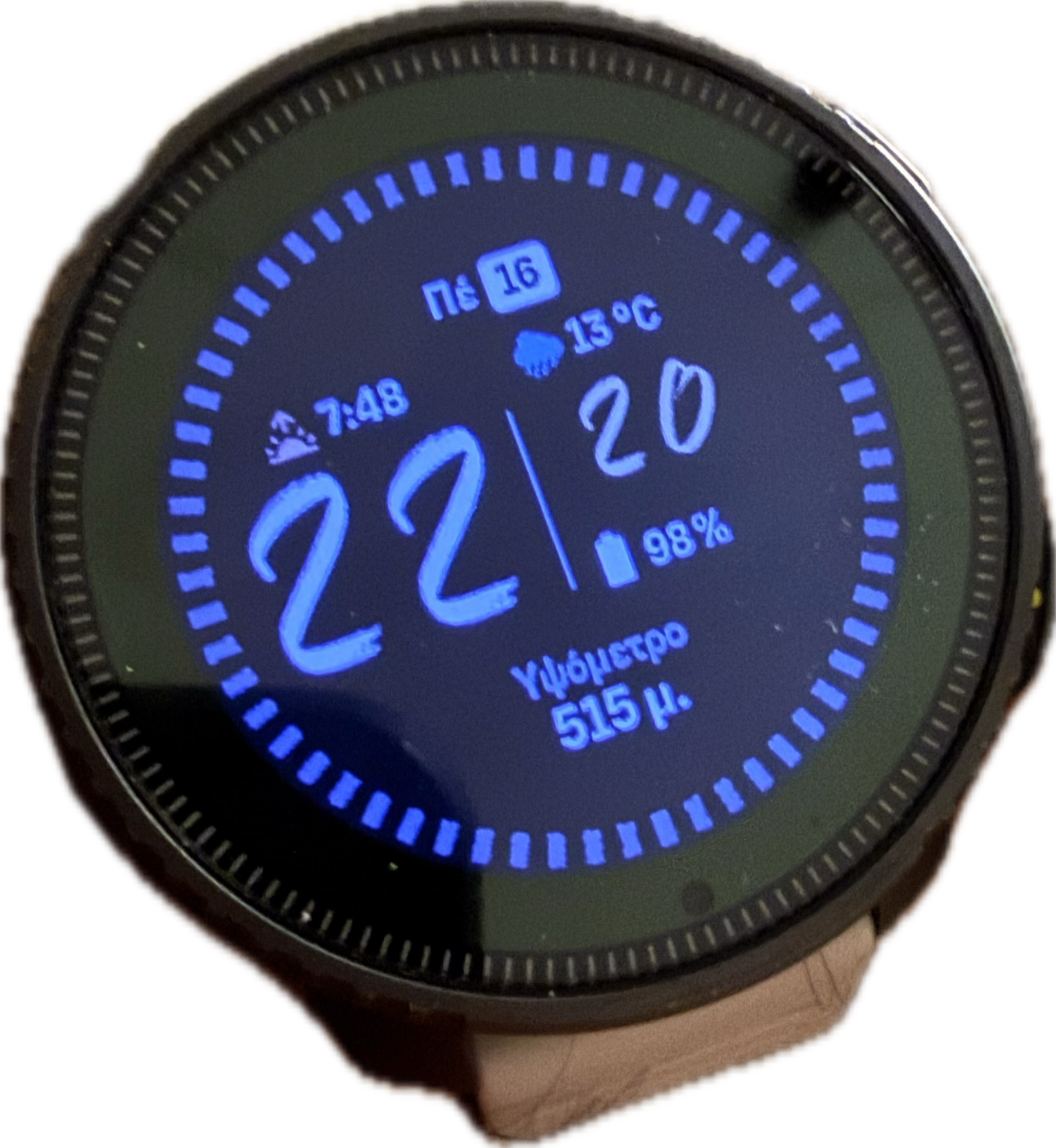
I like the Race Flow, but I’m not sure if the circular seconds display is necessary. The seconds don’t work after a while anyway.
Something else that’s present in other watchfaces in a similar circle could be added here: battery, compass, daylight, recovery, etc. -
Both watchfaces with costumizable circular complication would be really nice.
-
Have Suunto only licensed tiny fonts for their watch faces?
Other brands manage to make readable complications and other things.
The best one for the most part is Race 2 with a readable date font, but that’s about it, other details are again in the tiny font.
I would love to use Vertical 2 if they had slightly bigger complication fonts (and you could customise the bottom complication).
Watch: Suunto Race S
-
@Steven-Hambleton said in Race Flow & MonoEdge:
Have Suunto only licensed tiny fonts for their watch faces?
Other brands manage to make readable complications and other things.
Maybe they got inspired by Fenix 8 release last year. Major complaint after release, was tiny unreadable complications on ALL default watch faces. 🧐
At least here, you have more usable options if you find these fonts too small. -
@Squirrel Such as?
-
@Steven-Hambleton I think a few things are mixed up here.
People with vision problems should use a special group of watchfaces with higher contrast, larger fonts, etc. Suunto doesn’t have such a design.
Changing now all watchfaces is rather pointless, as not everyone needs disproportionately large elements.
The watch screen is physically small, the resolution is quite high, so generally the elements have to be small.
-
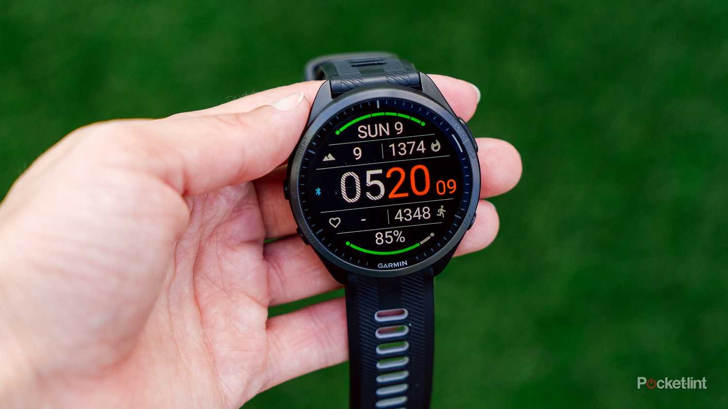
@maszop If the resolution is high, that means there’s more pixels to play with. The time could be a bit smaller, the complications could be bigger like this face -
-
@Steven-Hambleton It doesn’t always look cohesive.
Often, watchface design requires small elements.To me, this Garmin watchface looks average at best.
-
@maszop The information is clear and decipherable, and that’s what I want from a user interface.
Suunto make great watch faces, I just wish they’d tweak the sizing a bit to make everything readable.
Their sports apps are fantastic in this regard btw.
-
@Steven-Hambleton But that’s not the only thing. It also has to look attractive.
I once saw a Polar watch that was very legible, but the clunky design made my eyes bleed. This was enough for me not to even consider buying a Polar watch.
The same applies to the application, SuuntoApp, although it is much simpler and lacks a lot of features, for many it is better than the ugly Garmin Connect.
-
@maszop I agree that function cannot stomp all over form, there needs to be a balance.
The two new faces, Race 2 and Vertical 2, are really nice and I switch between them, I just wish they’d consider slightly larger fonts for the complications, just reduce the time a little. It can work!