Update time in Europe?
-
@brad_olwin so it is! Although it’s unlikely I’ll need that many, as I only have four set currently (up from three previously!).
It’s nice to have the option to have more though

-
Went for a short run after the update and now since the hr is true 24/7 the watch picked my hr immediately when launching the Suunto app. Before the update it usually took a while.
NICE!!! -
@jantikainen said in Update time in Europe?:
Went for a short run after the update and now since the hr is true 24/7 the watch picked my hr immediately when launching the Suunto app. Before the update it usually took a while.
NICE!!!Noticed this and made me happy!!
Also - do we know if the GPS services were updated somehow?
When running locally, I usually start the App as I leave my front door, and I get a GPS lock by the time I’ve walked to the corner about 75metres away (sometimes have to wait a bit when I get there, but it never gets the lock until I’m at least half way there), and then I start my runs from there.
Just now, I started app at same place as usual, and GPS lock happened within 10metres. That NEVER happens!!

-
Wasn’t coming for me here in the UK but I have it now. Just keep checking and when it says up to date just recheck, do that a few times and it will start the download. Well it did for me

-
@isazi yes it changes colour and brightness as the sun sets. Really clever, I love this watch face. Not sure how much of a battery hog it will be though?
-
After charging and restarting, the update is also available for France.
-
An someone please tell me how I “enable” sleep tracking I can’t find it anywhere on the watch itself?
-
@scott-gibson if you add the sleep tile it’ll ask you to enable sleep tracking.
-
@isazi thanks so much
-
@egika sorry for the delay, yes, exactly the same and solved like @olymay said in Update time in Europe?:
I had that, a reboot of the watch sorted it

-
@scott-gibson said in Update time in Europe?:
An someone please tell me how I “enable” sleep tracking I can’t find it anywhere on the watch itself?
Took me a while to figure out I needed to add a tile. Not very intuitive.
-
Sleep tracking is unreal! 1% battery for 1 hour of sleep tracking. It uses more battery when I leave it at desk overnight
 Great job Suunto team!


Now to finally add a external HR support and we have a perfect watch over here

Btw, something is weird with resources, so please clarify. I had like 70% and then new day started and it dropped down to 20ish%. Why is that?

-
@egika I had to reboot the watch
-
@metalmi Because you get up and move

 .
. -
@metalmi said in Update time in Europe?:
Sleep tracking is unreal! 1% battery for 1 hour of sleep tracking. It uses more battery when I leave it at desk overnight
 Great job Suunto team!


Now to finally add a external HR support and we have a perfect watch over here

Btw, something is weird with resources, so please clarify. I had like 70% and then new day started and it dropped down to 20ish%. Why is that?

I’m guessing (just guessing here) that the resources are probably not very accurate the first day or two as it won’t have enough information to go on? Maybe that drop was the resources calibrating itself?
-
@ianarg said in Update time in Europe?:
@isazi yes it changes colour and brightness as the sun sets. Really clever, I love this watch face. Not sure how much of a battery hog it will be though?
I had a mind blown moment when I realized this. At first I though, well it’s an ok watch face. Then I realized that the hour circle is supposed to be the sun, and then I realized why it didn’t show a number for all 24 hours. Then I felt dumb for not realizing before
 .
.This is definitely now my new favorite watch face!
-
@aleksander-h said in Update time in Europe?:
@ianarg said in Update time in Europe?:
@isazi yes it changes colour and brightness as the sun sets. Really clever, I love this watch face. Not sure how much of a battery hog it will be though?
I had a mind blown moment when I realized this. At first I though, well it’s an ok watch face. Then I realized that the hour circle is supposed to be the sun, and then I realized why it didn’t show a number for all 24 hours. Then I felt dumb for not realizing before
 .
.This is definitely now my new favorite watch face!
Me too! I thought it was annoying at first as it seems like the digits need a thin dark outline on them to help them stand out against the bright background…but then I approached sunset and ‘kaboom’ !!
Love the little ‘24hr dot’ (although would like it SLIGHTLY larger - I think from other UI decisions also, the people who work at Suunto all have really good eyesight!?)- you get a real glanceable sense of, “if I want to go out for an evening run, I need to go ‘now’ to get back before dark”, much more clarity than simply having access to a sunset/sunrise notification.
It would be really cool if the daylight background changes with the weather also! (maybe it does, it was sunny here yesterday).
-
@nigel-taylor-0 said in Update time in Europe?:
(maybe it does, it was sunny here yesterday).
Same here. Blue sky and sun. Would be cool if it did take weather into account.
-
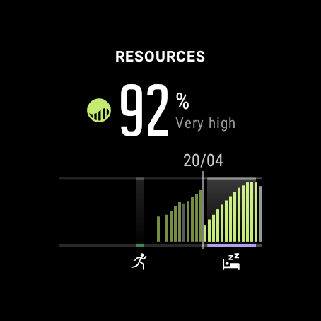
In the Resources display, should the Active, Inactive & Stressed times be different shades (similar to how recovering is green) ??
As it is, the graph feels like “Recovering vs Everything Else” - its difficult to get a proper context of the other categories across the day…seeing them tagged in the graph would surely be a better approach than simply having the list of numbers? I think just other shades of grey would help with comprehension - maybe it should be…>
Active - Grey as-is
Inactive - Lighter Grey
Stressed - Red
Recovering - Green (as-is)The graph in the app should also carry the “activity icon” (where you’ve done a workout) and “sleep” icons along the y=0 axis, just as it does in the Watch tile.
That would enable a glance which differentiates ‘active’ (I assume this is just general ‘moving around’ and causes resource drain) from ‘activity’ (an actual workout) - they’d show grey in the chart, but you’d get the little icon and a short line along the bottom tagging your runs/cycles etc. -
@nigel-taylor-0 said in Update time in Europe?:
Active - Grey as-is
Inactive - Lighter GreyI feel this is already differentiated with the running man icon and the dot under the bar it applies to.
Stressed - Red
How would one define if a bar should be red or not? We will always have some degree of stress surely? I feel stress would be better off as its own tile showing how stressed we are throughout the day.