S9 Watch faces
-
@egika said in S9 Watch faces:
@rhustox While of course not speaking for Suunto, I can tell you that this forum has been founded exactly to do, what you are commenting on: To gather user’s ideas and opinions.
In the beginning it was all about the new Suunto App and Dimi has spent days to gather the contributions, evaluate them and report them back to Suunto product management.
The voting function has been the tool to “like and support” an idea.
I am very sure that priorization of the development of app features has been largely influenced by these reports based on user input from this forum.Now recently the forum has been opened to watch discussion (it obviously proved almost impossible to limit the discussion to the app, while the more important product are watches). So I guess, that watch feature suggestions are welcome and can be voted for as well and will find their way to the responsible product manager eventually.
Their task is it to get the big picture. Not listen to individuals that shout loudest.
Keep on producing and discussing your ideas. They will be heard for sure.Oh, thanks for the info!
I did not know this and really sounds interesting!
Will take some time on new watch face ideas and see if a merge of different proposals can end up with new and powerful results! -
@rhustox just remember that the forum is only one of the channels Suunto have to collect feedback and ideas. And it’s probably not the largest, as you may imagine there are more people with Suunto watches than users in this forum. Also the forum is English only, and this already exclude part of the population. You may get surveys on the Suunto app, they are very important for Suunto to collect feedback.
-
@egika
I like your answer on the big picture and to not listen to individuals that are the loudest.
This is exactly the spirit a such place could bring.
We should put our ideas on the table, also explain and justify why so that people can catch their reason and criticize them
After it is SUUNTO to consider what they think is strategic and bring the biggest benefits to teh largest possible with the less effort … not so easy.
Also as said by @Rhustox all this make sens if we are not speaking just in the wind but there is someone on the other side of the line who will see all our points as an advantage to make even better.
As also he said … Suunto brand, fingers crossed this works for you! -
@isazi
Hello Isazi
I tried in the past through multiple angles … trying also to post my ideas on some facebook pages or sending them directly to Suunto support … but I was facing to be not heard …
here … it is a SUUNTO.COM page, so I guess that there are some people of SUUNTO Dev team who just observe and accumulate ideas
After …
for sure in IT all is possible but it is a matter of time / money / effort / priority / choice …
beign now a little nit old I’m still a kid with this watch so I continue to dream to Santa SUUNTO Klaus


Let’s just bring ideas and reason why, then there are I’m sure super expert at SUUNTO side to take these ideas and to do even better.
I work exactly this way at my side with my own IT team. … and guess what … I’m very often astonished to see that when I put an idea on the table which kept much simplier even if I was thinking more ambitious … it is the people of the team who counter propose something much better …
So what I put on the table, I’m sure SUUNTO team will do even better
-
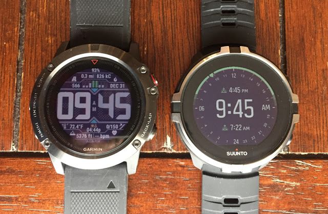
Browsing a little I took few minutes reading a review on Suunto-Garmin comparison from 2018.
The post is quite interesting and for the matter I’m concerned of which is as this post name says, the watch faces designs on both brands difere as much as we can imagine. While Suunto is focusing on minimalist and fine designs, Garmin is doing quite de opposite making the most of its space kind of Casio’s classic style, I mean too much stuff in there.
Honestly, I think that a lot could be done regarding more useful info as proposed and knowing that between little and much is the good measure I’m sure there is a lot to gain, for both parts, people like me who are interested in having more at one sight and for visualy impaired as well.
Here is the image I take as an example of how good ideas could come to a good port.
-
@rhustox
the watch faces both go in line with the general design philosophy of the companies. Suunto is nordic nice and simple with few beautiful details and Garmin is completely overloaded somewhat military style
-
@pierre-yves-colle said in S9 Watch faces:
I work exactly this way at my side with my own IT team. … and guess what … I’m very often astonished to see that when I put an idea on the table which kept much simplier even if I was thinking more ambitious … it is the people of the team who counter propose something much better …
I think you do it exactly how a a good leader should work - being open for everything that comes. I made the same experience (being a principal) with my teachers and often the best proposals come from our very young people, who just started their career. In martial arts we call this “beginners mind” - somebody who’s mind is “empty” often has an more unbiased view on the things! therefore (working in a school) we sometimes even ask our very young students (like 6 to 10 years old) how they would solve certain problems we face and boy, some of their ideas are hands down brilliant 🤩. Perhaps that’s an idea for the IT companies too

-
@freeheeler said in S9 Watch faces:
@rhustox
the watch faces both go in line with the general design philosophy of the companies. Suunto is nordic nice and simple with few beautiful details and Garmin is completely overloaded somewhat military style
Totally agree, two opposites and so many possibilities to take as example of how to or not to.
My proposal ideas are not of breaking any design or brand style at all no even thinking of copying of following any brand ideas either. The point is to improve our experience as users and by that as a matter of fact Suunto will become better in different ways as said, user experience, being loved for this watch capabilities and at the end being a real good and interesting product I guess.
Offering a larger array of watch faces with the option of upload/download them from your Suunto app instead of having them all installed in your watch, and all those watch faces being able to be customised by each user in the same fashion of ON/OFF button we already have, in the Alarms menu for example, will bring nearly endless possibilites of watch faces that anyone can have at their own taste.
When you activate your prefered watch face and after choosing the color, something like this would follow:
Date ON/OFF
Sunset-Sunrise ON/OFF
Altitude ON/OFF
Steps ON/OFF
Calories ON/OFF
Sleep ON/OFF
Recovery (ON/OFF
Last 7 days ON/OFF
Battery % ON/OFF
Moon ON/OFF
…
Keep all info* ON/OFFAs many good and available options come to your mind

Perhaps only 5-7 tips could be active at the same time. That is what Suunto teams have to see and decide if it is possible or not.*Another interesting option as in some watch faces some info disappears after 10 sec. Someone may just want to see it after pressing the button.
By the way, sorry I did forget to share the link where I have taken the picture from, if someone is interested on the reading about this comparison: https://www.roadtrailrun.com/2018/01/comparative-review-garmin-fenix-5x-with.html
-
@rhustox said in S9 Watch faces:
Browsing a little I took few minutes reading a review on Suunto-Garmin comparison from 2018.
The post is quite interesting and for the matter I’m concerned of which is as this post name says, the watch faces designs on both brands difere as much as we can imagine. While Suunto is focusing on minimalist and fine designs, Garmin is doing quite de opposite making the most of its space kind of Casio’s classic style, I mean too much stuff in there.
Honestly, I think that a lot could be done regarding more useful info as proposed and knowing that between little and much is the good measure I’m sure there is a lot to gain, for both parts, people like me who are interested in having more at one sight and for visualy impaired as well.
Here is the image I take as an example of how good ideas could come to a good port.

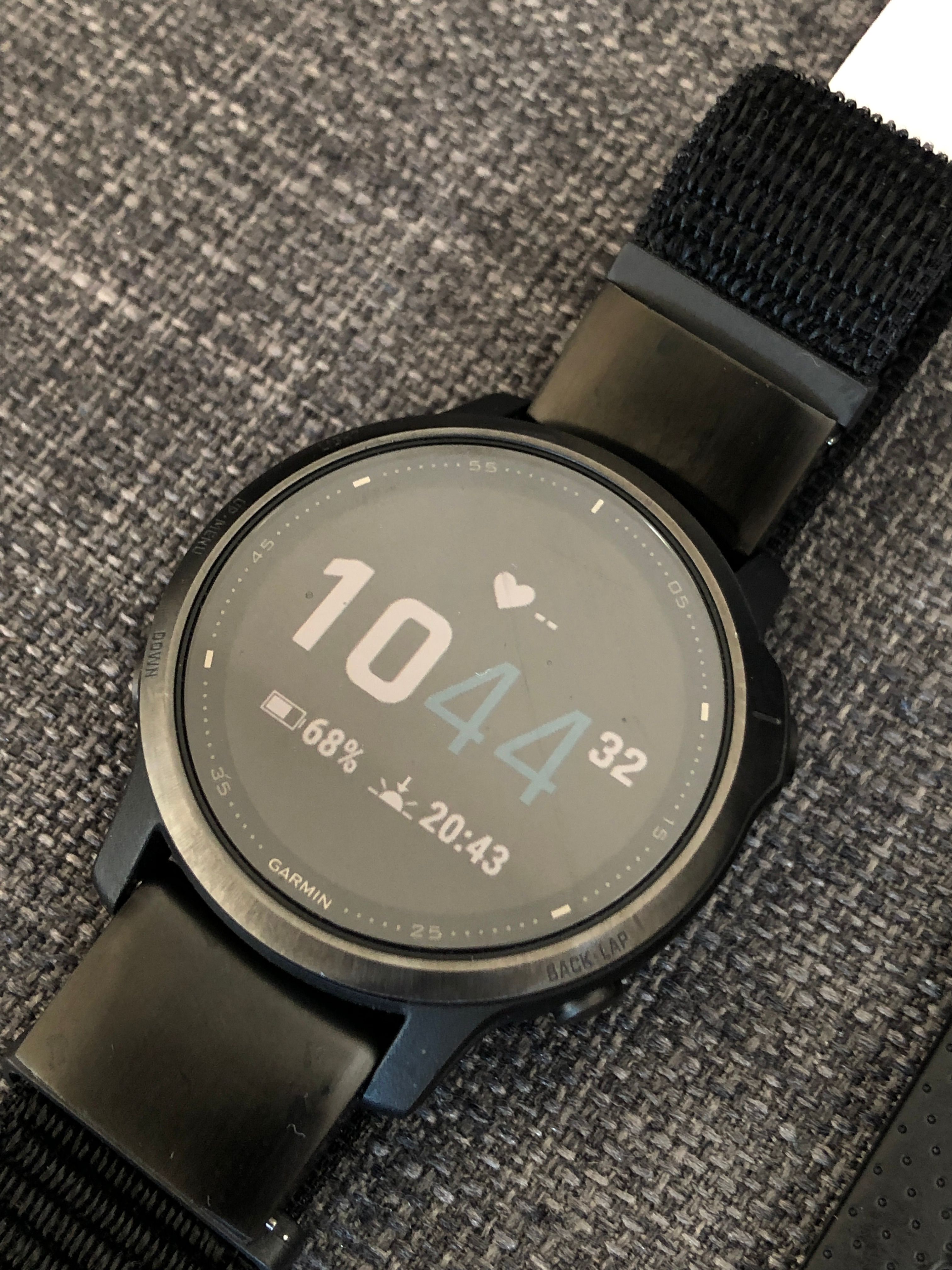
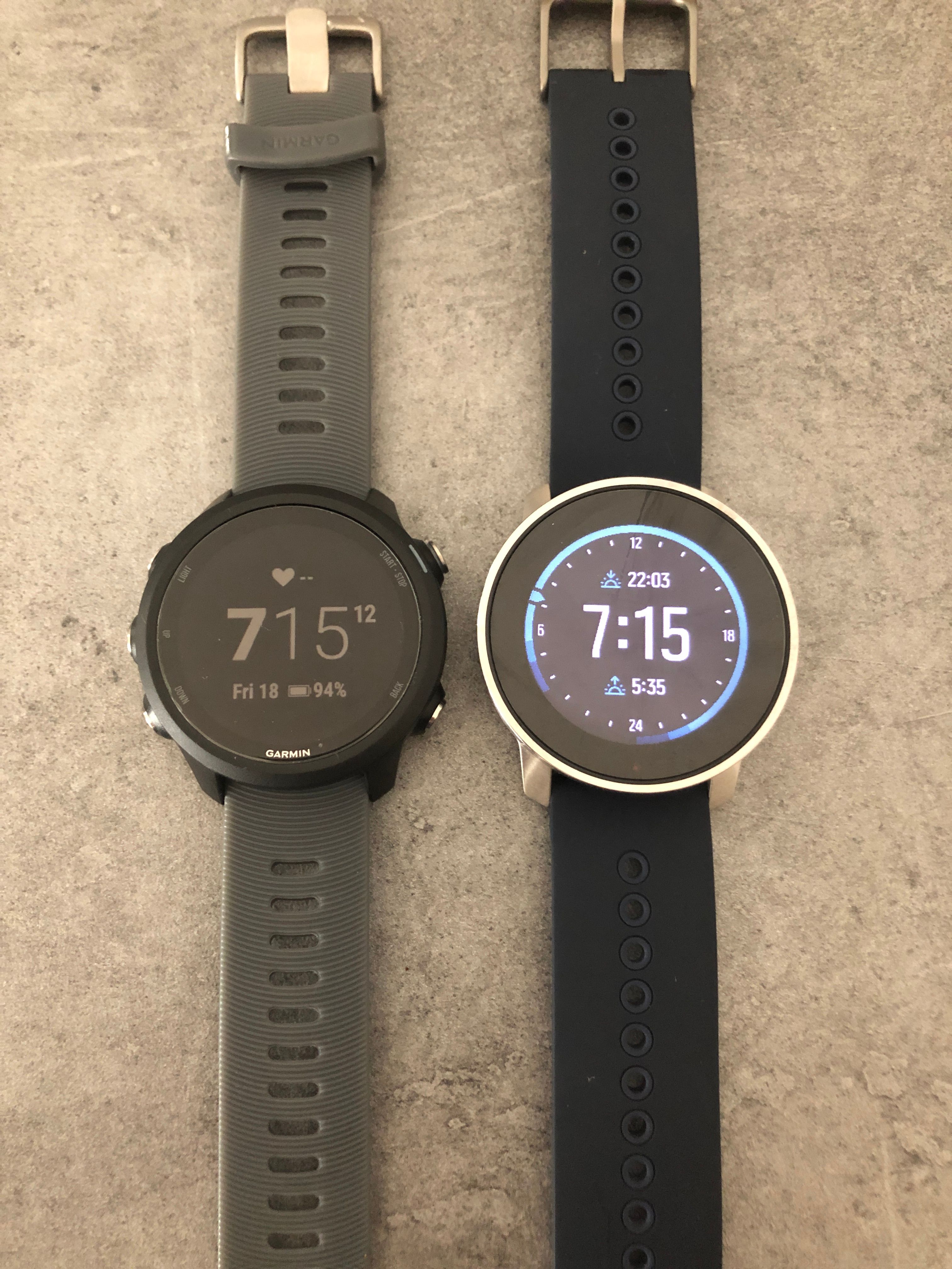
In defense of garmin, they can have more stock minimalist watchfaces with “enough” (for me) data fields that are customizable.
That for me is ideal. I don’t need fancy watchfaces with zillions of data fiels. I just need to be able to choose what data fields I am viewing in a watch face.
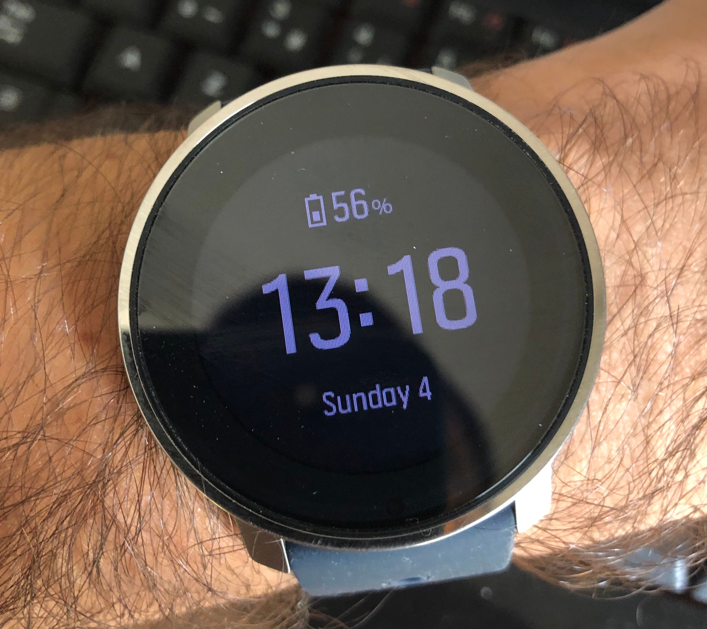
What I find a bit annoying on the S9P today, is that some watchfaces have some data fields and other watchfaces other data fields.
You can’t get (at least that I know/understood after reading the manual) two different watchfaces with same data fields (ex: battery, day of the week, sunset time).
That is for me the “issue” with this watch face (which I like the most)
-
@andré-faria That is exactly what my suggestions are and the reason of this post.
Completely ignoring if S9 and S9B against S9P have some watch faces in common, as I’ve seen so little of the latter only in this forum and browsing a bit about it.
Would be great under my little understanding of programming if this is possible. Taking for granted that these devices are not the old displays like the Core model and with a little experience on graphic design I know that that would be possible and having personal preferences when to choose which info I want to see in each watch face or at each moment, comes to mind that Suunto would do a great job if could make it happen.Imagine not just a personal taste, preference or need but a customised watch face from a base design for each one to choose.
One would love to have his/her Suunto loaded with many fields and as much info as possible. Another one would keep the minimalism to its fullest. Imagine just doing this thing the same person in different occasions, once wearing casual or sport look with cool watch sport face style, then same day going to the office on a business meeting and wearing it as minimal and stylish as you like.
Isn’t that everyone’s dream? From my point of view, I think so.

-
Well it confirms my feeling … the GARMIN screen with too many information … is just … abslutellynot readable at all at the end …
It make me confirm my love to SUUNTO approach … and why if I propose new screens the ideas is not to add many information at the same time but better to use the touch on the screen to move from one screen to another where their are multiple secondary information possible
-
Maybe I’m in the minority but I simply want a few options for uncluttered, easy to read watchfaces that are customisable to a degree. I don’t want or need the choice of tons of different watchfaces and I don’t particularly have any desire to swipe through different screens to acesss more information. It’s a sports watch for athletes not a smart watch!
FWIW my daily wearer apart from my prized Rolex is usually a chronograph of some sort - visually appealing, easy to read and uncluttered. My Magrette is a good example:
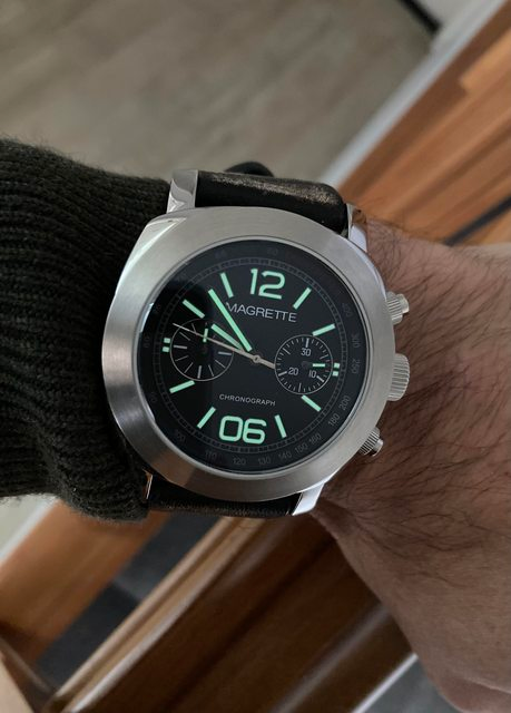
Point being is I want to look at my wrist and be able to quickly see along with the time and date just a couple of fields that are important to me. Being into watches I love simplicity and elegance, and for the most part I really think Suunto stamps it’s authority over the other brands in this regard.
If I were wanting anything to be implemented into the watchface it would be being able to select the ‘Recovery time’, I’d much rather have this on my watchface over daily steps
-
We are absolutelly not in contradiction
See my proposal https://forum.suunto.com/topic/6692/my-prefered-watch-face-if-i-could-developp-it?_=1625484429299
I’m exactly like you
- At a given time I prefer to see less, but still some very interresting information for that peculiar moment. this is why I call a primary information and just a seconday one … for me all the watch face screen could behave the exact same with just 2 textual informations displayed at a time (the primary being the time, the seconcady being anything else :displayed smaller but still very easy to red : date, alarm, altitude, sunstet/sunrise; pressure (for lucky BARO owner) …
but … I will add this on top
-
At another given moment I may want to see another secondary information
-
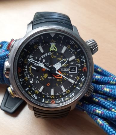
These watch are in fact computers, exactly what differs from yours which you shown or y lovely citizen below …it makes a big differences : I’m not asking anything to my “analogic” watch because nothing can change anymore … so it took me many years before I found her and now I’m married to her until my last day (a real honey moon which last), however knowing that I have a computer at my harm with this SUUNTO and that we can ask whatever we want to a computer, then I’m still super demanding and proposing … my SUUNTO 9 BARO is already wonderful … but with few centimers more … it will become such awesome that all competitors will be not just behind but far behind
So if such computerized watch are not providing their advantages like especially able to adapt … then no need of a such watch, you can remain with an analogic one which will give you also the direction and altitude … mine does it very well and the funny of this is that here in reverse I like a lot that she has plenty of “information” written …
-
As we can see, there are lots of views and truth be said will be difficult to make happy everyone. One likes only the way it is, another with more than one screen and different info… At the end, if there is somehow a customisable menu where each one can decide, maybe we would not have this discussion, picking your watch face of preference with its more or less fields chosen before activate that watch face and as well as sport modes, choose one or more screens.
I guess is kind of sport modes menu what we are talking about and would be that easy to get?
Only same or few more different watch faces designs I’m sure will make a huge difference.
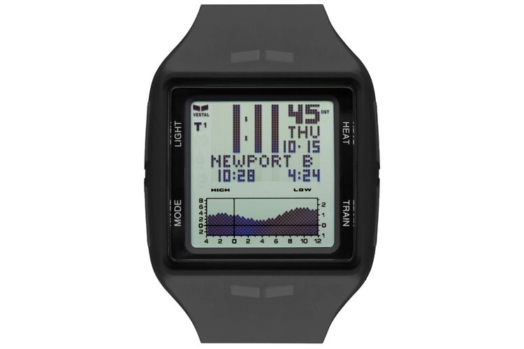
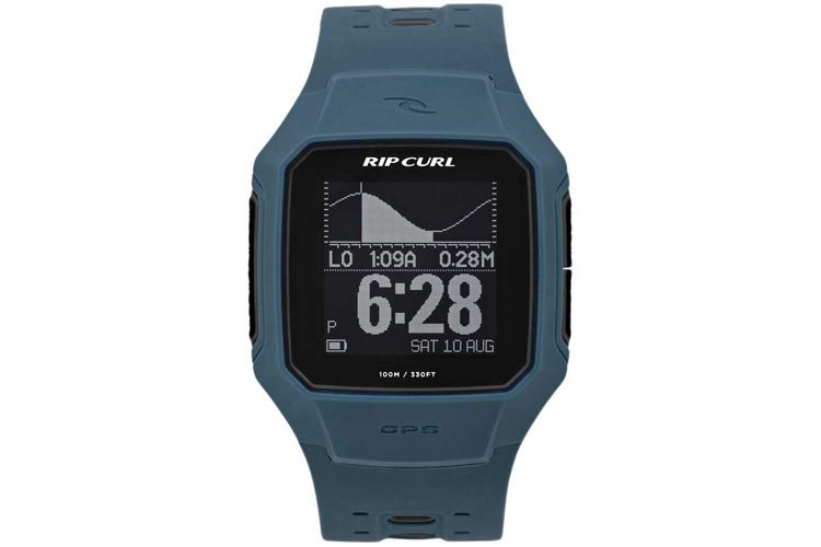
By the way, one thing I can say I’m kind of missing is the sea tides with its high/low timing, which would be great to have along with actual sunrise/sunset.
Maybe most people will not even think about but I’m sure there are lots of Suunto surfers, kite and windsurfers around. -
@rhustox said in S9 Watch faces:
sea tides with its high/low timing
Hello my english is too limited … could you tell me what is : sea tides with its high/low timing … may be posting a picture and highligting it …
Few remarks (will be redundant with other post I already made nut just to get a sunthetic view here)
- Let’s first put on the table what is really fantastic : your SUUNTO logic is awesome
- 1.a going UP & DOWN ==> to select a big feature
- 1.b going RIGHT -> RIGHT -> RIGHT ==> to select different screens specialized a given feature
- 1.c touching the sxreen ==> keeping the screen as it is but just changing the kind of secondary information to display
- 1.d a long press on the middle button with a contextual menu for that screen and specific options here
-
from what I dream you are really not so far … most surely it is not a high revolutionary whish – at least me – I hope … your watch design is already super mega awesome. I’m more in favor to display less at a time, but bigger to ease the reading and use the above 1.c to just change which secondary information I wish to see now
-
Some times the RIGHT RIGHT is not used as its potential could be …
For example the RIGHT on main screen is here poorly used and just going to a very empty black screen with just the date and battery which could have been access much better if you were letting me choose in the APP some screens from a sort of a catalog
For 2 and 3 … see my post here : https://forum.suunto.com/topic/6692/my-prefered-watch-face-if-i-could-developp-it?_=1625494686817
- May be a FULL Light Theme … now that I tested it in the exercise view I realized that despite it give less a warrior style, at least I can see much better the small info.
…
Honestly … even if we are all demanding you … we should recognize that you are not so far from perfection … and it’s an IT guy who tell you this.
last rq that I hope will please you … I was a little bit unfaithful with you as I bough a GARMIN forerunner 625 to my wife (sorry for that, … but because she wished to run with music) … Well , well well, between your approach and menus and them … there is no more than 5 seconds to give the winner and by far, you approach is much much better and continue to work with no additional difficulty even if you add some screens.
Very well done guys !!!
-
Hey @pierre-yves-colle I don’t know if this was a reply for my earlier text but yes, this menu logic is looking great and easy to use.
About the sea tides… Might be marée marine?

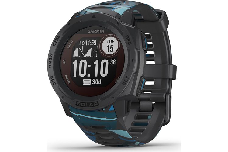
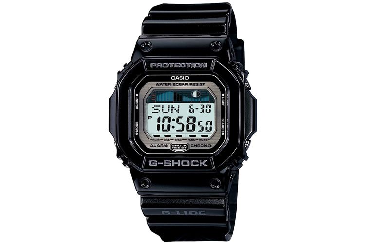
I’m sure you know what this is. High and Low should show the time were the sea level is in the highest point and the lowest point.Not only surfers take that info so seriously but sailors, fishermen and other sea lovers like divers focus their activity timing on the restricted sea and moon activity.
Here are few examples for everyone to see how easy and fun would be having this on our S9 and S9B. These are ‘surf’ watches because of the sea level info.
-
@rhustox
they’re comnected and synced thru magic seaweed, right? would be nice if suunto would extend their partnerships in that direction, too
maybe the favourite surf spot swell height and wave quality would be asking for too much, but the tides would already help -
@freeheeler said in S9 Watch faces:
@rhustox
they’re comnected and synced thru magic seaweed, right? would be nice if suunto would extend their partnerships in that direction, too
maybe the favourite surf spot swell height and wave quality would be asking for too much, but the tides would already helpActually I don’t know exactly which brand does or does not use magicseaweed.com service, RipCurl’s surfline.com is also used in these kind of watches, a deep search should be done to know better.
As you said, maybe it is too much asking for all that right now but I’m sure that somehow there’s an easy way to link major cities and famous surf spots tides to get the readings from.
I’m quite familiar with surf-forecast.com as well and as many others, they must get the data from official forecast stations, so shouldn’t be a big deal getting it.Hopefully as Depeche Mode’s songs say: ‘It’s just a question of time’ that Suunto listens to our modest proposals, then we ‘reach out and touch faith’.

-
@rhustox
Hello Rhustox … another suggestion but here may be much much more to do … still could give a possibility to the people to propose and to other to vote …
Do you know this site : https://customstudio.atomic.com/
Here anyone can design his own ski cover and the people can vote … or the guy could order itSo I was wondering (and may be you already have this kind of tools at yout side to test soem design before to implement them) …
if you were havign a sort of a “proof of concept tool” in which we could
setup a logic of screens
the starting point being the default clock … from here we can either put screens above (so in case you scroll up or use button 1), below (so in case you scroll down or button 3)… the from any of these we can also add screens on the right of them (so in case you click on middle button 2) , or above (a little bit special here : it is in case you touch the screen) … or below (also special here it is in case you long press the midddle button)
and
for each screen, we can take from a catalog any of the objects you can manage today, place it in the screen, choose the color, also the positioning and the size …
then …
many people could submt their throuhg not as sentences but as something which is visible to all … and the others could criticize it … telling what they like (so to be kept) or dislike (so to be improved) …
then 2 possibilities …
Either it need to go by you for REAL implementation in that case may be only the 2 five could be retained … or … from this POC application I could decide to change my own watch … and in such case it is the POC application which will get sync with my watch and I will have my own personalized designed…The beauty of that …
you give the power to the users …
it is even better than the GARMIN where … of course they have tons of watch faces that you could get … but no-one of them is indeed your onw personalized one that you and only you though and want … for your own reason.It is super complex for sure
but super dynamic
and in any case strictly only your controls are available in the catalog with may be some constraints in case of conflicts … -
@rhustox said in S9 Watch faces:
Suunto listens to our modest proposals
Why be modest? Grab all you can. “Everything counts in large amounts”.