Watch Faces - we need new
-
I have been an Apple Watch user for seven years, and this year I bought a more sporty watch that can work more than 20 hours. I chose the Suunto Vertical 2. I really like the military-style, solid look of the watch, but unfortunately, the watch faces leave a lot to be desired.
Cons of the current watch faces:
- There is a lack of minimalist, single-color options (e.g., all elements in red).
- UI shortcomings – the unevenly aligned battery icon, which slopes downward, bothers me every day when I look at my watch.
- The layout of information on some watch faces is illogical, chaotic, and illegible.
- The rounding on some elements is flawed
- Some watch faces are childish and totally unsuitable for this watch
I am starting this thread, and if you have any suggestions regarding watch faces, please write them down. Maybe someone from Suunto will read this thread and be inspired to take action.
I have been working in web UX and UI for 16 years and would be happy to design a watch face for @suunto.
-
@Lukasz-Domiza Reading this, one might think you’ve never seen watch faces from Garmin or Coros. I still find SUUNTO’s to be by far the most attractive.
And if I may say so, without wishing to offend you: just because you’re a web UX designer doesn’t mean you have a monopoly on good taste.
")
https://runomatic.de
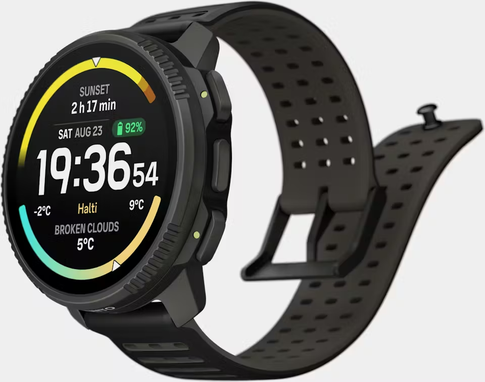
SUUNTO VERTICAL 2 Titanium
SUUNTO WING Black
SUUNTO App (iOS) -
@runomatic said in Watch Faces - we need new:
@Lukasz-Domiza Reading this, one might think you’ve never seen watch faces from Garmin or Coros. I still find SUUNTO’s to be by far the most attractive.
And if I may say so, without wishing to offend you: just because you’re a web UX designer doesn’t mean you have a monopoly on good taste.
This is true. It looks like Coros hired a 10 year old to design their watch faces.
-
@runomatic said in Watch Faces - we need new:
@Lukasz-Domiza Reading this, one might think you’ve never seen watch faces from Garmin or Coros. I still find SUUNTO’s to be by far the most attractive.
And if I may say so, without wishing to offend you: just because you’re a web UX designer doesn’t mean you have a monopoly on good taste.
Thanks for your perspective — and no offense taken.
I mentioned my background in web UX/UI not to claim a monopoly on good taste, but to signal that my feedback comes from many years of working with visual hierarchy, alignment, and consistency on a daily basis. My intention was simply to emphasize that this is an area worth investing time and care into, and that I’d be happy to contribute constructively if Suunto were open to it.
Comparisons with Garmin or Coros don’t really address my point. The fact that competitors may have less attractive designs is not, in my view, a strong argument for standing still. I believe it’s reasonable to expect more than the minimum — especially from a brand like Suunto, which clearly cares about hardware quality, durability, and identity.
What I’m asking for is not the removal of existing watch faces. Those would remain, and people who like them could continue using them. I’m simply advocating for additional options — more minimalist, more refined, better-aligned faces — so users can choose what best fits their taste and use case.
Choice, quality, and thoughtful design can coexist, and I think Suunto has the potential to do even better in this area.
-
Suunto has been putting a lot of work into its watch faces lately.
I think there are bigger problems (the colossal number of long-unfixed bugs) that cause more discomfort to users than some utopian vision of creating watch faces that will please everyone.I think someone forgets that it’s mainly a sports watch, and the smartwatch functions are just a minor addition.
-
@maszop although a complete sidetrack, what bothers me most is that there are a lot of tiny things Suunto could correct that would make a visible change for users. Things that need almost no effort, like fixing translations. So it is always a “Let’s see what the next update brings”…
But I second the topic here, I like some of the watch faces that are very visually pleasing, but more options, would be a good thing. Especially the UX background seems to be missing in some of the aspects of Suunto’s software and firmware…
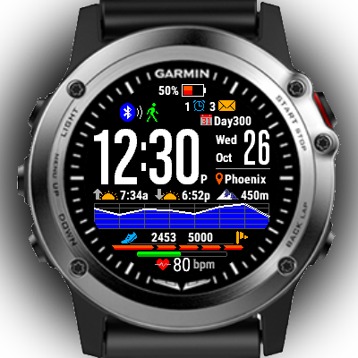
Garmin that is always compared to has a huge amount of watch faces and a lot of them are garbage, bute some of them are really good.
-
You’ve just touched the watch faces topic — welcome.
This area lives somewhere between “not being developed” and “extreme simplicity.”
Simple? Yes. Improving? …maybe next adventure
-
I like Suunto design + watchfaces. Clean and esthetic. For me Suunto watches are both - sports tool + mens jewelry. Out of sport I love clean watchface with time + minimal information. I don’t need tons of info near time during day when Iam out of sport - in work or home. Both watch design or watchfaces from for example ,G" company “screaming” with too many things in design and watchface. Its just my opinion, i love minimalism. I can accuse Suunto for many, many things, but their design is 10/10 for me.
Just my opinion and my two cents :P.
My eyes hurts when I see watchface like this
-
I’m not complaining about the watch face designs themselves. There are some I like more than others but, overall, I like and appreciate the design philosophy behind it.
What I do dislike is, in general, how weak the designs of those watch faces look when the AMOLED screen is dimmed. They’re very poor designs.
I’ve noticed this since I got the Races S with an AMOLED screen, and it’s something I’m finding hard to get used to.

Suunto 9 Peak Pro (all black version)
Suunto Race S (gravel gray) -
@enriqueescoms I absolutely agree. There are a few designs I really like, but the AOD design stops me from using them.
-
@Tami999 That one sends me into anaphylactic shock! I typically only use a few watchfaces and prefer analog over digital.
-
@enriqueescoms I think much of this has to do with AMOLED screen burn in.
-
@Lukasz-Domiza hate to say it but as an Apple Watch Ultra 2 user I find the Apple Watch faces awful. I just tend to stay with the Ultra faces as the rest are boring and dull. I find my Race Watch faces extremely useful and aesthetically pleasing. Each to their own I guess.
-
@Jeffrey-Tillack
I use “monoedge” and “stride” suits for the office, and “athletes” for sports and outdoor activities. No one has replaced them. -
@maszop Legibility should be a very high priority unless they think their demographic is mainly 20-30 year olds with great vision?
-
For the record, I think the Race 2 and Vertical 2 faces are very good, I’d like to see more development in terms of options for those two.
For example being able to configure the Race 2 graph to show us sleep over time, or HRV, or CTL, or cycle through all three if you tap on it.
The same with the Vertical 2, make the bottom complication configurable too!
Oh and larger complication fonts
-
the watch face I needed
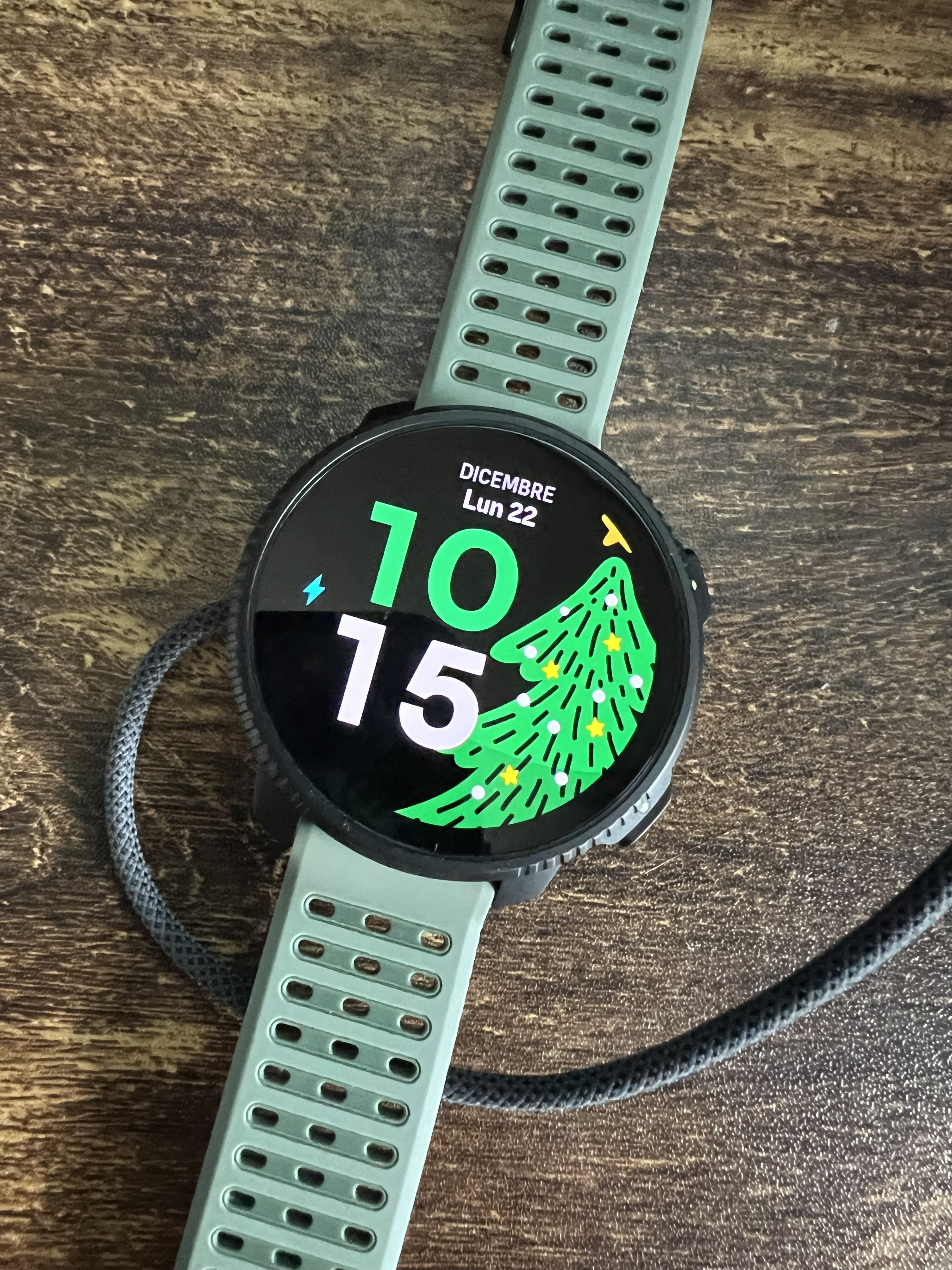
Vertical 2 v2.56.18
-
@runomatic The Christmas watch faces look like my 7-year-old daughter painted them.
 🤮
🤮Suunto Baro Ambassador Edition
Suunto Vertikal
Suunto Race
Suunto Race 2
Suunto Wing 2 -
@Manuel-Extreme exactly the look of my watch right now. Same band as well. Haha. Like @Cyclepunk says: it does look like a child’s picture. Still like it. A collegue asked me: do you have painted it yourself?
I do like it
-
@Cyclepunk luckily we can choose - don’t like it, don’t use it
")
@Manuel-Extreme I am using the same right now
Hello! It looks like you're interested in this conversation, but you don't have an account yet.
Getting fed up of having to scroll through the same posts each visit? When you register for an account, you'll always come back to exactly where you were before, and choose to be notified of new replies (either via email, or push notification). You'll also be able to save bookmarks and upvote posts to show your appreciation to other community members.
With your input, this post could be even better 💗
Register Login