Incompetent graphs
-
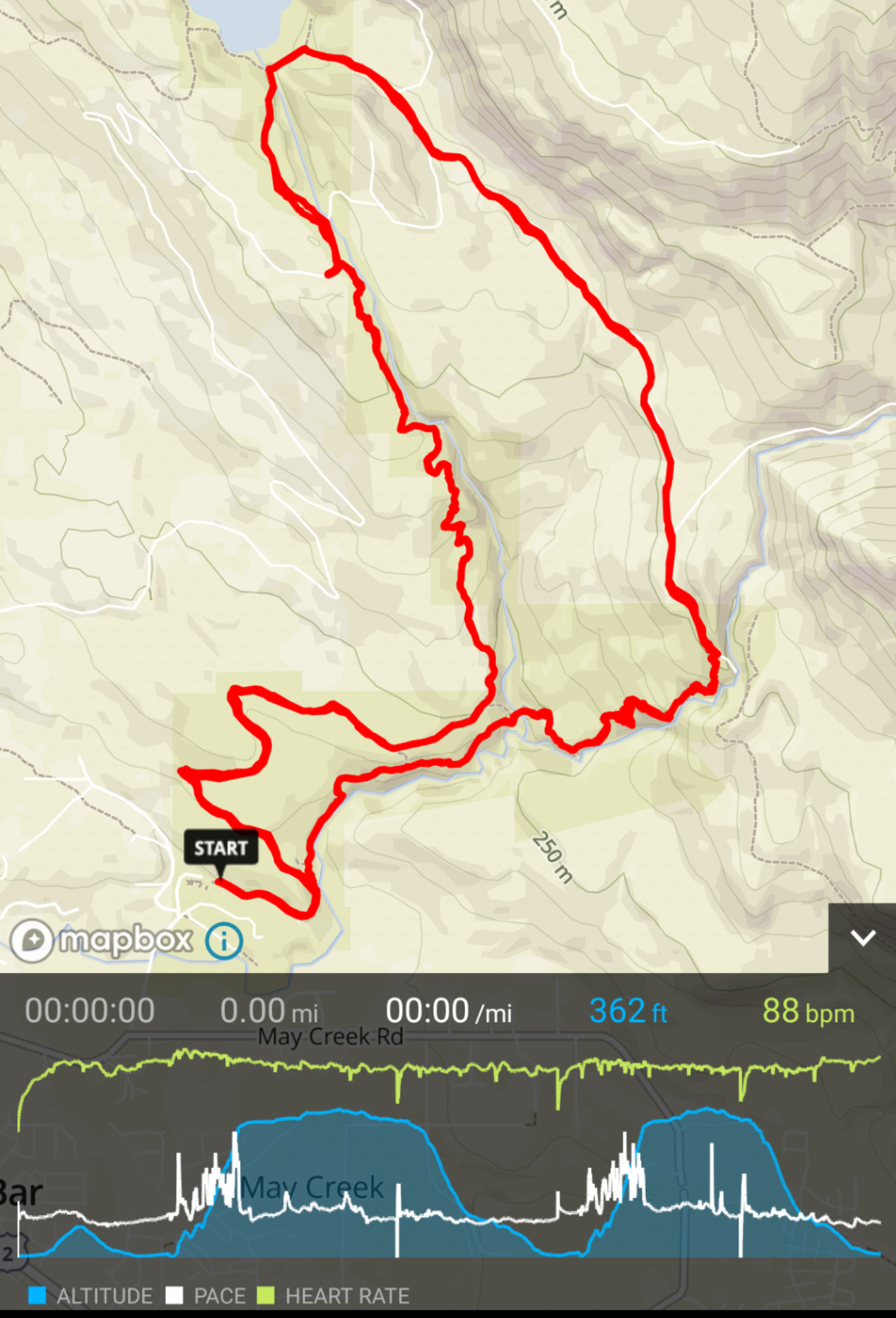
This is a screenshot of my today’s race in Suunto App. The race course consists of a short out and back in the beginning and then two absolutely identical loops. Why the elevation profile looks so different between the two loops? The distance was the same and the second loop took longer. Why does the second loop looks shorter on elevation profile? I see the same issue in other graphs throughout the app. Don’t Suunto employees ever use this app during their test Tuesdays?
And I don’t even mention the illogical pace graph - that is already covered in other posts. These are absolute basics, and they scream of incompetence.
-
@silentvoyager I wouldn’t blame the employees, just the management, which I think is quite a worthless bunch of strategists, that know practically nothing about software development and marketing.
-
As I see in the speed graph, the two loops took more or less the same time, so the two hills in the altitude graph should be almost the same size. I think it has already been reported that the x axis is not linear. Btw what is no the x axis time or distance?
-
@cs-eps said in Incompetent graphs:
As I see in the speed graph, the two loops took more or less the same time, so the two hills in the altitude graph should be almost the same size. I think it has already been reported that the x axis is not linear. Btw what is no the x axis time or distance?
Yes, that’s my point. If X axis was distance the two hills would look exactly the same. If X axis was time, the second one would be slightly longer. But the current one makes no sense whatsoever. The rest of graphs in SA show time on X axis but they are similarly non-linear.
I mean, the main point of graphs is to be able to evaluate the result at one glance, without having to dig in the data, and these graphs fail that miserably. What’s the point of having these graphs at all?
-
@silentvoyager said in Incompetent graphs:
Why the elevation profile looks so different between the two loops? T
are you able show same activity in the movescount. com graphs for distance and time/altitude selected and post here as reference to your original post, if the two round really similar then there is so. e wrong on the graphs plotting in the SA
-
@Tobias-F said in Incompetent graphs:
@silentvoyager said in Incompetent graphs:
Why the elevation profile looks so different between the two loops? T
are you able show same activity in the movescount. com graphs for distance and time/altitude selected and post here as reference to your original post, if the two round really similar then there is so. e wrong on the graphs plotting in the SA
Sure, I can do that right on my mobile phone by opening movescount.com in Chrome. I still sync with Movescount first, and from there sync my moves to SA via SportsTracker.
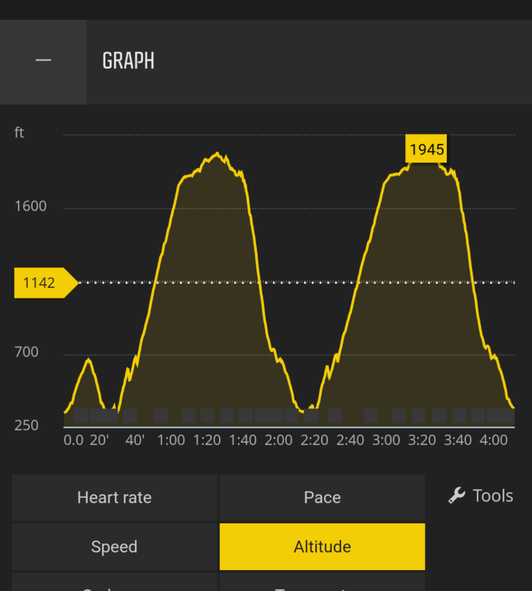
The first graph is by time:
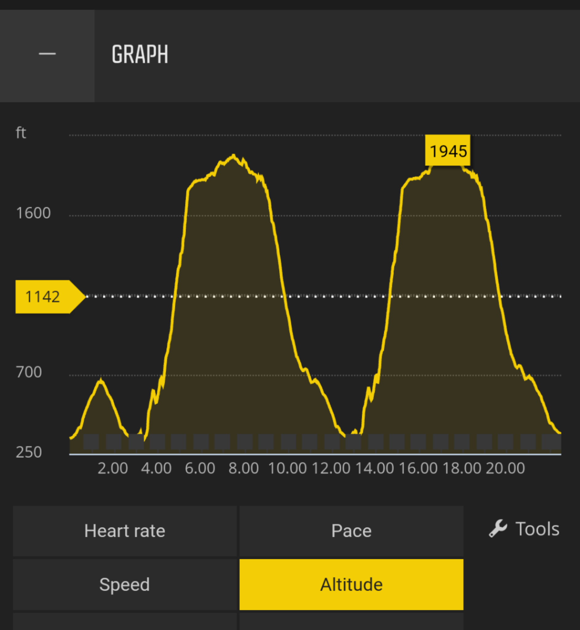
The second graph is by distance:
-
As already said in other discussions, you shouldn’t sync through sport tracker to update SA data. As far as I remember data are not correctly managed and very probably corrupted.
That said, this doesn’t mean it would be correct if you sync via SA directly, but you should give it a try.
-
@silentvoyager I will second @sartoric as SportsTracker does not handle the raw data appropriately. If you sync MC first and do not sync to SA directly there is no good way to get the data into SA adequately. The best is to sync SA first and then download fit from Strava or sync with a third party to MC. BTW I don’t think that graphs have the capability to be incompetent:)
-
@silentvoyager said in Incompetent graphs:
@Tobias-F said in Incompetent graphs:
@silentvoyager said in Incompetent graphs:
Why the elevation profile looks so different between the two loops? T
are you able show same activity in the movescount. com graphs for distance and time/altitude selected and post here as reference to your original post, if the two round really similar then there is so. e wrong on the graphs plotting in the SA
Sure, I can do that right on my mobile phone by opening movescount.com in Chrome. I still sync with Movescount first, and from there sync my moves to SA via SportsTracker.
The first graph is by time:
The second graph is by distance:
At least in Android, you can sync first SA and then MC. I do it in that order so I do not have the altitude correction in Strava.
-
@Brad_Olwin said in Incompetent graphs:
@silentvoyager I will second @sartoric as SportsTracker does not handle the raw data appropriately. If you sync MC first and do not sync to SA directly there is no good way to get the data into SA adequately. The best is to sync SA first and then download fit from Strava or sync with a third party to MC. BTW I don’t think that graphs have the capability to be incompetent:)
I don’t think syncing through ST causes this. Personally I don’t see any difference in data. I follow another runner (Suunto 9 owner) in SA, and I see exactly the same issue with non-linear graphs in every single run. Just to be sure I went on the map in SA, where you can see activities by random people, and randomly opened a few, and every single of them them had the same non-linear graphs.
I am not syncing through with SA, not until it gets all the features I need and stops being beta quality.
-
@silentvoyager said in Incompetent graphs:
@Brad_Olwin said in Incompetent graphs:
@silentvoyager I will second @sartoric as SportsTracker does not handle the raw data appropriately. If you sync MC first and do not sync to SA directly there is no good way to get the data into SA adequately. The best is to sync SA first and then download fit from Strava or sync with a third party to MC. BTW I don’t think that graphs have the capability to be incompetent:)
I don’t think syncing through ST causes this. Personally I don’t see any difference in data. I follow another runner (Suunto 9 owner) in SA, and I see exactly the same issue with non-linear graphs in every single run. Just to be sure I went on the map in SA, where you can see activities by random people, and randomly opened a few, and every single of them them had the same non-linear graphs.
I am not syncing through with SA, not until it gets all the features I need and stops being beta quality.
Here you are my hero if you are able to read any data in the phone screen besides with the screen ratio of the graphs. Until this improves (SA Web) I use MC to (deep) analyze the data, SA for sharing or quick checking.
-
I just can’t understand what’s happening on this forum (and FB group around this mobile app). Really, I always try to figure as I am the developer, or the big manager at Suunto. And in any way, I could imagine that trying to close mouths in some diferent ways could be a good decision to take the right way. Things are as they are, a ball is a ball and a kitchen is a kitchen.
That said, I can’t understand why a training graph application could “change” the graph in any way based in the origin of the data. Garmin Connect, Polar Flow, SportTracks, FinalSurge, Endomondo and any other training app could do it and it doesn’t matter the origin of the data (raw data, manual imported, API imported…) What that means? As I said different times: it’s a bad born application: bad origin, bad code, bad language, and developed a lot of years ago to do another kind of thing of what it’s trying to be used now.
Anyway: the first born of it was to be a kind of “workout repository” (and pretty basic analysis of them). So the theory that said “raw data trigger bugs” has no sense. Even if it’s a bug, Suunto had time and time and time enough to solve (no matter if the problem is in the export section of MC or in the import section of ST.
BTW, I’m in the starting process of suspect that there must be a kind of “cool answers book” to give to every critic users write about SA (or SportTracks with a few of added code lines). So, finally, there is ALWAYS some kind of finish to every discussion where there is no FREEDOM for users to test and compare this “beta” app. There is always a stone in the path, that make you stop and can’t continue. You can’t have a direct sync MC-SA in anyway, you can’t sync SA-MC too, you can’t… you can’t… and you can’t criticize because there is always something you’re probably doing badly.
So if you use both MC and SA there is a trick, but if it doesn’t work for you, then it’s not an “official” trick (even if it’s wrote by a forum manager, administrator, or moderator). If you try to compare graphs between MC and SA, and something is wrong then… where could be the failure??? You, the user (@silentvoyager in this example).
If SA exports bad data to Strava, then the problem is in the Strava side, even in the case that you export it from MC and it shows great, because again, Suunto users must say SA is a wonderful app. But IMHO, it should be, in the pink unicorns world.
This app is not a beta, it’s some kind of “proof of concept”, maybe an “alpha” app. And I can’t see still it practicable for normal users. Just for testers, as it’s -still- a high risk app which can make you lose data (some workouts) in the process. And I can’t understand who convinced to Suunto to make the announce from January, knowing the developing rhythm at Suunto’s world.
That said. graph machine in SA is DREADFUL, gives ZERO freedom for the user (zoom, change x-axis, mixing data in a graph, smoothing graph…) and makes you can’t figure how your workout went. I could understand all those features (about graphs) are terribly difficult to implement in a mobile app (where you just have 2 fingers to control it, and some fingers are terribly thicky, and some screens incredibly little) but… HEY!!! That is not my problem!!! I bought a Suunto by it’s software ecosystem. Just work harder and better, but please, don’t kill the messenger who just try to inform about a BUG. In this case, please, don’t close the messenger’s mouth telling him that he is the one who is doing something bad.
var Watch="Garmin Forerunner 735XT", WatchFw="9.40";
var Phone="Samsung Galaxy S8", PhoneOS="Android 9.0.0"; -
@ColdBeer Good points!
-
@ColdBeer I see your points. And i think you are right about the heritage of code…
As i told before when announcement of movescount kill appear, someone put even more weight in developer shoulders.So many work to do for SA be a viable app. Sometimes i see two companies in Suunto. One with excelent hardware, excelent design, concept and well chosen components. Other, with fragmented software. This is the issue. But just with human ressources you reach the goal.
Apple is today what people know because they have a ecosystem. Not just beautiful machines but also the real secret - iOS and macOS.
Some companies design also mobile apps from scratch and things work better.SR
Site (gr7vel spin): https://youtube.com/channel/UCfHM0mXWS8S61h70Rzj9mfA -
@Luís-Pinto yeah, some companies ‘miss the train’, IBM with pc, Microsoft with mobile, suunto with the fitness craze. Then they try to catch up while sacrificing what made them good…
-
@Luís-Pinto Totally agree, but the point is not to talk here about the excellent work from one or X. How much do one or thousands work in a project doesn’t matter, if all (or most) of them are padding to a waterfall. It’s even a poor situation if they want to arrive in NY, and most of the crew are telling the captain “I thing I can see the statue of liberty”, and rest of the crew just try to die la silence those who attempt the captain can see the reality.
I see Sunrito just like this now, or maybe the captain is the only that can see the statue, like in The Emperor’s New Suit.
But the important here is: if you want to pad in direction to the waterfall, it’s ok, but let people who can see that the boat has some leaks to advertise it. Don’t change the point to the great benefits of living in the Big Apple with the pink unicorns

-
@silentvoyager said in Incompetent graphs:
The first graph is by time:
you are right this seems completely screwed up and I thought it’s only me who has a problem with these SA graphs …
whoever designed/engineered this Sportstracker plot function did this badly and that falls back now to the SA
as an unusable graph… I really hope they will redesign a state of the art plotting functionality in the SA, the current one it’s just a joke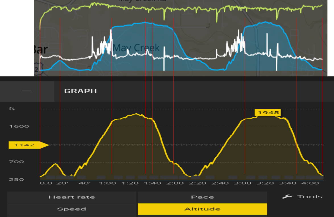
-
@Tobias-F Totally agree, but taking about an app which needs a totally redesign of plotting function, totally redesign of notifications function (as it still can’t filter notifications in Android), a totally redesign of web interface (as it’s valid for nothing), and probably -IMHO- a totally redesign of the core -to let an easier development and don’t have two separated branches for Android and iPhone-… My question is: is intelligent to bet for it, annoying users and spending more and more resources?
So, following the subject of this post… Is for real the incompetence in the graphs? Is it in the user when he claims because he feels something wrong? Until when the same answers (it’s a known bug, vote for it, that’s not an official answer, maybe in a future…)?
So, Suunto leaders, please: close this forum for a while, spend $$$$$$ to completely rewrite the app (you could still call it "Suunto App if you want), make some SERIOUS tests, and just when it have -at least- the same functions and functionality as MC (web), publish it for open beta testing. And never, never, shut the testers, specially if they don’t feel they are working on a beta.
-
@Brad_Olwin @sartoric said in Incompetent graphs:
you shouldn’t sync through sport tracker to update SA data
guys, with all due respect, I don’t think the end user like here @silentvoyager is the problem aka “you shouldn’t sync from … to …” - for such comic shown here an labelled as graph - rather the software engineer who for whatever for reason decided the sportstracker database is a better source of raw data and then produced such non-usable crap like shown above,
why SA don’t sync from movescount in the first place is a miracle for me and probably only the marketing genius at Suunto can comment about it as I’m not capable to say anything intelligent about such decision …
Suunto SW engineers: if you are reading, good place to start for making a real ‘graph’ (that is worth the name) would be to name the x/y axes accordingly what data you are actually plotting there … kids learn this in elementary school…
Suunto: if you want me seriously considering using the Suunto app for your Sport Instruments then show me facts and reliable data casualization from my activity records and not make-up fiction and joke like this…
-
Hi let me announce this, sorry I am at HQ now and have been traveling.
Next stuff to come to you asap among many others- Better graphs
- Laps as they should be
- MC history in May to June
The above is the main focus from now-on!
I hope this helps.
Regarding the graphs, issue here is non-linear time
To enforce this: Your data are correct in SA and the representation is skewed.