Android Color App
-
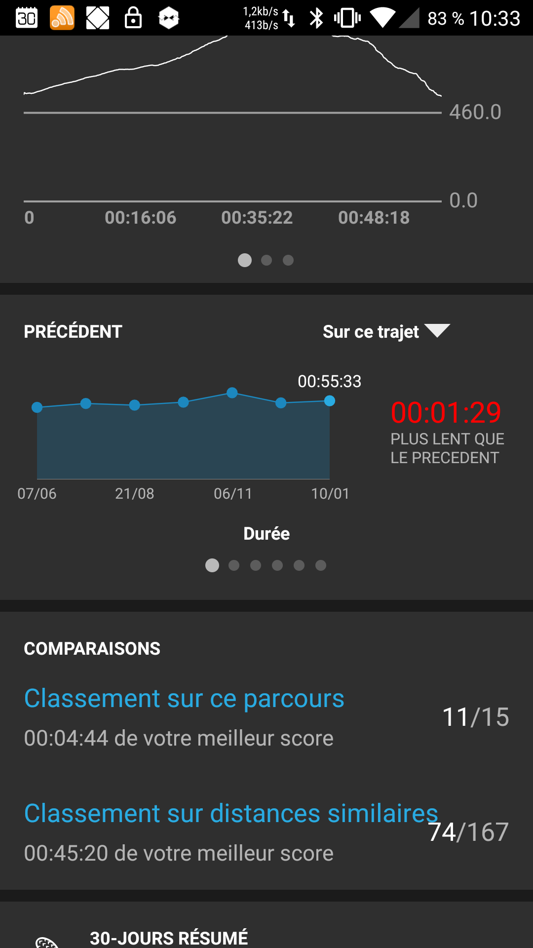
Hi, first impression for Android app . WAOU.
Nothing to be compared with Movescount app.
First point : color.
All the screen shots I have seen on this forum since its beginning seems to be white background.
But, for me, all is black .not an issue, but can’t find an option for that.
And you Android users ?
-
+1
I was writting same bug. -
Big story short:
On android, the black theme is preferred. There are also a lot of IOS users that have this preference (they want black like Android).I will communicate this and come back to you guys
-
I think black looks better and the power consumption with AMOLED displays will be better.

-
@klunzinger This can be the case I ll get and answer about this
-
-
I prefer white

User setting? it would be nice
-
@mff73 White is the new black with this app, like Dimitrios menitoned. Not quite there with the styles, Bluetooth and other things are more important, please bear with us with this beta version(s)

-
I agree with the fact it is not an issue. Sorry for putting the wrong tag.
I will try to édit.
Black is not bad, just différent from iOS screen I used to see since months
-
Tag removed.
-
I prefer white theme color on android
-
Shall we make this a poll perhaps?
What do you think ?
-
@dimitrios-kanellopoulos I will prefere to have both options (configurable) but my vote will go to white
-
Shall we make this a feature request?
Or an issue and wait till it’s aligned.IMHO adding an exception for Android only to have black and white would then furstrate iOS users no?
-
@klunzinger I’m not code guy but the colour is not all. To have black for amoled there has to be coding changed. I’m not saying it’s easy or hard, just worth mentioning. My battery app has black theme but in options I got 2 types: adopted to amoled (where black pixels are off) or standard (where black background illuminates).
-
Apart from the discussion between black and white, I think the App should reflect the colors that Suunto has implemented so well in the Spartan model. In my opinion, the App is very monotonous and that difficult to differentiate between different sport modes and features within the App (ascents and descents values, heart rate, rhythm acceleration…)
-
@peñalba said in Android Color App:
I think the App should reflect the colors that Suunto has implemented so well in the Spartan model
Totally agree, and this is one of the most voted feature request: https://forum.suunto.com/topic/287/unified-product-movescount-looks-and-features
-
My vote goes for “black/white theme selection on the settings menu”. Its quite frequent on some other Android apps.
-
@dimitrios-kanellopoulos But is the current SA app UI in any way representative of what the released app will ultimately look like?
I’m sure weeks ago I read it (Android version) just looks very identical to SportsTracker only temporarily as there was a fork from a common code base, and an all new SA UI would follow at some point? (And it seems that’s the case, as some of the ‘over and above’ functionality compared to SportsTracker looks odd…like glued on!)
I’ve refrained from commenting on any thoughts on look and feel for this reason.
-
@nigel-taylor said in Android Color App:
@dimitrios-kanellopoulos But is the current SA app UI in any way representative of what the released app will ultimately look like?
I’m sure weeks ago I read it (Android version) just looks very identical to SportsTracker only temporarily as there was a fork from a common code base, and an all new SA UI would follow at some point? (And it seems that’s the case, as some of the ‘over and above’ functionality compared to SportsTracker looks odd…like glued on!)
I’ve refrained from commenting on any thoughts on look and feel for this reason.
Yes new UI is under works