Why a 5 meters test is a good test ?
-
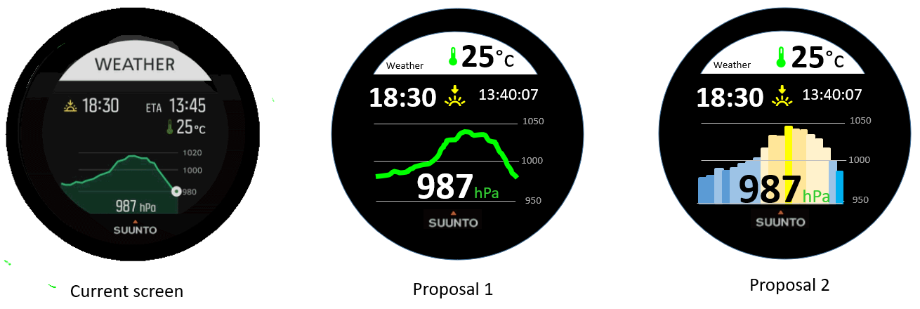
@miniforklift After having tried it again just now, I agree that the bargraph is more coros or garmin oritented but it has an additional advantage the more it goes into yellow the more you are in anticiclonic situation, the more it goes into the blue the more you are in a depression situation … so it is super east to catch the trend.
Hence why I still prefer the proposal n°2 … if we were havign a watchface configurator may be it could have been an option of the screen so both of us could have been happy")
-
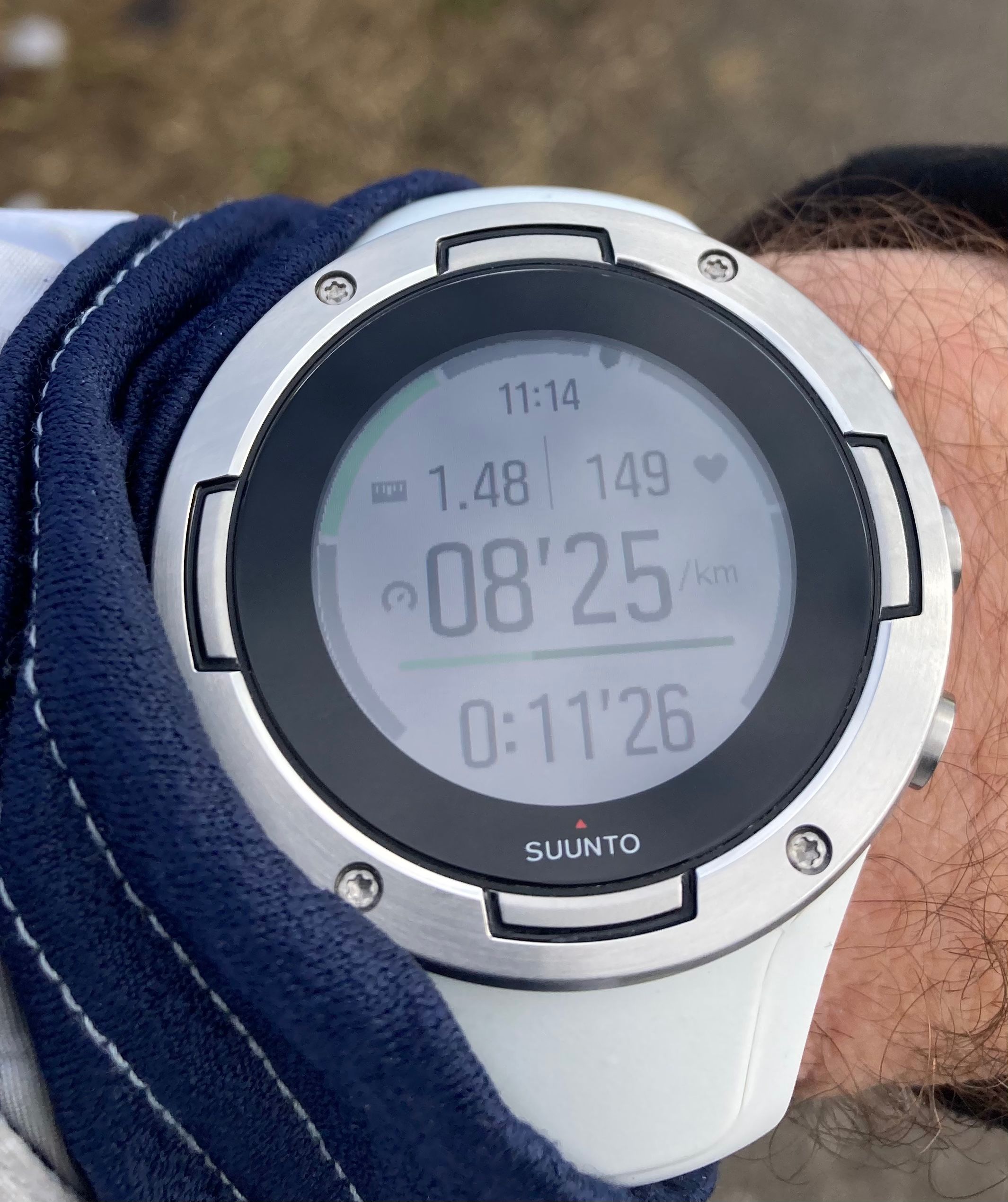
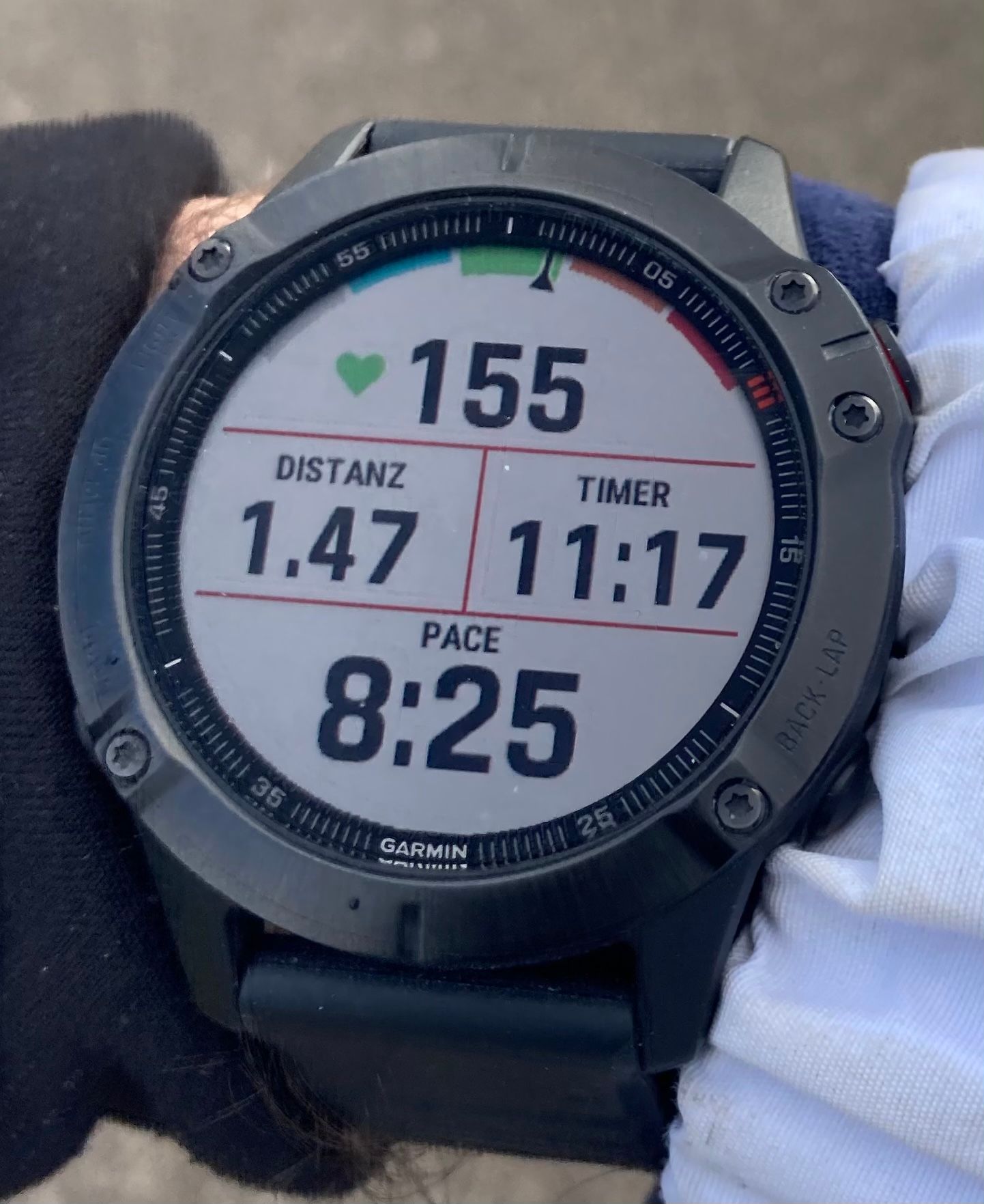
@mister-pyc I agree With you, that some small changes would have a big impact on readability. Comparing the Fenix 6 (Not x) some months ago to the S5 - besides having a bigger screen diameter of 1.3 to the S5 with 1.2 - same run, pictures taken within a few seconds , (Garmin right, Suunto left wrist) you can see that the much „bolder“ fonts are much easier to read
Currently Race I
-
@chrisa Despite I do not want to do any marketing to Garmin or Cronos. I’m just a Suunto 9 baro user, which by the way I like a lot and hence I’m faithful to this trade, I should confess that this is a perfect demonstration of why biggest – even fat – fonts are far better.
The target should be the readibility of info, hence efficiency.
Even Garmin could have put bigger font … removing Distanz and Time text which after few hours of use you will know by heart or put a small gif to represent than which btw will avoid any translation …All is possible in IT
Driven by you fear you stay on the ground, driven by your dreams you fly -
@mister-pyc although I understand your concern, I would say that if I was a product manager or engineer I would not likely think of looking at the device at 5km distance, because usually it is a much higher distance than the one of the regular use.
-
@andré-faria Hello Andrea, May be I did not wrote enough correctly or you did not catch my point.
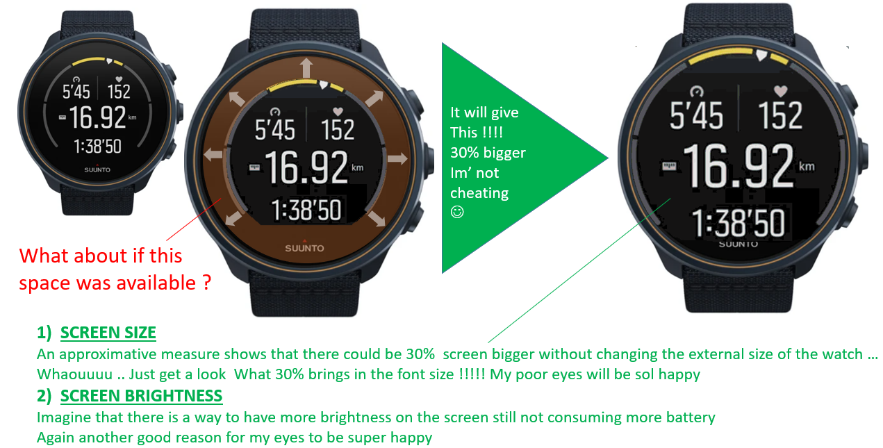
When I was talking about 5 meters … it was not too look the watch !!! but to look the screen demo that you could do of a watchface.A 1920*1080 computer screen is more that 21 bigger than the 320x300 suunto screen. If you forget this and you draw a screen on your computer, you may have the feeling that you did something excellent … but when you transfer your screen to the size of the watch and you go into normal conditions (not perfect ones that happen at noon sunny time) then your screen is becoming not so good.
Do again the exercise. move up to the post where I put the current suunto plus weather screen and my 2 proposals, display this on your computer, then step back from 5 meters and see what you can see … do you still see the suunto graph … me no, do you read the sun set time and its ETA or the temperature … me no …
tomorrow I will post a photo of this screen in a real sailing situation … you will see, this screen which has genius feature is becoming almost unreadableAll is possible in IT
Driven by you fear you stay on the ground, driven by your dreams you fly -
@andré-faria An additional reply …
This is when I was discussing with a Suunto boy that I realize this …
We were discussing the Suunto Plus Safe screen and he posted in his reply a screen short of it with this beautiful skiers …
When I saw it, firstly I was thinking … WHAT A BEAUTY !!! WHERE IS THIS MARVEL WITH THESE 2 SKIERS ON MY WATCH !!! then I look to reality … the screen shot was displayed on my 1920x1080 pixels screen whereas the watch has for the moment a 320x300 … so ~21 smaller …
Where the screen was a pure marvel on my computer, the same on the watch screen will have been a unreabable toy.
By the way … this safe screen even if simplier is also not easy to read, I will propose some suggestion here one day
OK Suunto boys and girls will finish to hate me, forced to read all my texts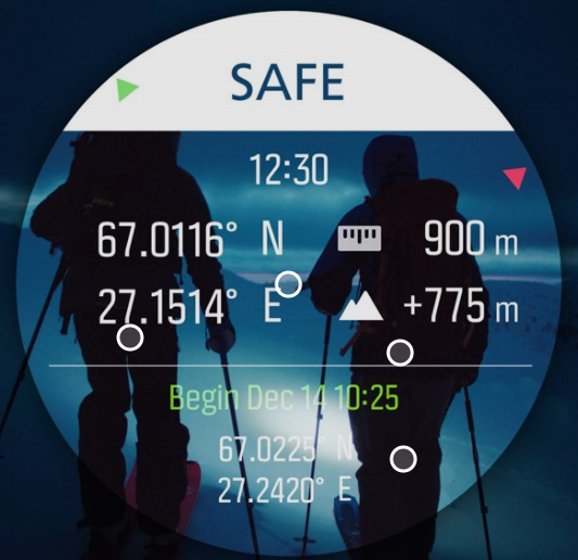
-
@mister-pyc well, if we’re getting technical, pixels may be of a different size, so it’s not a fair comparison. A fair one would be to equate the object width(e.g. watch screen)/distances to screen or monitor. In case of optimal distance of the watch to the wrist ~ 40cm and a watch width of ~ 3.3cm, we get a ratio of 0.08. In other words if one to do 5m test, the watch mock-up on the monitor should be about 40cm.
But, I think this still isn’t a fair comparison, since not everyone sees as good at longer distances, as at short ones.
However, I see your point!
I, personally, am lucky to be able to see my so s9 screen no problem, it would be cool though to be able to trigger a bigger font for the whole watch somewhere in the settings. -
@mister-pyc I actually sold the Fenix some months ago and stayed with the Suunto
 . But I really would like to have the bigger fonts of the Garmin (and how you propose: some small icons describing the function). Perhaps that’s an option in further firmware updates.
Currently Race I
-
@chrisa said in Why a 5 meters test is a good test ?:
@mister-pyc I actually sold the Fenix some months ago and stayed with the Suunto
. But I really would like to have the bigger fonts of the Garmin (and how you propose: some small icons describing the function). Perhaps that’s an option in further firmware updates. -
@dmytro Good to see we are in sync. I see many users who are on the same feeling that bigger fonts is interresting, so it might be possible that Suunto dev team take this in consideration. There are many screens in which this is possible.
PS: on the technical standpoint, although you are right … the truth is in the middle, a computer screen is far much brighter and illuminate much much more a screen, this is not a pure size aspect but should be taken in consideration, hence why I said 5 meters.
Honestly have you done the test with my proposal. the interresting aspect of the test is that I did not cheat I was proposing 2 alternative screens having the same size as the suunto plus weather one, also with same colors (OK I admint I took some freedom on the bar graph …
)
So … are you able to see the info of the suunto one ? are you abel to see the info on my proposal ?
the result will be exactly the same on the watch itself …All is possible in IT
Driven by you fear you stay on the ground, driven by your dreams you fly -
@chrisa Hello Chrisa see my other posts there are also some other exemples where some other screens could be reorganized so that with exact same behaviors and fields we could have a better readibility
-
@mister-pyc also, another thing I’ve noticed is that Garmins screen itself has a better contrast and seems to have less reflections => better visibility.
I took my lenses off and gave it a shot. I can still see everyone watch face, but yours are definitely more pain free. But I would probably still go with the original because it isn’t more aesthetically pleasing, I don’t know if suunto could achieve this with a bolder font. Still, I acknowledge that some or maybe most of the user base might be better off with larger font. -
@dmytro
so … mine are not aesthetically pleasing !!! I’m chocked :-):-):-)
humm it is just to give a direction. I don’t have the real suunto fonts on my computer and also only the official fonts … but I will try to search for some interresting ones which are more condensed and at the same time bold …
I repeat : it is just directions to show what could be possible … after for sure with better fonts, perfect alignment … it could be even better …
PS : althought teh proposal 3 is not Suunto oriented as they do not have such bargraph with almost no space between each bars , the proposal 1 is “just” a reorganisation of their screen minimizing the space lost so gaining space to enlatge information and make it more readable … btw … like Garmin is doing -
There is more to readability than font size and line width. Intra spacing are also important and variability of lines (especially in serif fonts). Whitespace is also a key factor in UI readability.
I appreciate how screens are designed in S series as there is enough breathing room around the type, icons and other elements. Garmin and Coros seem to cram things up too much and Polar is using thin font.
To me it’s easier to read a smaller font (if it’s sharp that is) but with proper spacing than a larger one next to other interface elements.
It is super hard to create a readable interface for such a small screen.
S9PP 2.44.52
-
@łukasz-szmigiel I also agree with you. the big fonts of Suunto are exactly as you say, large but thin, so easy to read (even if I also like the Garmin ones which are much bold – not sure it is the right word, my english is limited – .
My main problem is with the super super small texts which are written for secondary information. here it is far too small to be readable.
Most surely one big progress to come in future will be an enlarged screen which will take all the space of the watch and also much more brighter but not damagin the battery -
@mister-pyc secondary information is, well, secondary. It’s smaller because it has to be smaller in order to provide more screen real estate for primary information which is therefore larger
")
After all it’s just a watch which goes on your wrist - it can’t be too large as it would be too cumbersome to use during the activity. And things can’t be too large as there will be no whitespace, etc. which will in effect affect readability in negative way.
To me the design team and people responsible for UI are doing good job as things that are necessary to read during the activity with just a quick look are designed to be readable but secondary information may require the user to stop and focus on the watch and this is ok. I believe that until we have HUDs in our glasses that show the data in the field of view regardless of where you look, it’ll have to be the way it is now.
Furthermore, keep in mind that the transreflective technology used in S series (apart from S7) is generally poor in terms of contrast, color fidelity and resolution in comparison to our everyday standard LCDs. It’s really challenging to make things readable in such conditions with such technology. This I believe is the reason why for example bar graphs in S series screens have significant spacing between the lines or everything is simplified (ie. navigation screen where there is only the breadcrumb trail as it’s crucial during the navigation).
This begs for a series of questions in the like: Why can’t we have X or Y information on this particular screen. But after some research and testing you’ll probably get to a conclusion that you’ll rarely use the extra information but the primary one will suffer in one way or another which is a readability and also a safety concert (when navigating I must see the breadcrumb trail but I don’t necessarily need to see my speed, ETA or any other data - if I need it, I’ll switch the screens changing my primaries accordingly).
Also, not wanting to sound like an asshole (seriously) but if you have persistent problems with watch screen readability perhaps it would be beneficial to get your eyesight checked? And I really mean it in an empathetic way as it may as well affect your safety during the activity (ie. mountaineering, running, cycling, etc.).
-
@łukasz-szmigiel said in Why a 5 meters test is a good test ?:
eflective technology used in S series (apart from S7) is generally poor in terms of contrast, color fidelity and resolution in comparison to our everyday standard LCDs. It’s really challenging to make things readable in such conditions with such technology. This I believe is the reason why for example bar graphs in S series screens have significant spacing between the lines or everything is simplified (ie. navigation screen where there is only the breadcrumb trail as it’s crucial during the navigation).
Hello
Few points
Primary and the most important
- for sure and 1000% agree THE SUUNTO DEV TEAM ROCKS !!! I love this watch more and more and more each day I’m using it, so what they did is awesome.
Now …
humm humm … not agree with 2 of your points
-
seconday information might be as important : I give you 1 example : in a COMPASS view, instead of the AZIMUT giving you precisely the nbr of degree – wich somehow is redundant even if more precise with the red or blue arrow of the compass – the ALTITUDE which is treated secondary, could be sometime super important,the combination of the arrow giving you largely enough idea about the direction to go and the altitude could allow you a navigation staying on the same curve of altitude which is a very well known technic of old alpinist and teached in army to navigate to certain point in totally cloud a no visibility situatuon
-
a bigger watch screen … well … it does not mean that the watch will become bigger, not at all
instead … the exactly same watch … but … no more this black useless circle, see below …
I dream of this in a suunto 10 or 11 baro watch …
-
@chrisa try reverse colors, it has great readability on sun.
Suunto Ambit 2, Suunto 5, Suunto Race 2
-
@tomas5
Agreed, so much easier to read with the font being in white on black background -
@tomas5 Thanks! Actually I always use it like you (white on black background) and on the S9Peak it’s very Good contrast
I did the black on white pictures some months back for comparing readability, when I was testing the Fenix against the Suunto. Your black/silver S5 looks really great

