More watchfaces
-
@Egika partly agree also that there is not need for all kinds of data fields and complicated complications. BUT still the watch faces should be simple, nice looking with some complications (i.e. weather, steps, active kcal) which are used OUTSIDE activities in a daily life. At the moment many of the watch faces are just… well ugly (i.e. the first and vertical seconds are disappearing after inactivity and then the hhmm is not aligned in the middle, fonts are very strange in some). IMO it just about the overall look&feel+usefulness of the watch and that could be improved by giving a little bit of love to WFs
 Ofc these are just personal preferences.
p.s. many of Garmin stock WFs are also fugly and many complications useless. But there at least an option to build your own so it is not that big of a deal.
-
ugly or not changes with the person looking at it.
I know that the way the complications are handled is currently under development.
What I don’t know is, if there are other basic layouts coming with this… -
If Suunto is looking for watchface designers, I’m sure we’ll get a few people here happy to also volunteer

-
I’d really like the option of being able to see the seconds all the time rather than having to click a button to see them… and they they disappear again after a short time
-
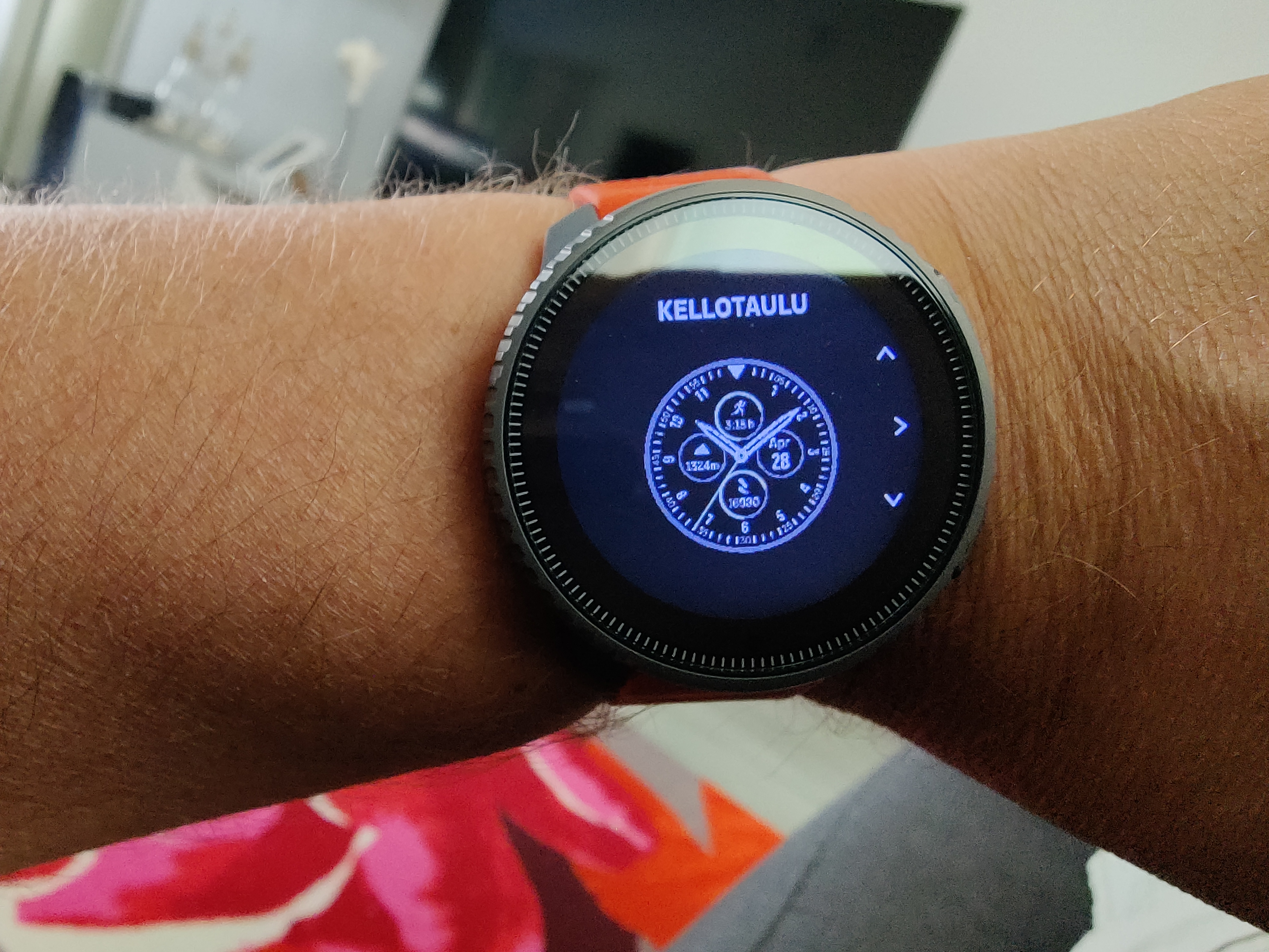
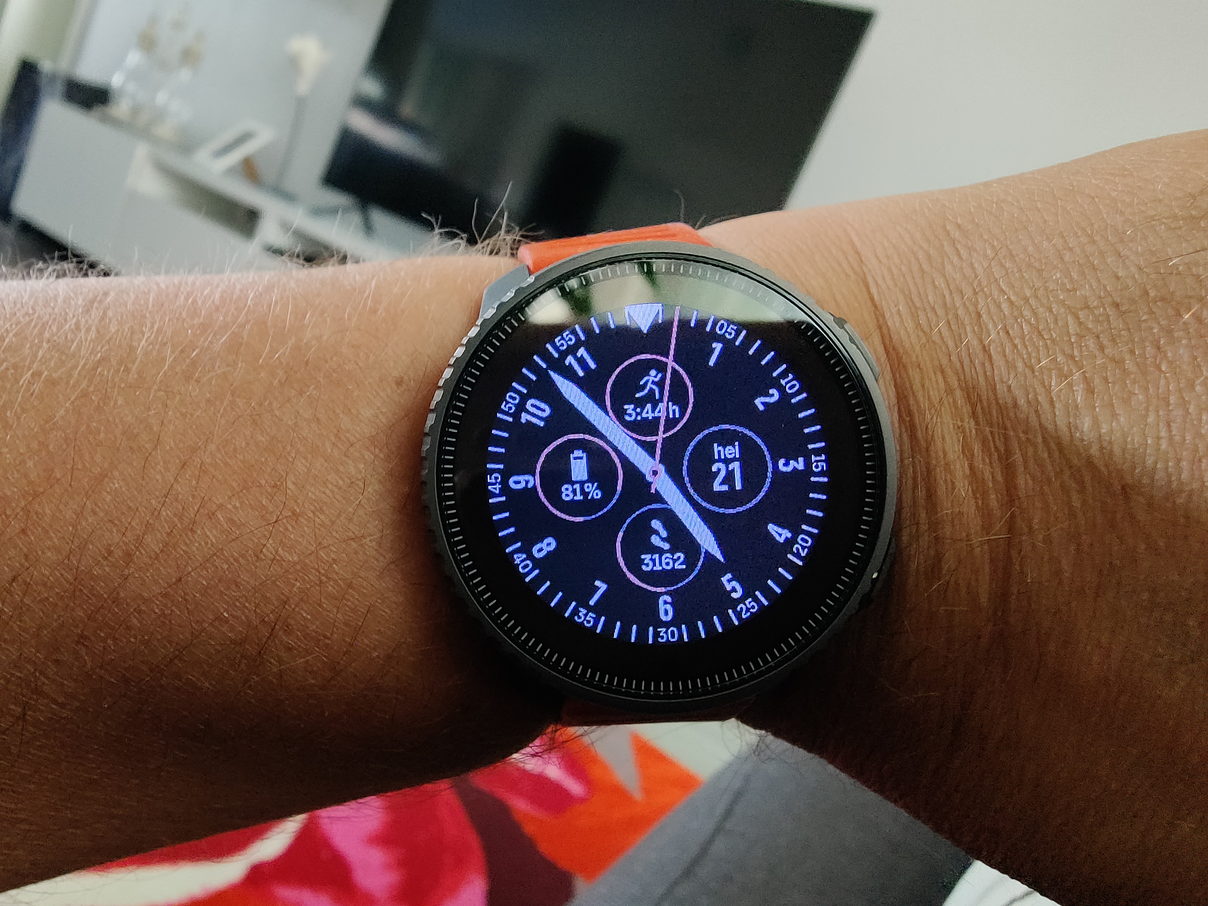
I have a minor cosmetic issue with a watchface. The attached watchface used to have hollow see-through hands in S9B and that’s how the preview is shown in Vertical. But the actual hands are solid and often hiding details of the complications. I’d prefer the original hands. Anyone else agree?
-
@BrunoH I like your feedback but I disagree. I prefer the solids because they’re easier to read at a glance.
As a workaround it may be interesting to have the obscured complications show up as an inverted color. E.g. the auto inverting cursors in windows:
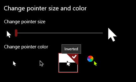 but maybe it looks even more untidy then…
 -
FWIW I think the solid hands look better
-
@MiniForklift agree with you ! Easier to read !
However, I would love to see some new designs !it’s a cool way to “think you have another watch” -
Ja ein paar mehr Watch Faces wären schon fein. Aber es geht ja auch so.
-
@Lexlehtor said in More watchfaces:
@markusoutdoors lets help Suunto a bit
I would like to have something simple like this:
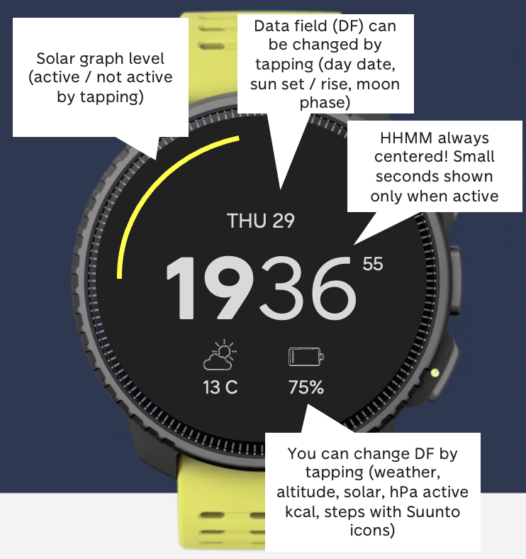
this is the way!
-
@Lexlehtor said in More watchfaces:
@markusoutdoors lets help Suunto a bit
Let’s do it!
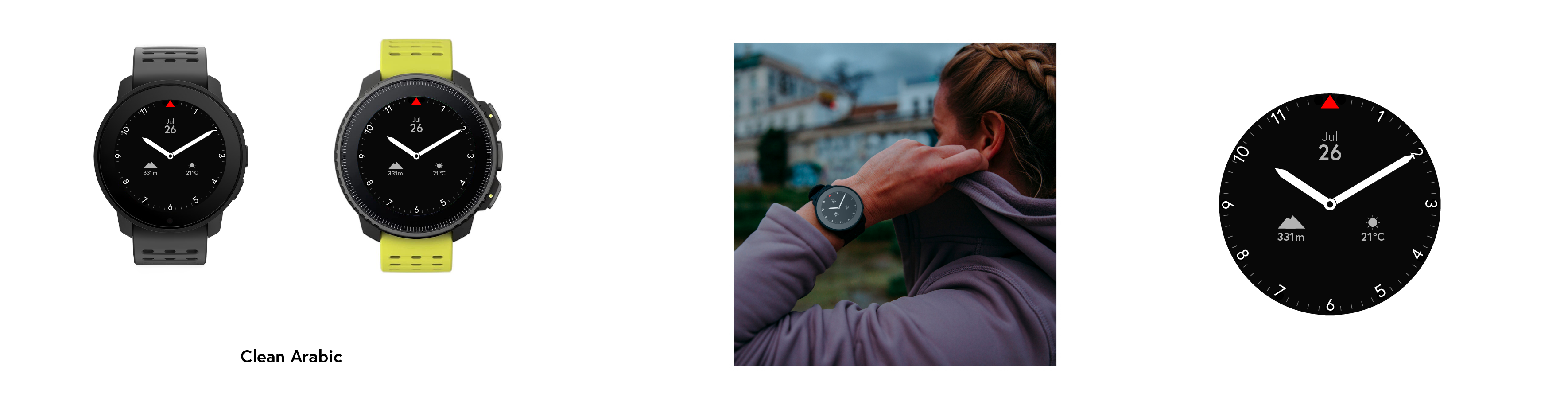
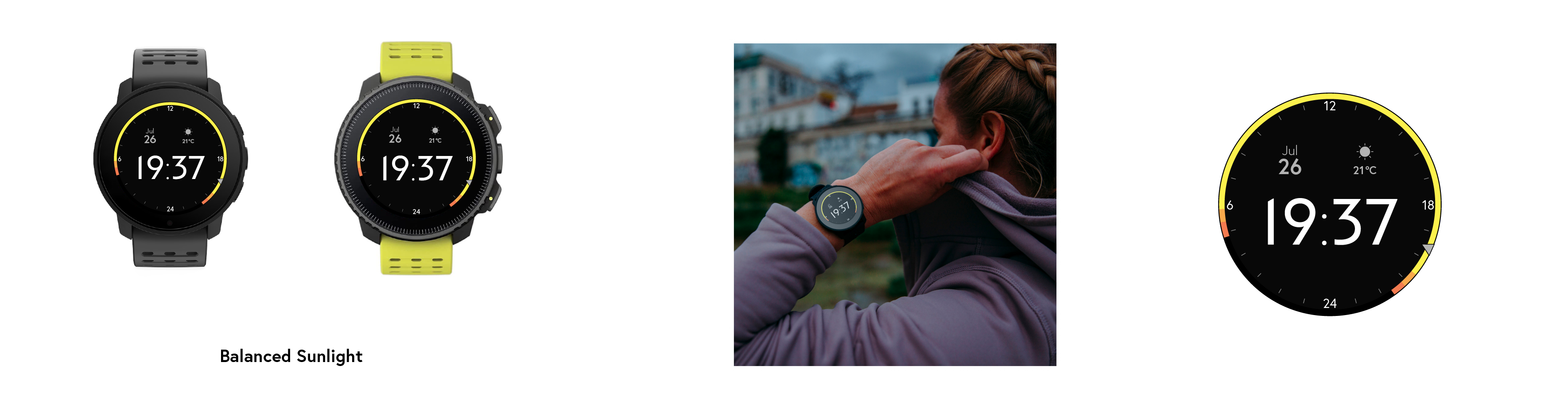
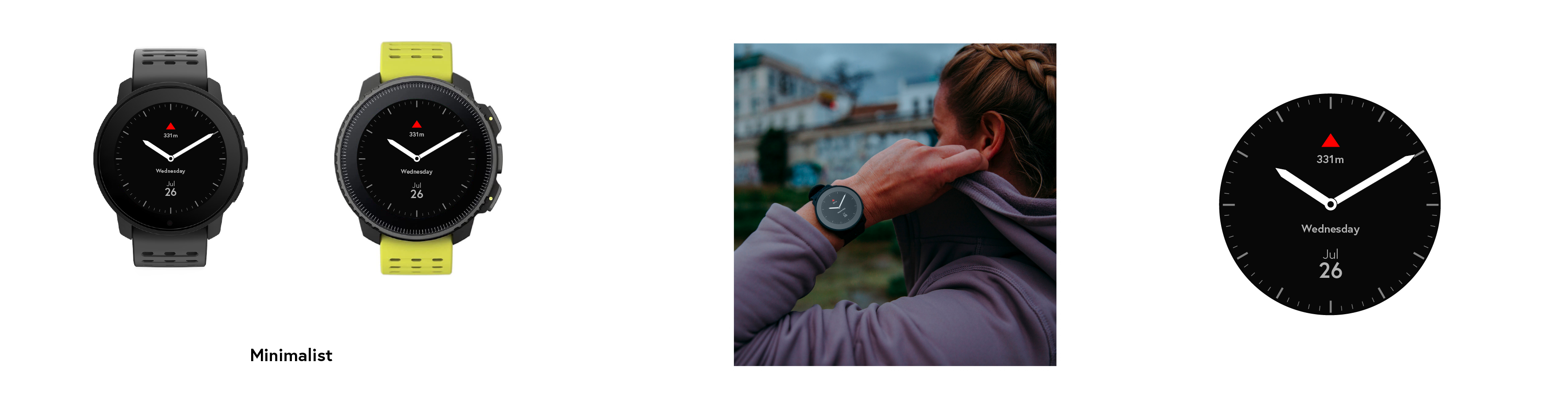
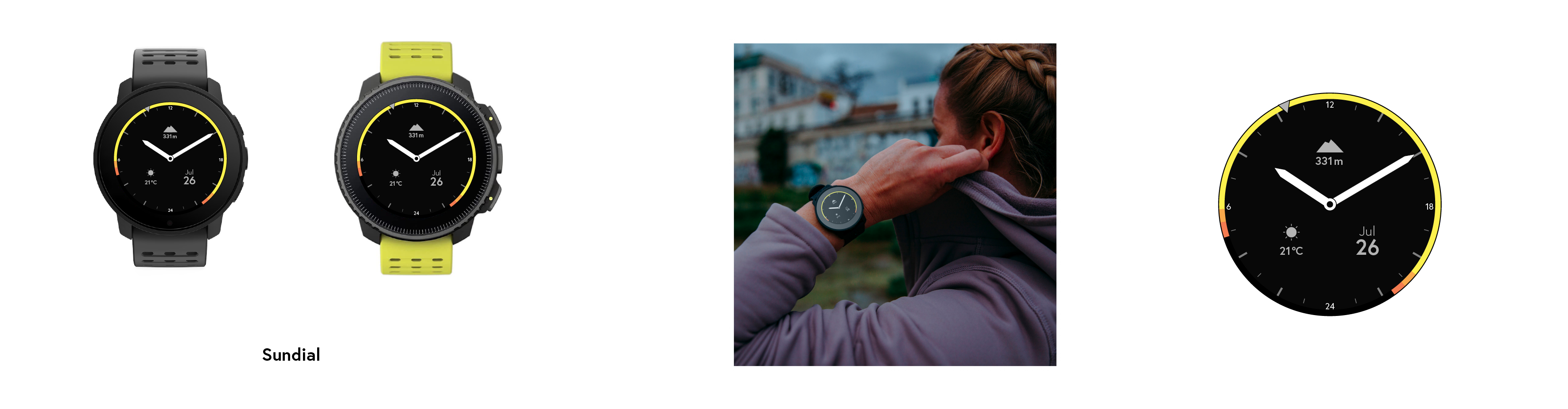
I’m not a graphic designer and these could be a lot better than these concepts. For the most part, these are variations of existing Suunto watchfaces. These could be improved a lot. I personally lean towards cleaner faces with good hierarchy. I also would love an analog face with the sunlight indicator. Don’t need to see my steps or training hours etc. And I sorely miss the gorgeous Suunto red triangle from my A3P.
Less is more.
-
All of these are something that I would prefer to use compared to the current ones. Simple and clean.
-
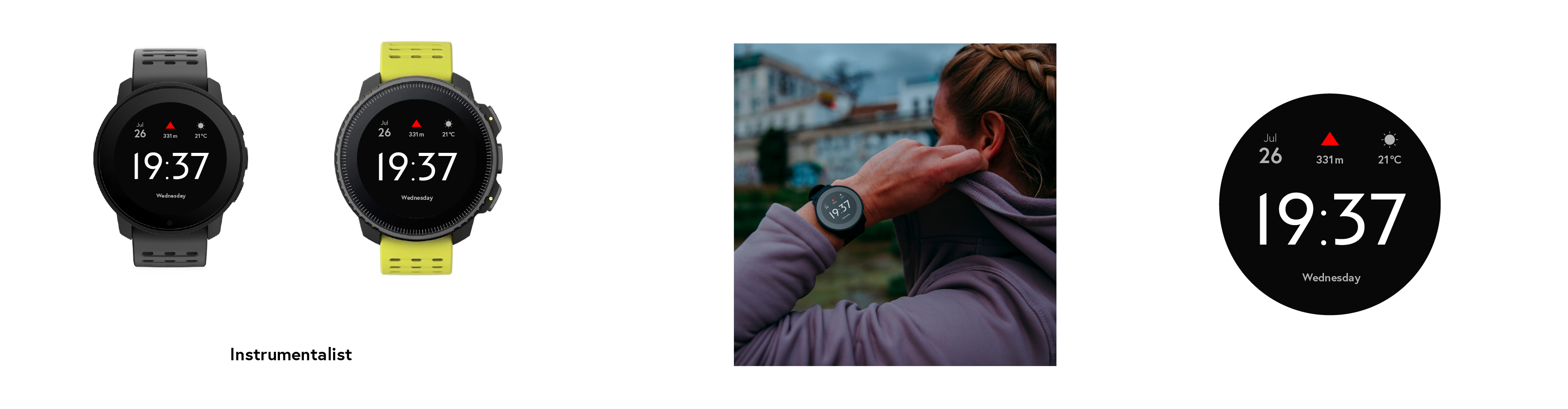
What we also need is the weather complication on all current watch faces. This should’ve been an option at launch. I’m stuck with the default watch face, but that one triggers my OCD when the seconds disappear from the screen.

-
A good idea is have the possibility of create watch face with the visual studio code and a plug-in similar as Suunto plus editor
Watch: SV Fw: 2.40.44
IPhone 13 (Sim) IOS 18.5
Android 15.0 with Android Studio
macOS Sequoia 15.5 M1 & M2
Apps IOS: 2.45.3 (19258)
Apps Android: 4.107.2 (40107002) -
@Umer-Javed Concordo, anche a me manca l’apice rosso di Suunto nel quadrante
-
@Umer-Javed I am a graphic designer and these are great concepts, like Lexlehtor mentioned: “I’d prefer any of these to the current ones”
Just typed it somewhere else, I really hope Suunto will focus on their UI design. Their watches are beautiful, but the UI looks like it’s designed by engineers. No offence. There is just a lot of value that could be added by adding some great designs that focus on read- and usability.
-
@omunoz yes, open source it
 ️
️ -
The UX has seen some welcome changes in the past 10-odd years from A1/2/3 to Spartan and now 9PP/Vertical although still sluggish and slow for new products. UI is however another matter and if it were my way, I would love to blend Suunto’s industrial design team with an independent UI team who might listen to the customer’s voice rather than keep repeating the same mantra every year. Frankly all this talk is good but sadly it has occurred before and is very likely to be ignored by Suunto.
-
@Lexlehtor Agreed, I think they looks great! I’m kinda bit bored with the current ones, definitely would be nice to have a fresh look. That’s probably one of the few things I actually liked about Garmin, they had tons of watchfaces to choose from and they were easily able to be modded to suit you
-
@Ilya-Sul said in More watchfaces:
What we also need is the weather complication on all current watch faces. This should’ve been an option at launch. I’m stuck with the default watch face, but that one triggers my OCD when the seconds disappear from the screen.
I’ve always been a campaigner to have the option of having the seconds showing all the time, especially for the ‘digital’ looking displays
SV Titanium Solar Forest
