Barometer graph
-
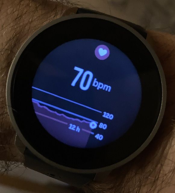
Here’s an example hr graph:
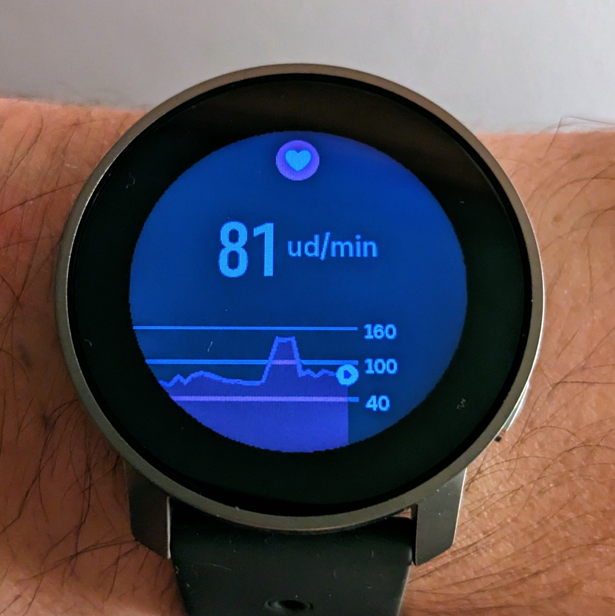
It looks OK. There’s room above the max registered hr.
Here’s an example barometer graph:
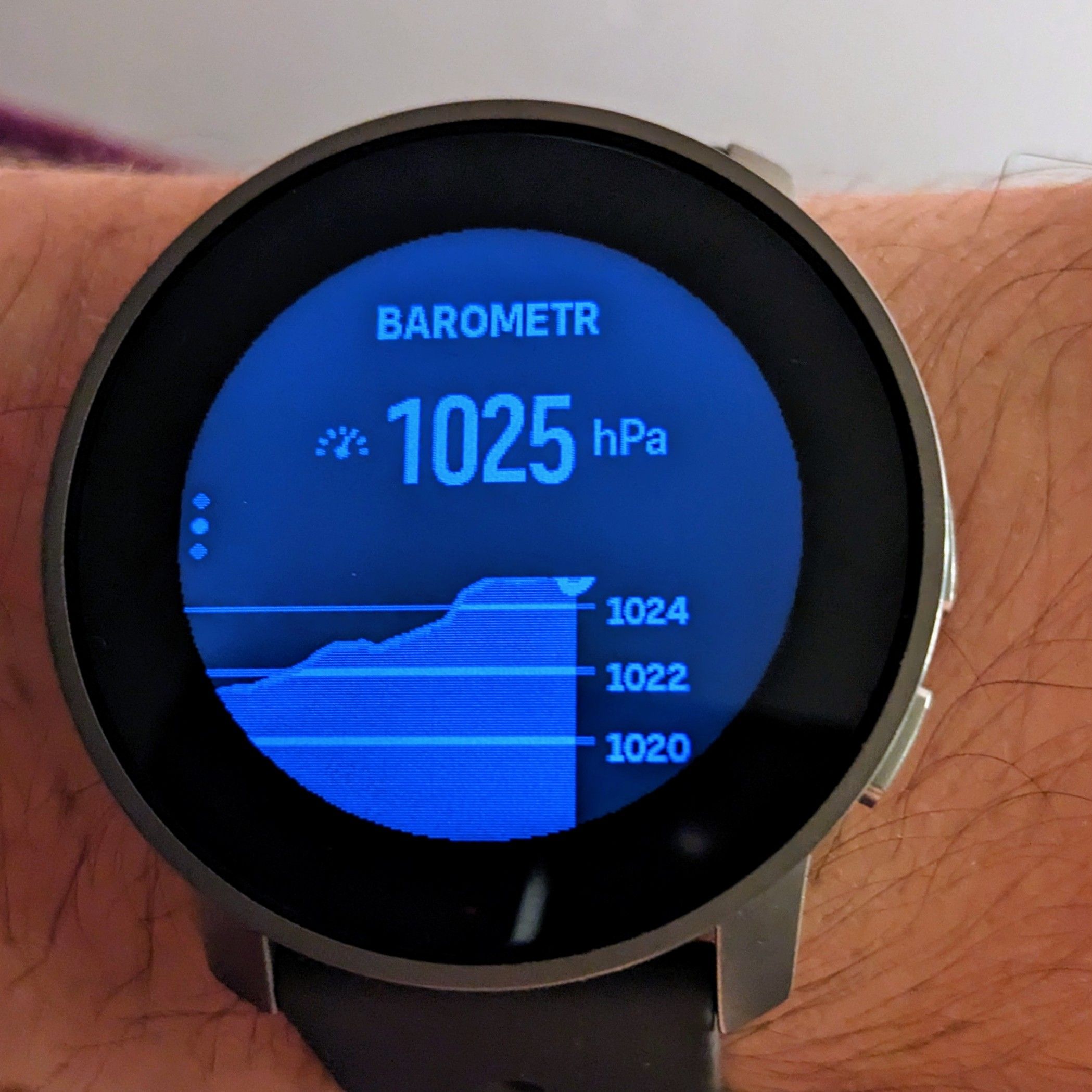
Why is it positioned like this? Why 1024 is max while the pressure is higher and it tops the graph? Shouldn’t 1026 be visible?
As a bonus, resources:
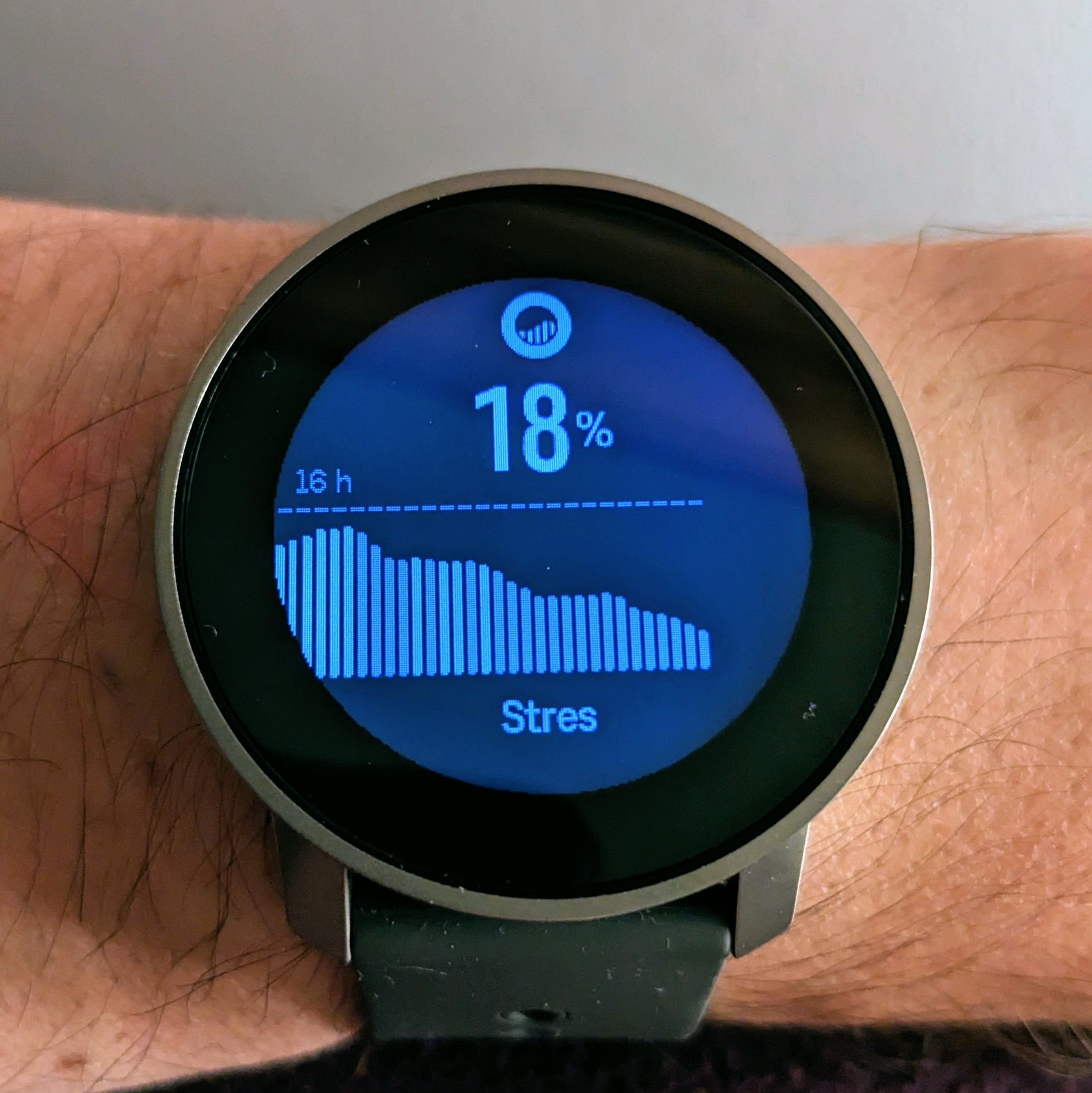
Why there’s dashed line on top with 16h? I assume that it’s resources for the last 16 hours? If so, why there’s no time scale in barometer trend or hr widget?
S9PP 2.44.52
-
@Łukasz-Szmigiel Ive seen that on mine too re: barometer. I think it’s bad code and hopefully fixed in a future firmware update.
-
@Łukasz-Szmigiel said in Barometer graph:
I assume that it’s resources for the last 16 hours? If so, why there’s no time scale in barometer trend or hr widget?
the x-axis description is there in S9B, I assume it will also find its way to the pro.
The graph going over the y-axis limit looks like unintended behavior. -
Time scale is displayed for the four graphs in S9P (HeartRate, Resources, Altimeter, Barometer) so I assume it will be solved for S9PP in next update.
-
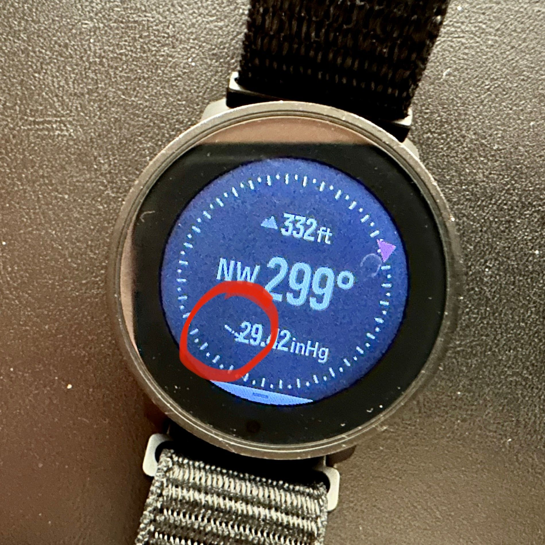
Theres a similar UI bug on the Compass widget with the pressure symbol on the S9PP.
-
@Łukasz-Szmigiel those time scales will come with next update. Test builds already have them.

-
@Egika nice!