New owner of Suunto Race - first feelings
-
My favourite picks of the watch (there are many but just some listed here):
-On my opinion the Suunto app is just the best of them all (I’ve tried every sports watch company and too many sport watches
 ) e.g. your stats weekly, monthly, yearly so clearly viewed. And different colors for different sports. Training metrics etc…
-route planing with heatmaps and how easily those routes can be sent to watch
-on activity the screen is a “true” always on display, metrics view wont dim or go blank. The map will lose the map view if wrist is lowered, but super fast back on if you turn your wrist. And also wrist lowered screen shows at least your trail
-quick buttons and multiple alarms, thanks Suunto for listening your users!

-screen is very nice and bright, hr metrics are better than suunto vertical, sleep monitoring improved
Christmas is coming


 So something to wishlist also if someone from Suunto is reading these posts:
-fix for the training metrics not syncing correctly back to watch without turning the watch off and back on (more of this in another topic here in this website)
-possibility to check the time at night without awaking the whole screen, suggestion: for example in do not disturb mode lower or upper button would just show the time like in normal aod screen saver mode and a press of the middle button would wake the whole screen.
-adjustment to flashlight. E.g. with wheel scroll you could adjust the brightness of the light like in apple watch
-the little lag when scrolling through widgets etc… I think it’s more precise when used with touch screen. Maybe the scroll wheel should be adjusted a bit to be more presice. Now it feels little like driving a Suzuki Jimny, turn the wheel and after a while also the car turns

-on map view and navigating: the next turn notification shows on the whole screen. If e.g. a route where lots of turns, the screen is showing all the time these notifications and then you can’t see the actual map, so maybe a smaller info screen for turns, so that the map would be also visible (even if smaller or something like that)
-more watchfaces. Altough the new primary watchface for Race is quite nice.
-is there allready your race time estimates somewhere or can’t I just find them…?
-it would be great if they would get back the recovery hours like in vertical and also this to the app
Overall a solid package and great value for the price. Liking a lot
 ️
️ -
@SuuntoR said in New owner of Suunto Race - first feelings:
My favourite picks of the watch (there are many but just some listed here):
-On my opinion the Suunto app is just the best of them all (I’ve tried every sports watch company and too many sport watches
 ) e.g. your stats weekly, monthly, yearly so clearly viewed. And different colors for different sports. Training metrics etc…
-fix for the training metrics not syncing correctly back to watch without turning the watch off and back on (more of this in another topic here in this website)This will be fixed.
-adjustment to flashlight. E.g. with wheel scroll you could adjust the brightness of the light like in apple watch
Interesting idea!
-on map view and navigating: the next turn notification shows on the whole screen. If e.g. a route where lots of turns, the screen is showing all the time these notifications and then you can’t see the actual map, so maybe a smaller info screen for turns, so that the map would be also visible (even if smaller or something like that)
-more watchfaces. Altough the new primary watchface for Race is quite nice.
-is there allready your race time estimates somewhere or can’t I just find them…?
-it would be great if they would get back the recovery hours like in vertical and also this to the app
With the switch to Suunto algorithms for training, etc. I do not know what will happen to recovery time.
Overall a solid package and great value for the price. Liking a lot
 ️
️Glad you like it.
-
@lexterm77 Please let this be fixed like the SR for all watches. Suunto way overshoots activity calories
-
@stromdiddily said in New owner of Suunto Race - first feelings:
@lexterm77 Please let this be fixed like the SR for all watches. Suunto way overshoots activity calories
But that would make me lose weight.
And actually do ultras.
-
@SuuntoR said in New owner of Suunto Race - first feelings:
.-is there allready your race time estimates somewhere or can’t I just find them…?
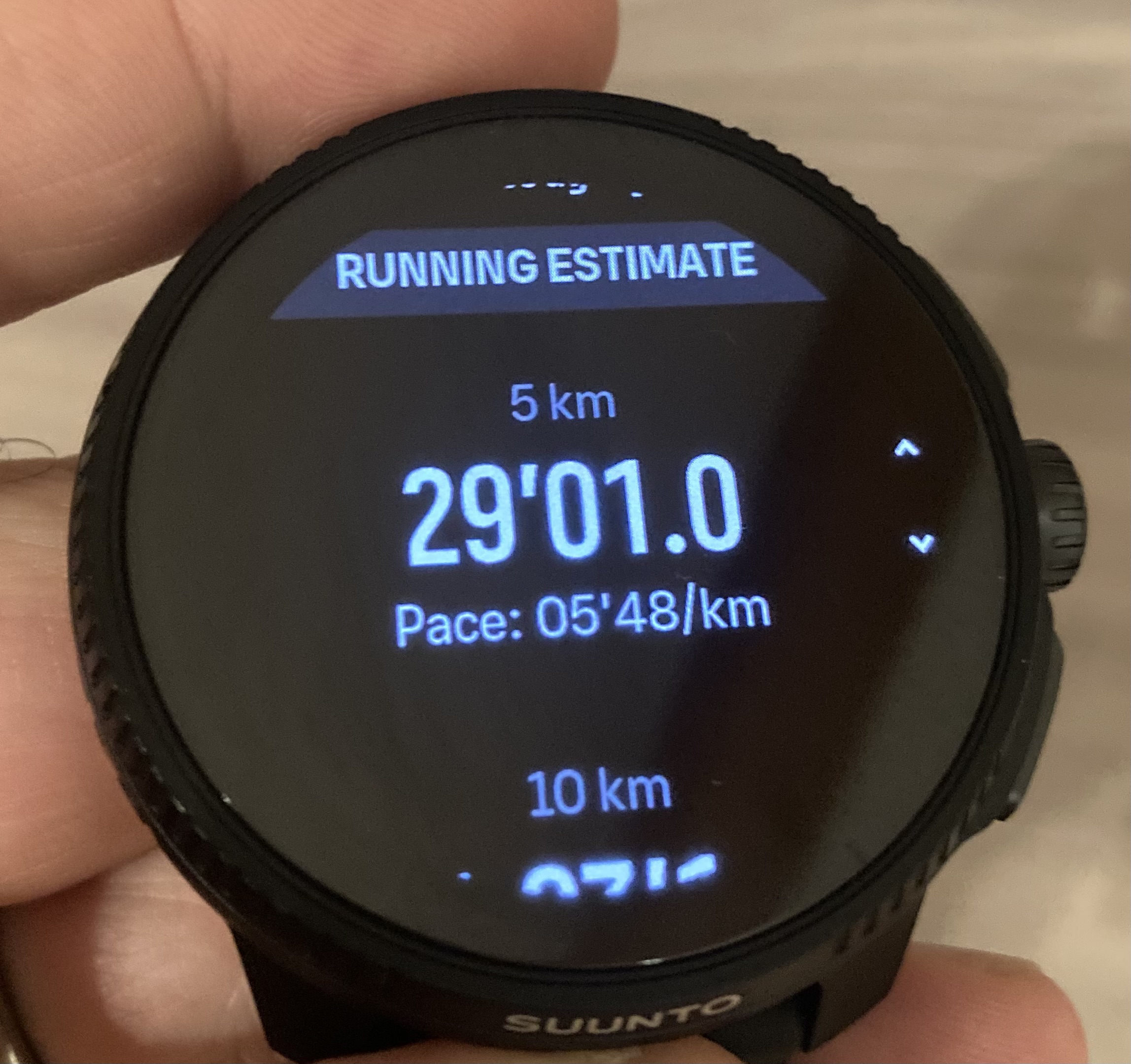
Scrolling down the progress widget

-
@ChrisA didnt see this info on my Race… But did only 1 Run
-
@GiPFELKiND don’t know when it started showing up - 5 runs/20 km in the last 10 days
-
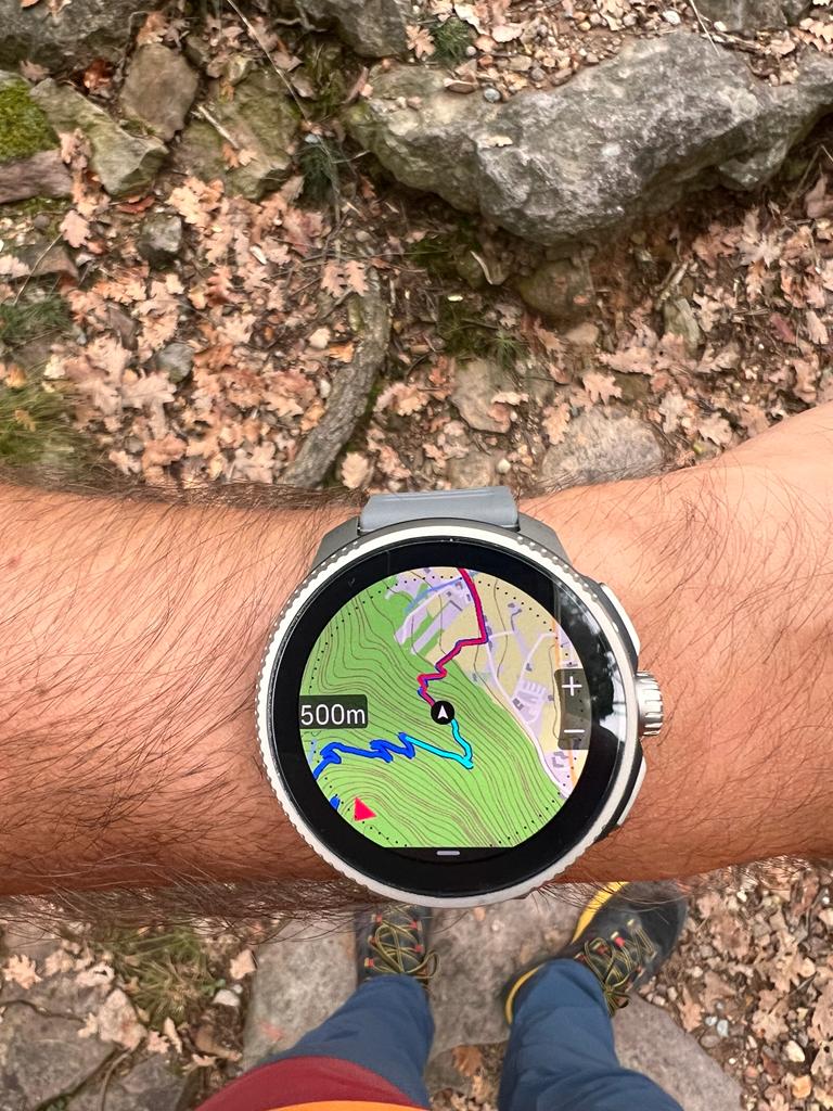
First real difficult scenario for the Race, a very steep path on the side of the mountain very close to the rocks.
GPS behavior was very good, I didn’t think multi band would make such a difference.
Map readability and brightness is a pleasure for the eyes, and the night version is really good in a night scenario provided you don’t point your frontal lamp directly on the screen.
To my surprise the optical heart sensor gave very realistic values in a fast trail running descent (I was very late).


-
@General_Witt Very nice!
-
As I remember on my S9P when I switch off vibration on the watch, I was able to have it only for notifications. On SR I have vibration on notifications and scroll wheel also. I can´t have it only on notifications, am I right?
-
Here are my thoughts from someone who was in the Garmin ecosystem for years and had a brief stint with Coros.
What I like:
- The build quality is great at this price point. I usually prefer velcro nylon bands but the standard one is great.
- I’ve had no issue with HR readings like some others, and my watch sits on a tattoo.
- GPS is very accurate.
- The app is very customizable. It’s still a bit confusing to me but I’ll get used to the layout.
- The screen is gorgeous. It’s my first AMOLED screen though, so I have no comparison point.
- Sleep tracking seems more accurate than either Garmin or Coros, at least regarding the times I fell asleep and woke up at.
What could be improved.
Keep in mind that I’m still finding my way around the watch and app, so I might have just missed some stuff:- As many of us mentioned before, the fact that the watch goes from off to full wake mode at the touch of a button in DND mode instead of low light mode has to change.
- There needs to be an option to ignore notifications during an activity.
- I do not understand how the “Intensity zones” display works.
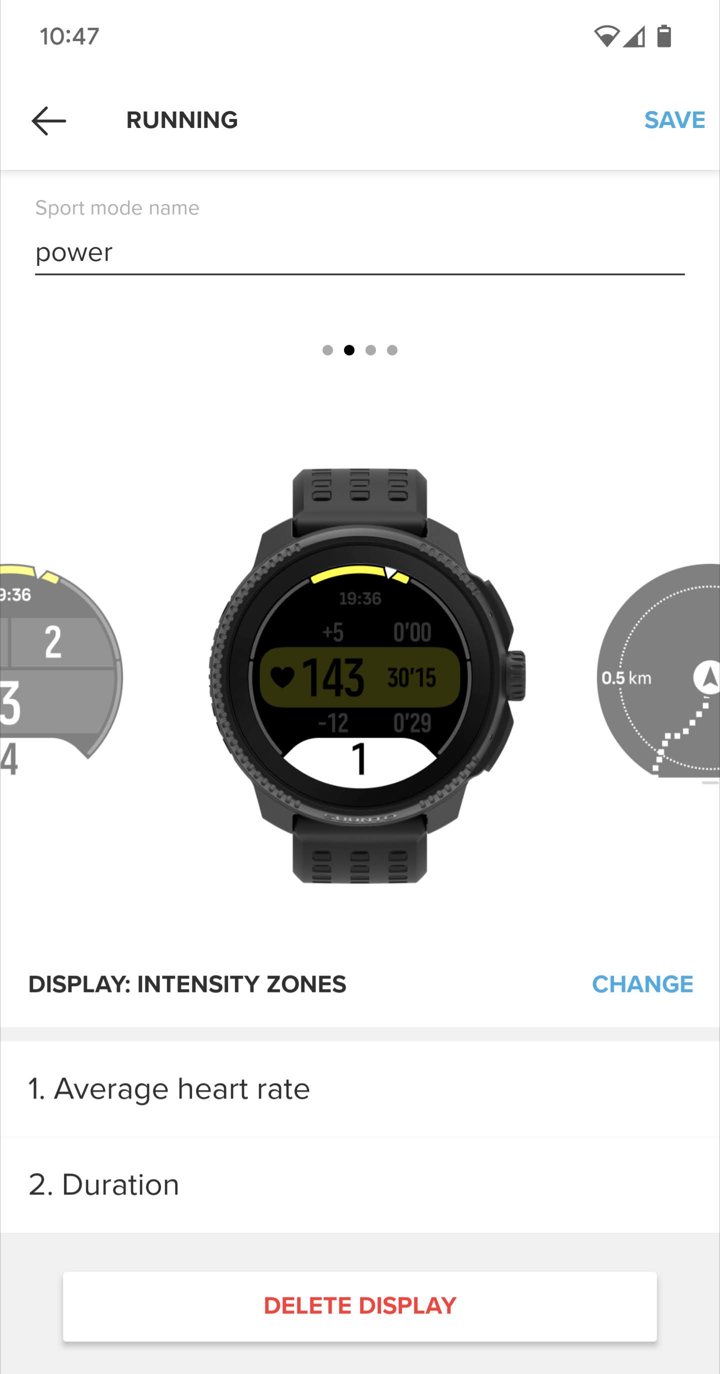
I understand that the metric used (pace, HR or power) is chosen in the activity menu, but why are there 2 data choices and only 1 customizable data on the display? - Speaking of which, the “Intensity zones” setting always defaults to HR. It would be better if it remembered the last option used.
- It makes much more sense to cycle between the activity displays by rotating the crown instead of pushing it as Coros does it. That way, you can go forward or back and it feels more natural.
- As a Stryd user, the ability to manually input a calibration factor would be a great help, or at least a way to see what the autocalibration factor was set to.
- The default watchface flickers rapidly between white and light pink on it’s low light state.
- The magnets on the charging dock are very weak.
- A dark mode in the app and a web interface would be appreciated.
- A countdown before a transition during a structured workout would help a lot.
- It seems to be underreporting burned calories during an activity compared to the competition. It seems to be around 30% less.
-
@FoleyRose intensity zones: the first display is the circular and graphic gauge of the selected metric around the screen perimeter.
-
@General_Witt LaSportiva Shoes


-
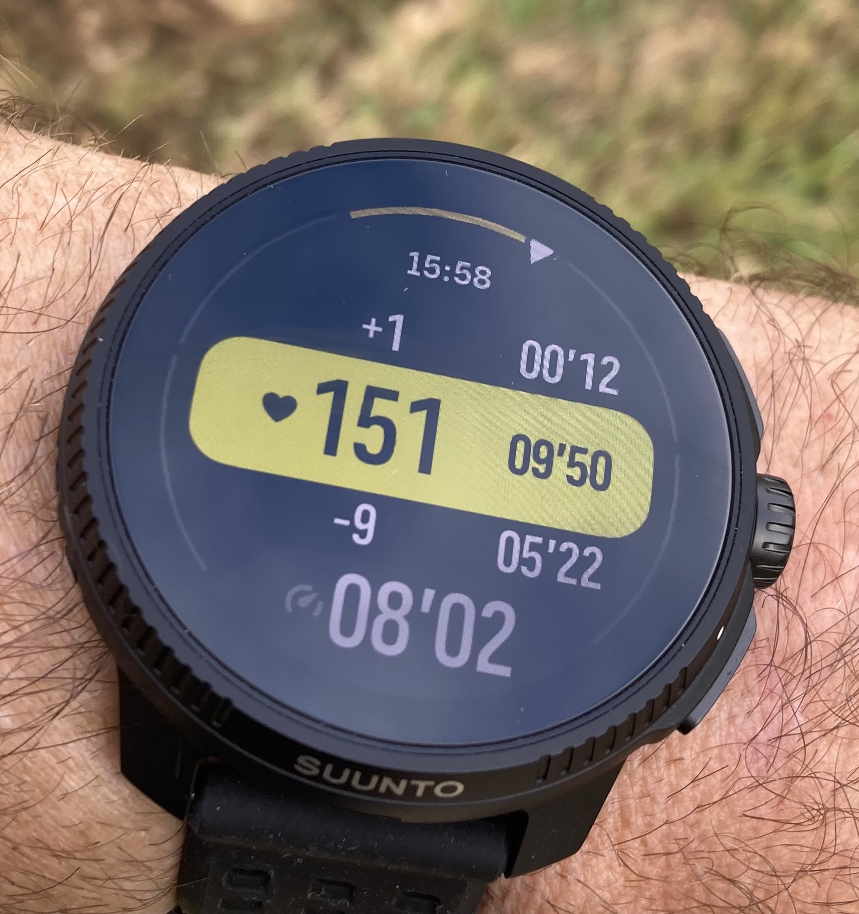
@Egika I think what @FoleyRose also refers to, is everything inside the gauge. I also have a question on this. Maybe you can help us.
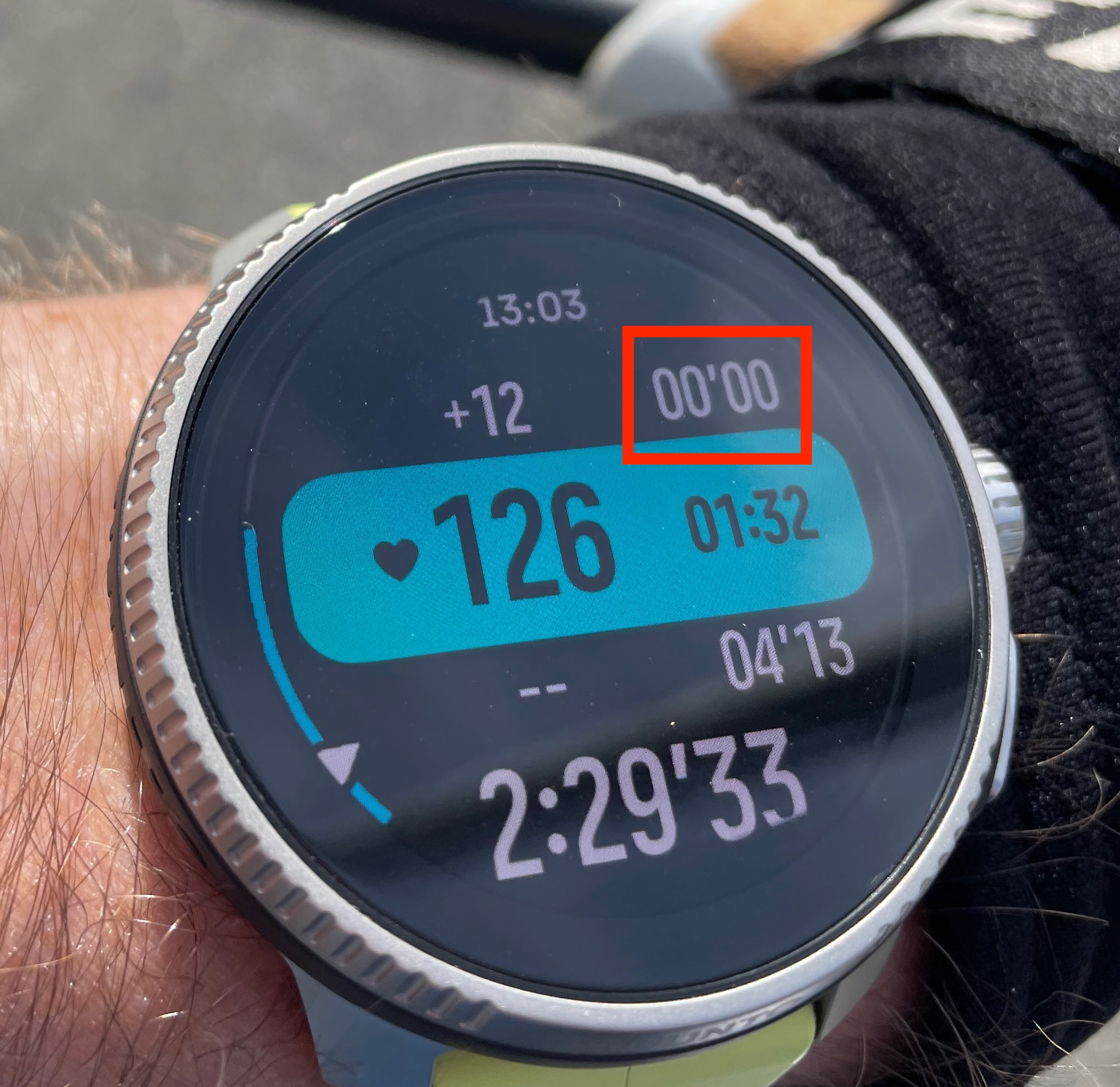
In this example I am in heart rate zone 1, current heart rate 126 and at this point I have been 1h 32min in this zone. The +12 mean that the next zone (zone 2) “starts in 12 beats” (138 in my case).
But what I don’t know is, what the 00’00 mean (red rectangle). At this point I have been roughly 57min in zone 2. So I would expect that this value should be displayed there instead of the 00’00. I have set zone 1 as the intensity target for this training.
I also don’t unterstand the 04’13 below the highlighted part. I now for sure that I have not been below zone 1 for 04’13 during this workout.
-
@Egika sorry I’m still confused. In this picture’s case I have selected average HR as data #1 and duration as data #2. Where would those appear?
I tested it and it seemed to only show one of them with no way to manually switch between the two. -
@FoleyRose have you tried reading the manual?
https://www.suunto.com/Support/Product-support/suunto_9/suunto_9/features/intensity-zones/ -
@wmichi shows the right values for me (time spent in the respective zone). Actually this is one of the workouts screen I like the most (and is not available on other watches in that form)
-
@wmichi you are right. There’s something fishy with those times above and below the current value.
I’ll report it. -
@FoleyRose long time Suunto-Stryd user here, we don’t have a way to see or set calibration factor as other brands, with Suunto watches the recommendation has always been to pair the Stryd and disable auto calibration once right before the first run, basically using stryd with default calibration. I’m used to it and works fine.
-
@herlas this is ok approach if you stryd is on track but my mine was some 3% off and in those cases the thing to do is: go to an open area with best gps reception, put the autocalibration ON, run for some 20-30 minutes and the watch will calibrate stryd and those factors will remain in watch-stryd interface. After that every other run do with autocalibration OFF. The important thing is that one you do it with autocalibration ON GPS should be really good and without any opstacles.