SOFTWARE UPDATE 2.35.34 Q2
-
@TheGlassWolf yes later on. Due to dive capabilities we want the device to sail smoothly now.
-
@Egika yup. Added
-
 G gizmo referenced this topic on
-
@Egika said in SOFTWARE UPDATE 2.35.34 Q2:
@Dimitrios-Kanellopoulos and you forgot to add the data tooth in the map view
")
What is this? Please

-
@Mff73 open the map view with a route loaded and you’ll see the navigation information in a data field at the bottom. just try it
-
@Egika
I am in a sofa, I clicking everywhere to dig into this, didn’t thought Yet, of navigating a. Route from where I am.
Sea kayaking schedule this afternoon, let see.New pause menu, added to new lock button feature is nice. It won’t make us run quicker but

 .
.
Let’s try all these in the field. -
@The_77 said in SOFTWARE UPDATE 2.35.34 Q2:
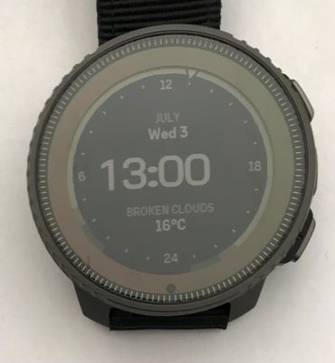
Unrelated feedback on this new watch face - be nice if the hours/minutes were moved to the centre when the seconds disappear after a minute or so. Just not as pleasing when the time is left shifted.
Equally low-grade gripe:
Along with that centering, the numbers could use some kerning. And the Vertical’s oblate separator dots don’t help:
-
Should we able to zoom in/out the altitude graph of a navigated route?
I see +/- near upper button, but quick click doesn’t do anything, and long click is opening multisport switch
-
 E EzioAuditore referenced this topic on
-
@Mff73 i’m following a route right now : short clic on +- switches from whole route (the same as before) to « guidance »
Don’t know it it is related to route guidance, but map fluidity is erratic
[edit] : same erratic fluidity on map screen with « petit poucet » instead of following route
Also distance to next turn indication on map screen is really big. No possibility to hide/show ?Suunto’s devices at home :
Vertical titanium solar
Suunto Race S
S9pp titanium sand
Suunto Wing & Spark
S9B titanium Ambassador edition, A3P, X6 -
@Dimitrios-Kanellopoulos @isazi Longpressing a complication now opens the full screen view of the corresponding widget. Unfortunately this does not always work. Maybe once out of 5 tries on the Race. And if it works, it takes about 4 to 5 seconds. I am currently using the new analog watch face. Can anybody else reproduce this?
-
@wmichi said in SOFTWARE UPDATE 2.35.34 Q2:
@Dimitrios-Kanellopoulos @isazi Longpressing a complication now opens the full screen view of the corresponding widget. Unfortunately this does not always work. Maybe once out of 5 tries on the Race. And if it works, it takes about 4 to 5 seconds. I am currently using the new analog watch face. Can anybody else reproduce this?
yes. and known issue
-
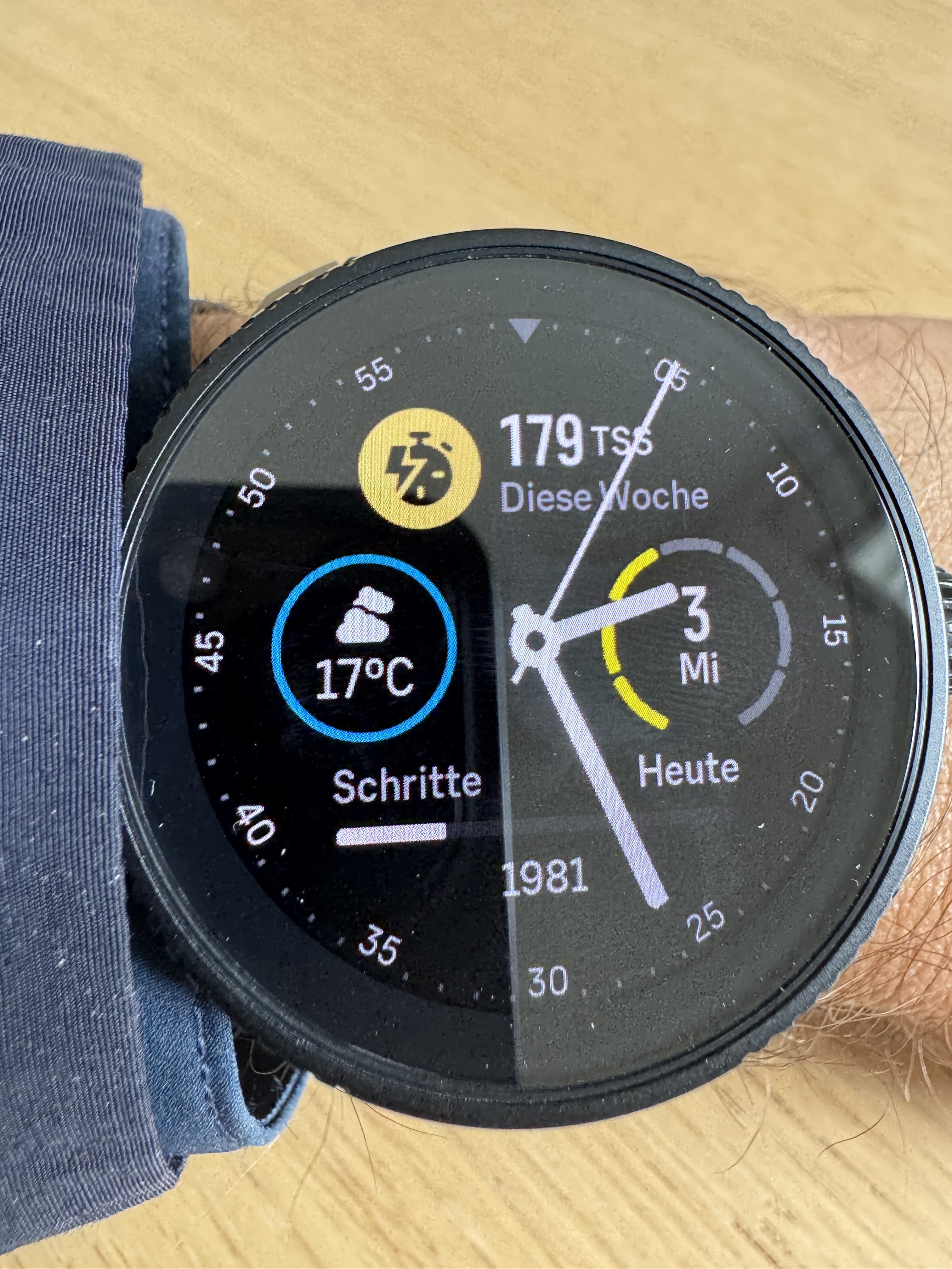
Can you please tell me what the yellow bars around the date represent. Thanks
-
@Patrick-Löffler-0 said in SOFTWARE UPDATE 2.35.34 Q2:
Can you please tell me what the yellow bars around the date represent. Thanks !
Is is the day of the week. 1=Monday, 2= Tuesday, 3= Wednesday
-
@Egika Thank you very much.
-
UI speed improvement is very noticeable on the Race. It was more than good enough before, but now we can fly through the widgets without any stuttering. Great Job!

-
Great updates. So pleased to be able to lock the screen while paused.
I will never be on board with horology’s use of the word ‘complication’ though
 , especially when smartwatches can be prone to the other sort of complication.
 -
zoom seems to be up to 25m on my Race
by the way, what does it mean “data tooth during navigation”?
Suunto Vector . Vector HR . Core . Race & Race S
-
@Stefano-M64 It means you will see distance to next waypoint in navigation or distance to turn at the bottom of the screen. (The tooth).
-
@Stefano-M64 said in SOFTWARE UPDATE 2.35.34 Q2:
zoom seems to be up to 25m on my Race
by the way, what does it mean “data tooth during navigation”?
Read thread; https://forum.suunto.com/post/147345
-
OKKEY! thanks to both!
-
Thanks for the update.
It’s great to see that there’s ongoing effort on optimizing GPS, HR readings and also on battery, where’s an area that Vertical and other watches are already the best on the market.
The enemy of the good is the better as we say in Greece.
I tried the customisation, I ll miss the toggling feature for the mini widgets but I can live without it.
It would be nice though that the new ones (like Resources) would be as colourful and shiny as the old ones (the CTL, HRV etc). Right now on my Vertical I am using the watch face introduced with the Race and prefer the CTL over the Resources one just to have some colour, although data-wise I would prefer the Resources one. Also don’t like the three dots solution for spacing. Maybe an icon or just the status of “Inactive” etc would do.
Fingers crossed for bug regressions

Hello! It looks like you're interested in this conversation, but you don't have an account yet.
Getting fed up of having to scroll through the same posts each visit? When you register for an account, you'll always come back to exactly where you were before, and choose to be notified of new replies (either via email, or push notification). You'll also be able to save bookmarks and upvote posts to show your appreciation to other community members.
With your input, this post could be even better 💗
Register Login