SOFTWARE UPDATE 2.35.34 Q2
-
@isazi geez I’m not bashing the update - I think it’s great. You’re talking about acting based on customer feedback - and I’m doing nothing more than giving them feedback
-
@Ivo-Smolis My point was it would be difficult to choose more than one with the current customisation. you go and change one and how will you add the other 2, 3 on the same field that you want to tap and change? One way is you chose one and have a small number 1, than the next with 2 etc.
Suunto watches: Vertical 2 (Titanium Sage), Race 2 (Titanium Trail), Ocean (Sand), Race (Titanium Charcoal), Vertical (Titanium Solar Sand), 9 Baro (Ambassador Edition), Spartan Ultra (Copper Edition), Ambit 2, S6
Suunto Wing -
@EzioAuditore The modern approach in user experience that at least Apple currently sticks to, is that the user basically shouldn’t even notice an update if they choose to do so. The fact that I woke up and found my favorite watch face broken is not good no matter how you look at it. A way to overcome it would be to keep the default behavior if a watch face is not customized, that is allow clicking through. But if the user chooses to customize, then they are free to put static complications into predefined slots. That’s it, that’s one extra menu row Revert to defaults, nothing more is expected.
Suunto 9 Peak Pro
-
@Ivo-Smolis yes, and I was replying, I don’t think I sounded aggressive or anything, or assumed you were bashing anything. I was just telling you that this is the first time we have customization of the watchface, it is version 1.0, like everything else in software it may change at some point if a better solution is found.
Watch: Suunto Vertical 2 Titanium Black
Blog: isazi's home
-
@EzioAuditore I see your point and agree - allowing the user to not only customize the complications but also in which order they cycle (directly on the watch) would be difficult. But allowing us to do it on the app would be one way of doing it - just like with widgets rearranging. Or maybe cycle in order in which you choose which complications to display (so let’s say you tap “steps” then “date” then “seconds” - so they will cycle “steps” -> “date” -> “seconds”). Just not remove the functionality altogether
")
-
@isazi You are right - no hurt feelings and sorry if I sounded like overracting
Anyways I think the update itself is great and a step in good direction -
@Ivo-Smolis I think Suunto will have surveys and so on in the future to gather feedback. I wanted to also open a poll here in the forum, but decided against it to not give a false sense of accomplishment to people voting, this is still a community forum and it is not the official way to contact Suunto directly, or the only way Suunto gathers feedback.
-
@enriqueescoms said in SOFTWARE UPDATE 2.35.34 Q2:
With all due respect, and from my point of view, it is a very unfortunate implementation.
It’ll be obvious from my previous posts that I 100% agree with you!
With the many software updates in my time using Suunto watches, some changes I like, some I don’t, some I don’t care either way. Everyone has different priorities and any change will nearly always please some people and upset others. This is the first time Suunto have removed what I consider (but clearly others don’t/won’t) to be a basic functionality of a sports watch - the ability to pause the recording with the same button press in any screen - and from the feedback so far it appears it is intentional rather than an error with the new button implementation.
It appears there are now three functions competing for two operations of the top button when in navigation: pause; map zoom; and multisport selection. Leading to one of two implementations:- single press to pause, long press to enter map zoom
- single press to zoom, long press to enter multisport
The button functionality on the 9PP in navigation clearly needs to be updated because the back function doesn’t work and top button single press appears to do nothing. It appears option 2 is the likely outcome, all I can do is wait to find out and until then I’ll use my 9 Baro for races that don’t need the extra battery life and fast charging.
-
@MKPotts it has been already reported to Suunto that, at least, watches should have consistent behavior, meaning all watches with buttons have the same UX, and all watches with crowns have the same UX. This is not the case at the moment, because Vertical and S9PP have differences in the navigation screen. Hopefully this is made coherent with a future upgrade.
Watch: Suunto Vertical 2 Titanium Black
Blog: isazi's home
-
@Naseem-Rayyan me too, hope that the personalization introduced by the Complications (unfortunate name choice) will be refined in the next future to allow again to tap to cycle across different fields.
-
I got idea to maybe add second compilation profile (or even more) and we can choose by holding shortcut button to choose which one we want or holding shortcut button will switch our watchface data to second one? Iam happy I can have now weather/altitude and baro on default SV watchface, but sometimes I wish i could switch my watchface for example to solar or next 3 weather graph, to steps or solar harvest icon or something by holding lower button. Not by going to options, compilation and swotch it manually just to fast-check things. It would be extremly fast to switch between two profiles.
Second option is to choose which data will be set to specific icon after tap. Like old way, but we decide what icons appear in specific place after tap.
Iam happy about update, since waited for altitude bar on Solar SV for so long, glad Suunto did that, thank You. Don’t take it offensive or frustrate, it’s just a proposition.
-
@EzioAuditore I agree of course not major disruptions should happen on an update. But Apple? When the update log of your OS says: - added new emojis is not really an update for a full blown OS
 Don’t get me wrong I am Mac user but the state of the updates on non iOS is bizarre. Movable widgets… what happened to the developers that were/are your core users. Everything is now aimed at ‘content’ creators and consumers…
 -
@Stefano-M64 said in SOFTWARE UPDATE 2.35.34 Q2:
Complications (unfortunate name choice)
…can not blame Suunto for it as that is an industry standard term https://en.wikipedia.org/wiki/Complication_(horology)
-
@cheetah694 said in SOFTWARE UPDATE 2.35.34 Q2:
The modern approach in user experience that at least Apple currently sticks to
well … let’s talk about system settings on macos …

-
@isazi I appreciate you reporting this issue to Suunto. As I see it, and as I have discussed it with @Egika and @Brad_Olwin too, it hinders the user experience and does not obey either logic or functionality.
I understand, as you say, that it is necessary to share UX in order for behavior to be stable and consistent (which I value very positively). But that does not mean that the solution adopted is the best. In fact, it implies an “inconsistency” in the way it operates depending on the type of screen.
For me (although I can understand that other people have different needs) the short press of the top button (which is the most natural gesture of all) should perform the same task on all screens (and on all watches): display the menu stop/pause. And “reorder” other secondary functions, if it was necessary, for example, multisport.
I don’t know, I don’t think I’m wrong, correct me if you see it differently.
Hopefully, as you say, this is made coherent with a future upgrade. (Now it’s not)

Special mention is the fact that long press the center button is the equivalent of “BACK” in Suunto language (99% of situations). But precisely, on the navigation screen, it is the other 1%, and does something else different than in the rest of the screens and menus.
Therefore, if you have the navigation screen active (which, to make matters worse, is available by default) it is like a kind of “wall” that any ball bounces off.
This is not logical and reinforces my argument of a need to reorder certain functions.
Suunto 9 Peak Pro (all black version)
Suunto Race S (gravel gray) -
Hi from sunny Cyprus! After some fiddling and adjustments to my previous set-up, I have to agree that this is a nice upgrade. Thanks very much to all involved.
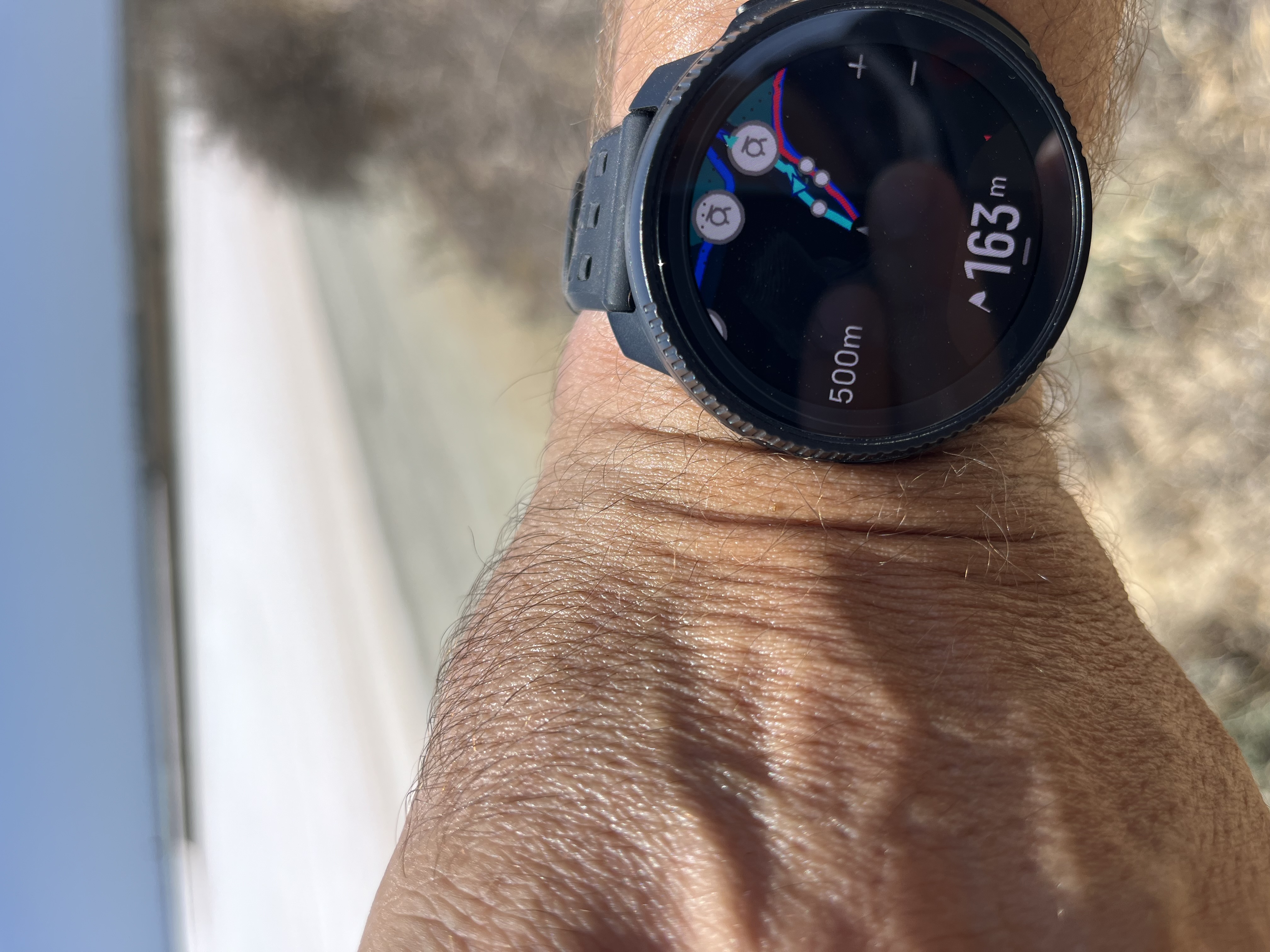
For me navigation interface is much improved (waypoints in the “tooth” for example):
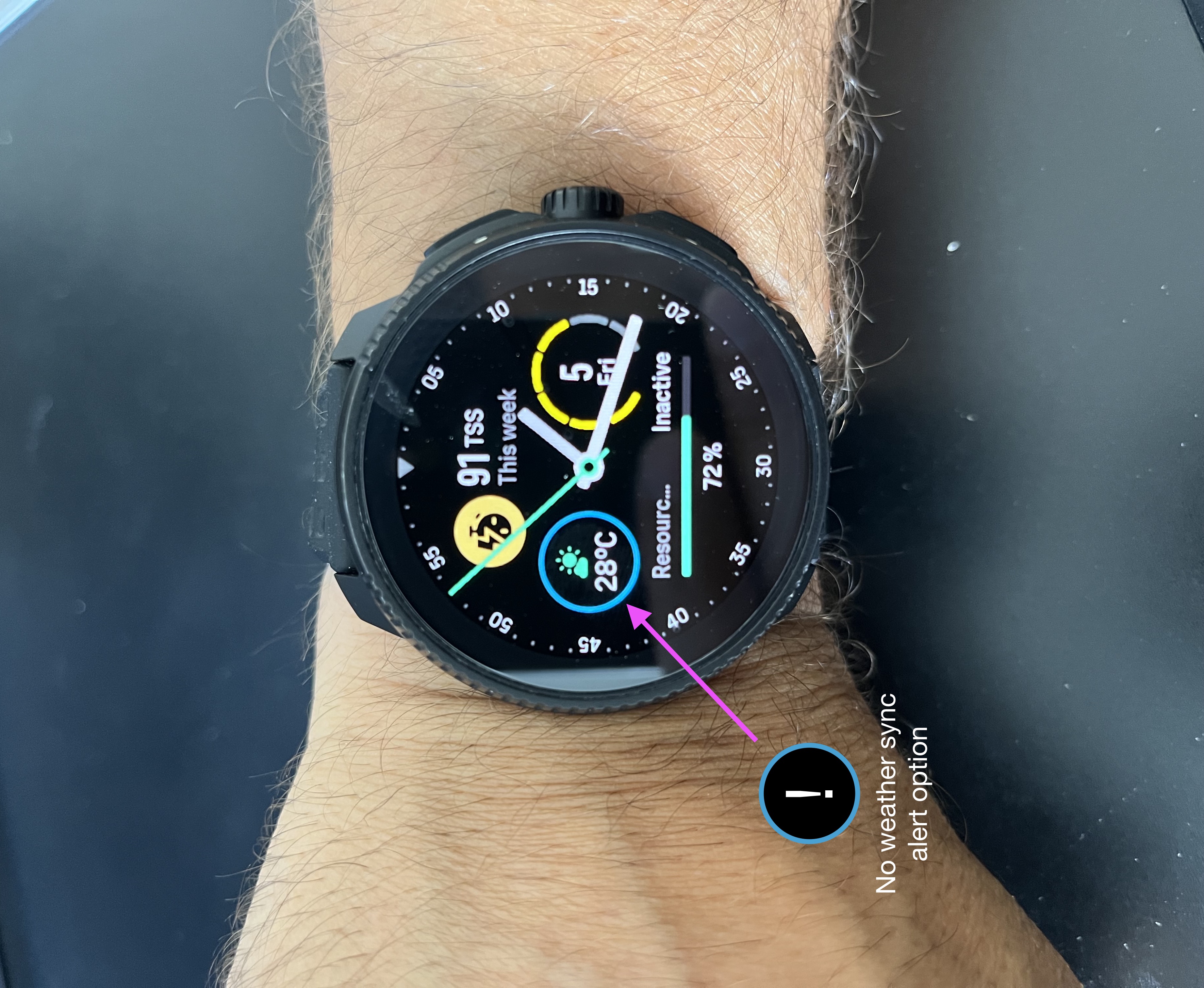
So far my only gripe is that the weather Complication does not alert me when the watch is out of sync with my phone. It would be useful to have some kind of alert, instead of showing the wrong temperature.
But otherwise, so far, so good.
-
@twekkel ah! thanks, everyday there is something to learn!
-
@enriqueescoms I agree with you here. The crown on some watches and not on others should enhance the UI not change it. So essentially with the crown there are 3 buttons. If the crown is not rotated it is a button.
If I am an avid Suunto user and don’t like sleeping with my Vertical but need it for crazy 100-200 mile races or multi-way events I bought a Vertical. Recently I am so happy because now an updated 9PP (the Race S is released)! Now I have a daily and for most workouts a watch I wear almost all the time. So comfortable for sleeping.
The problem: In Navigation mode to switch to the Climb graph or elevation overview in the Vertical I use a short upper button press. Not on the Race S! I have to use the crown. Every time I am using a route on the Race S I push the upper button to see the climb and it doesn’t work.
One example of the differences in UI. I too would rather see them consistent. But I would rather have all the improvements and live with the UI changes. Perhaps future upgrades require the design as it is now. I do not know.Vector/T6c/Vertical 2 Ti
-
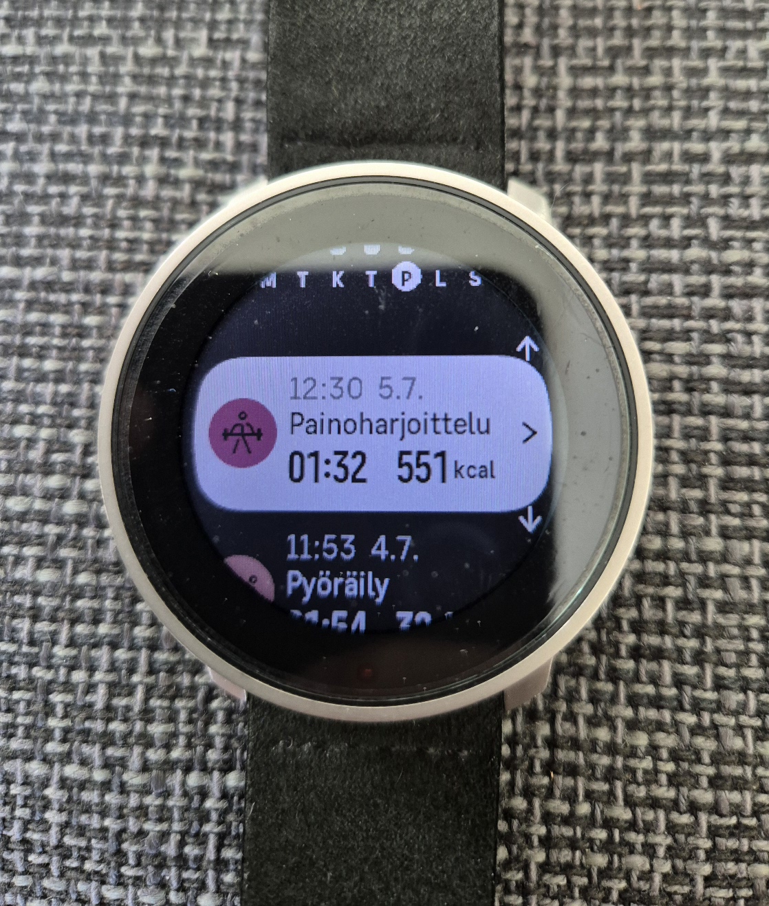
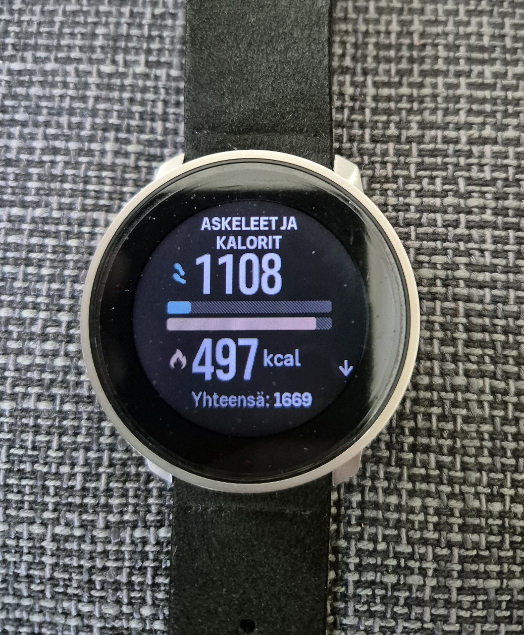
I noticed that daily overview doesn`t show all the burned calories right way. From the log I can see that 551cals were burned during todays excercise, but overview shows only less than 500. Same happened yesterday, but not before fw update. Same information can be seen also from SA.
S9PP.
-
This seems like an easy problem to solve. All the data fields are already there, so just let the user select which ones they want to see in the configuration screen. When they tap the watchface, it should scroll through the data they care about.
This is a signature feature of all Suunto watches I have owned in the past 14 years. To just discard it like they did in this update is infuriating.
Hello! It looks like you're interested in this conversation, but you don't have an account yet.
Getting fed up of having to scroll through the same posts each visit? When you register for an account, you'll always come back to exactly where you were before, and choose to be notified of new replies (either via email, or push notification). You'll also be able to save bookmarks and upvote posts to show your appreciation to other community members.
With your input, this post could be even better 💗
Register Login