Poor watch faces
-
@Mike-Islam-khachmakhov I guess I’ll be the one to say it… If you’re looking for a smartwatch that does it all and shows it all, Suunto isn’t the best choice. The current state of their watch faces with customizable complications is actually a few steps ahead of where they were a year or two ago. Of course some preferred the ability to cycle through the info directly on the face, but I suppose that’s a different discussion. The actually number of complications available has increased quite a bit recently.
If you want a ton of cluttered info on your Suunto watch face, you’ll probably never get it. Personally, I prefer Suunto’s approach with simple and (subjectively) well-designed faces over the crazy overabundance found on others (looking at you, Coros). And let’s not even talk about Garmin’s IQ store disaster.
The same applies to the Suunto App. I think most users prefer the simplicity. It’s kind of their thing.
On a more helpful note, what exactly are you looking to add to the face? There are quite a few that show at least 4 pieces of customizable data. Do you need more beyond that?
Vertical Ti / S9PP Ti / S9P Ti
-
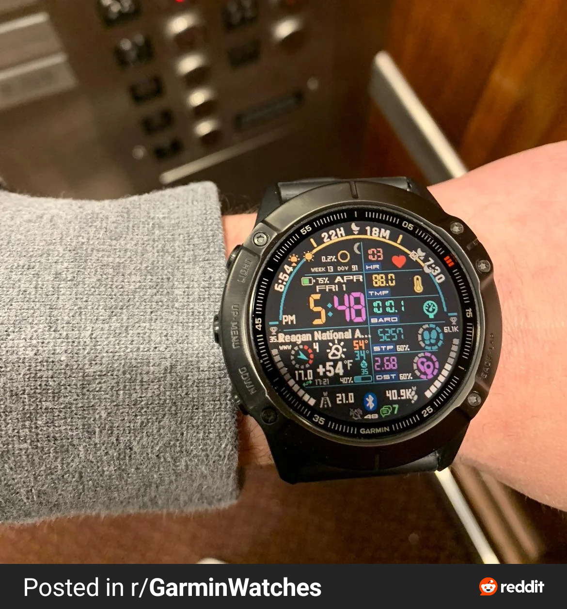
@duffman19 fully agree here! I find Suunto’s watchfaces among the best designwise! Clean and good to read. Please don’t give us something like this

Currently Race I
-
@ChrisA said in Poor watch faces:
@duffman19 fully agree here! I find Suunto’s watchfaces among the best designwise! Clean and good to read. Please don’t give us something like this
Horrific and (for me and my eyesight) unusable.
-
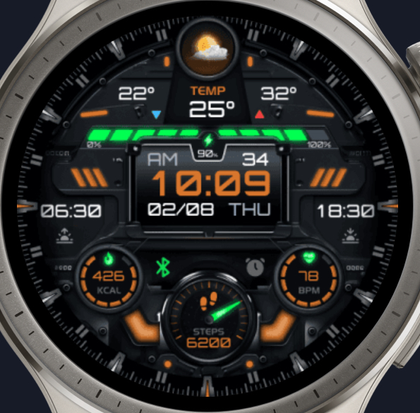
I have a bad habit of screenshotting some of these “data vomit” watchfaces. Two of the most egregious (and absolutely painful to look at) ones in my phone gallery are:
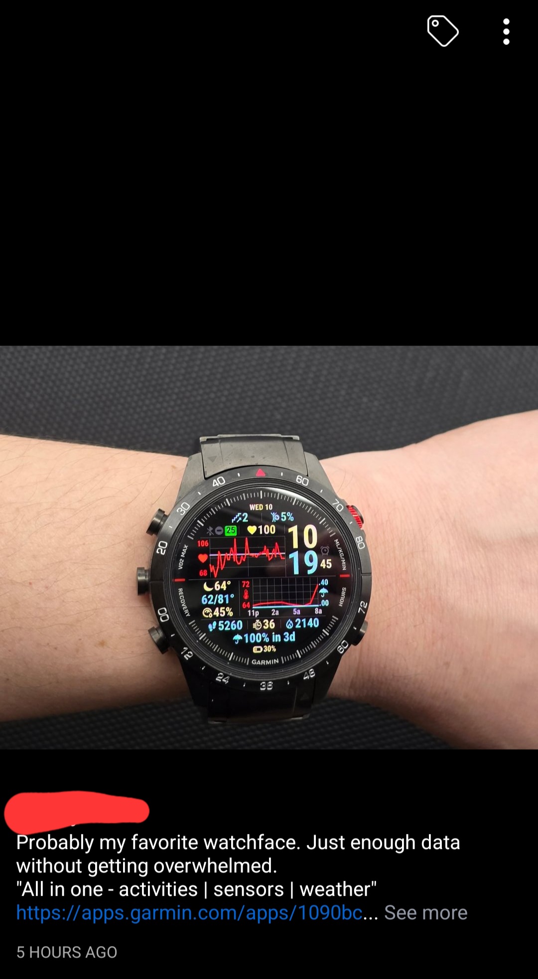
Suunto Vertical 2 / Run / Race S (gifted away) / Vertical / 9 Peak Pro (gifted away) / 9 Baro / 5 Peak (lost on adventure) / Vector
-----------‐-----------
Trail Runner / Hiker / Kickboxer
Instagram: @rytipps -
@duffman19
What you are saying:
Ignore different people ability to consume data. Say no to diversity. I like this way and it is the only way.Also moving the examples to absurd opposite cases doesn’t make your point stronger.
You might be a person with very limited ability to digest information and that is okay. But that is the point of watchfaces to be customizable in the first place. If we were all the same why bring all those watchfaces in the first place?The problem with current state is that all watchfaces are the same in the amount of data they show. Only visual design is different.
Date, battery charge, weather, steps. That’s maximum you can have. An i am not even sure about this. There are only 3 useful information you can see without extra action on most of them.Why not to make even single watchface that contains extra information? For those with normal eyesight and brain capacity.
-
@TrailEyes
So there are two extremes in this world?
We can either have overloaded watchface for geeks or oversimplified for those who have bad eyesight and limited ability to consume information.We cannot have something in-between. Strange view of the world to be honest.
-
@ChrisA
Who forces you to use them?
What is the problem having a choice?I don’t need it so nobody in the world need it. What kind of mentality is that?
-
@MikeKhachmakhov
What may not have been already written is that Suunto’s philosophy is this one with watch faces, it might be improved for usability, but it is unlikely (brand’s wise) that it will go the way your brain is willing to go.
You are for sure free to ask and, as it is a community forum, will just get others opinion, and maybe, suunto’s marketing team read here that for brain health or education, they have to change their philosophy of design. -
@MikeKhachmakhov I hope Suunto watches will never look like the pictures shown here.
-
@MikeKhachmakhov said in Poor watch faces:
@TrailEyes
So there are two extremes in this world?There are, in fact, many extremes in this world, as well as many degrees of moderation. I’m not suggesting that anyone here was asking for these eyesores, just riffing off a previous comment in this thread that mentioned a watchface that looked overloaded. And I was lamenting how some watchface designers unfortunately find themselves on a slippery slope of data presentation.
-
@MikeKhachmakhov said in Poor watch faces:
@ChrisA
Who forces you to use them?
What is the problem having a choice?Nobody has a “problem” of choice, as long as there is a choice. You put a “sticky note” on me, being a person with a certain “mentality”, because I expressed my opinion (which is a fundamental right, where I live), not knowing me at all - which I could ask in reverse what that says about your mentality, but I won’t, because this leads nowhere
Here in the forum and in any intelligent conversation, those are just expressions of everyone’s different opinions about what watchfaces should look like. Having different views and opinions and respectfully talking about those, is the basis of any dialectic approach and this doesn’t mean that someone has any problems. As long as you are easily offended by everything other people express, you create the very different intellectual and social environment , you’re actual looking for.I can absolutely respect, that you like watchfaces with lots of data on it and would have no problem with Suunto offering one. But I would certainly not use it.
-
@MikeKhachmakhov said in Poor watch faces:
What you are saying:
Ignore different people ability to consume data. Say no to diversity. I like this way and it is the only way.My apologies if my response came off that way. I only meant to point out that Suunto has a particular design philosophy. Many of its users appreciate that and some of us choose the brand because of it. Of course your opinions are valid and, hopefully, welcomed here.
There is also reason to believe[I meant to say, “One could speculate…”] that this aesthetic might change in the future, what with the company’s newish owner and recent movements away from the Nordic region. I personally hope not, but you never know. -
@duffman19 said in Poor watch faces:
There is also reason to believe that this aesthetic might change in the future, what with the company’s newish owner and recent movements away from the Nordic region. I personally hope not, but you never know.
I also hope not!
-
@MikeKhachmakhov I think Suunto’s philosophy is that watch faces follow the design and use of the watch UI. Simple, clean and useful. I and I think others personally like that. I understand about user choice but resources are limited and I don’t think a lot will happen. However, I do think you will see a few more watch faces/complications and hopefully more choices among complications.
-
@Brad_Olwin said in Poor watch faces:
Simple, clean and useful
And that is probably one of the main reasons for (us) users to buy Suunto.
")
-
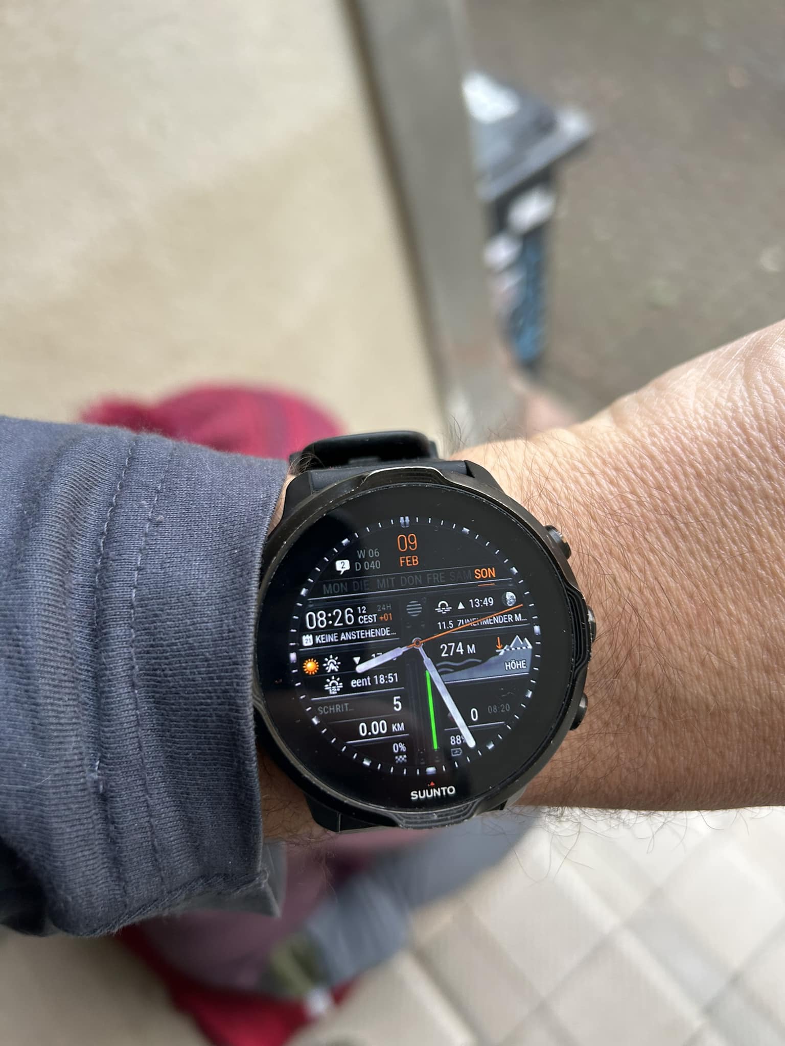
@maszop Like this?
-
@timecode
 No please NOT
 -
@timecode Still missing on the screen data from the New York Stock Exchange and current air humidity in the Democratic Republic of Congo.
-
I don’t want the watch to be a stock trading board.
-
@timecode data chaos