Map Rendering and Trail Visibility after Software Update 2.43.8/.12


-
I am starting a new thread to bring more visibility to the topic of map rendering after software update 2.43.8/.12.
It seems that the goal was to make map look cleaner in the city where there a lot of footpaths and sidewalks. But perhaps the unintended consequence of this updates is that maps are now much less useful when used outdoors.
Before the update, trails (footpaths, sidewalks, etc.) disappeared at the 1km? (1mi) level.
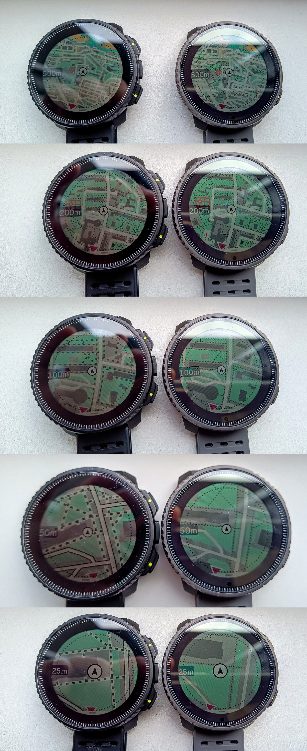
On the current software, trails (footpaths, sidewalks, etc.) disappear at the 500m (0.2mi) level. Service roads (driveways, parking lanes, alleyways, etc.) disappear at the 1km (0.5mi) level. And residential roads disappear at the 2km (1mi) level.
Note that with this change watches configured to use imperial units (miles) are especially impacted as the last level where trails are visible has gone down from 0.5mi to 500ft, which is roughly 5.3 times. In comparison, when using metric units, the last level where trails are visible has gone down from 500m to 200m - 2.5 times.
Here are some pictures copied from https://forum.suunto.com/topic/13169/software-update-2.43.8-.12-2025-q2 thread:
New maps on the left vs. old maps on the right when used in a city:
New map when used outdoors:
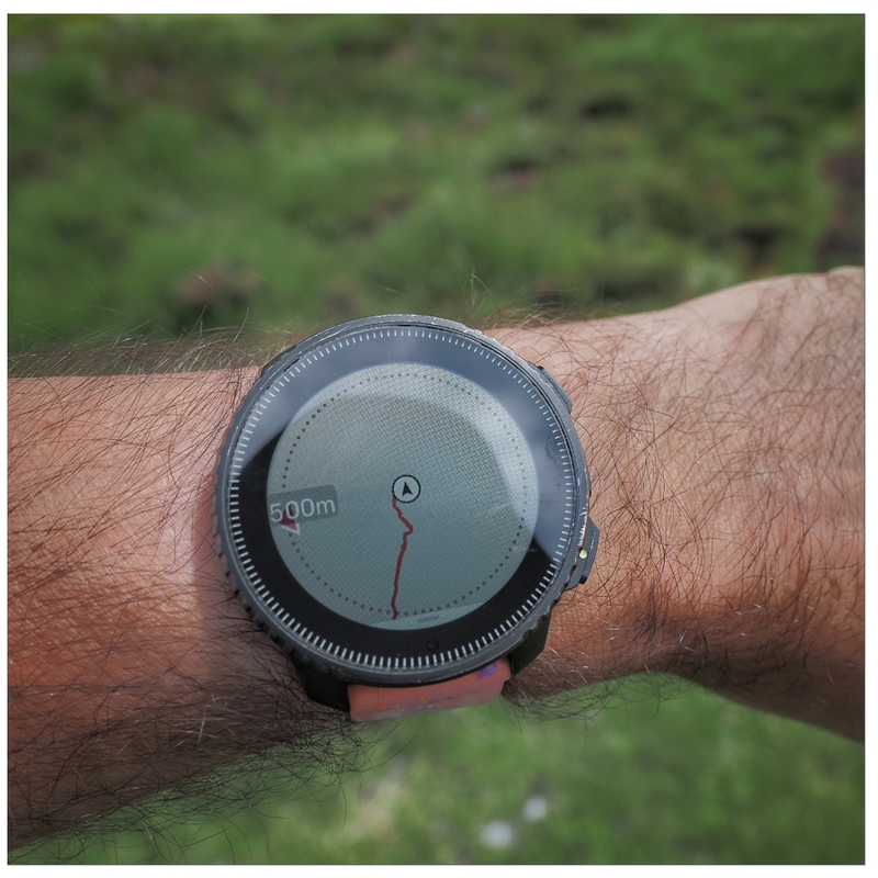
Please note that the new map rendering is worse for watches configured in imperial units where trails now disappear two zoom levels earlier than before - 0.2mi vs. 1mi.
In addition to that, on the current software, trails become very thin and very difficult to see at the 200m (500ft) level, which makes them especially difficult to see on devices with AMOLED displays because pixels are smaller. The choice to low contrast colors makes this problem even worse. Even the high contrast map theme uses gray on black to render trails, which isn’t exactly high contrast. On the standard map, when running outdoors, trails often appear as dark green on green, which is a poor, low contrast color combo.
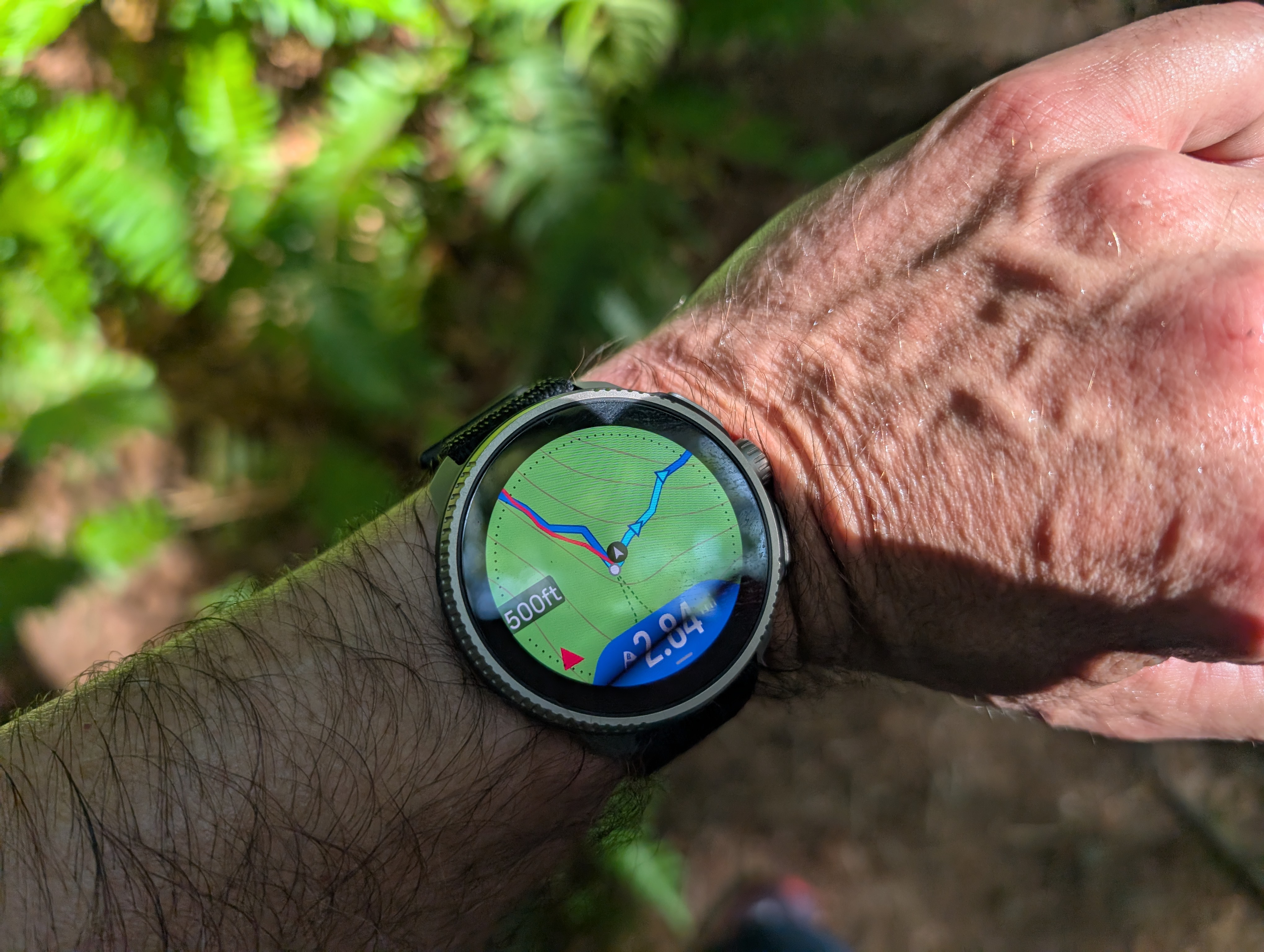
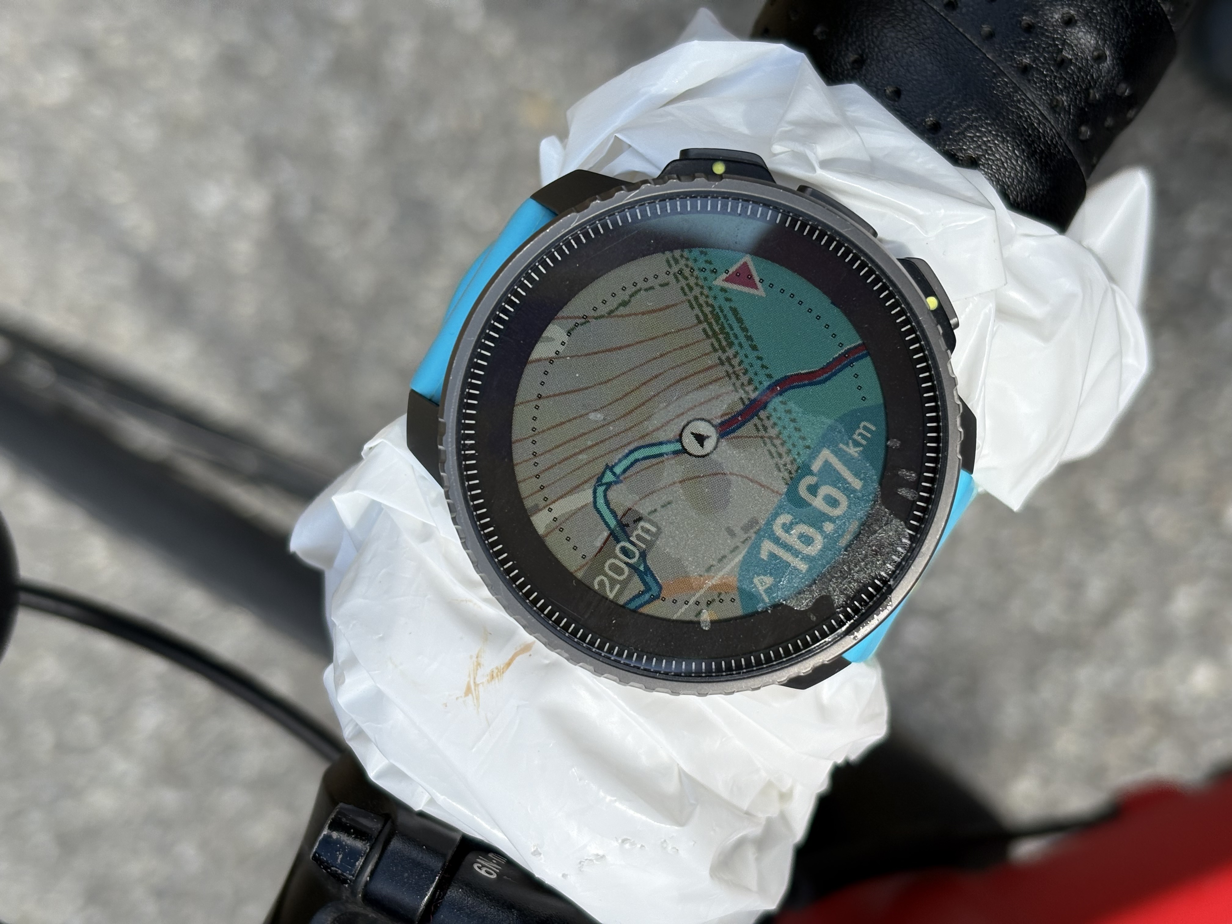
On Suunto Race or Race S, the last zoom level where trails can be comfortably seen is 200 ft (=60m) which covers just 20-30 seconds of running.Here is Suunto Race showing a new map at 500ft zoom level. Note that there is a trail that forks from the center of the screen towards the bottom of the screen, but it is very difficult to see when running (when the watch isn’t steady):
Suunto: Ambit, Ambit 3 Peak, 9 Baro, Race S, Race Ti, Vertical 2 Ti
Garmin: Forerunner 210, Forerunner 610, Fenix 6X, Fenix 7X Ti -
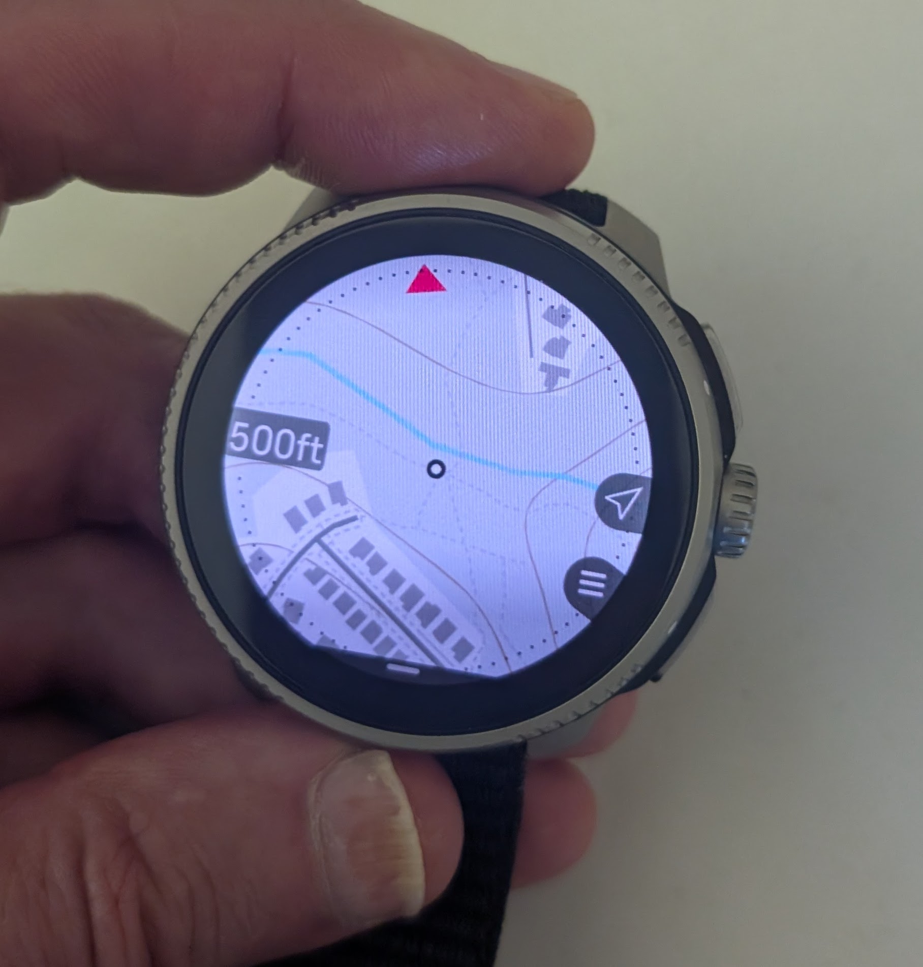
Also, I can’t understand what for are those stupid dots in circle shape around the edge of the display. I’ll appreciate map without them.
Suunto Vertical 2
-
@Jan-Suchánek said in Map Rendering and Trail Visibility after Software Update 2.43.8/.12:
Also, I can’t understand what for are those stupid dots in circle shape around the edge of the display. I’ll appreciate map without them.
I think the radius of that circle represents the distance shown at 9 o’clock, e.g. 500m, but I could be wrong.
Race S
-
I totally agree that having trails only visible at the 500 ft level is a huge step backwards.
-
I’m not sure if this came from the new firmware or the updated maps, but I ran in a new issue this morning: the base map turned solid blue.
Example, it turned blue from here: (44.66635N 6.59406E)
to here: (44.65173N 6.58086E, ~2km from the first point)
Between the two, it looked like this

-
@tuxella where are you? Country?
-
@GiPFELKiND French alps, between Gap and Briançon. The coordinates (in the previous message) give a more precise location.
-
@Squirrel said in Map Rendering and Trail Visibility after Software Update 2.43.8/.12:
I think the radius of that circle represents the distance shown at 9 o’clock, e.g. 500m, but I could be wrong.
I think you are right but these dots are still redundant and just a visual noise on the map which readability is already not the best. They are close to the screen edge so it doesn’t matter whether they are shown or not.
-
@Squirrel I looked at that yesterday, the scale is only a half of the screen. If there is 200m scale, it’s from the dotted circle edge to the center of the map (the dot in the middle). So with 500m label, the diameter of the dotted circle/map is 1km.
I looked at another map and find something 200m long and then looked at this on watch to make it clear to me.
Suunto Vertical 2
-
@Jan-Suchánek okay, until today THATS a NEW information think for all of us
 thank for your Work

-
@GiPFELKiND You’re welcome, just prove it again just for sure and it’s as I wrote. Btw, I found that the easiest way to measure that, is to enable the ruler function on watch map
 .
.
But I’ll remove the dots around map and even if the scale is measured to them, it couldn’t affect it much or the map could be rendered a bit zoomed… -
@Jan-Suchánek I would prefer to have 1/3 of the map “behind” me and “2/3” in front of me at least as a choice, so that I could see the track I missed … and see all the options before me.
using a Suunto Vertical & Suunto Wings; mostly running (AKA stomping around) and cycling through the northern german "wilderness", and wherever else I have the chance to do so
OS - Android 16/Pixel Pro 7 -
@Jan-Suchánek FWIW … At “200m” zoom, the distance from the centre of the position marker to the dot ring is 200m, plus 25m to the edge of the MIP display. (Measured using the Vertical’s built-in ruler.)
-
@Shrek3k Yes: at least the option for that would be useful. Having the position marker in the centre generally works better for a fixed “North Up” map. (Which also has its fans.)
-
@Fenr1r On Race, the dots disappear with ruler function, but I measured 215m from center to the edge of display. So it seems, that the dots-display edge distance is 15m with 200m scale.
-
@Jan-Suchánek Curious. 225m on Vertical. Dots disappear, too, but obviously not an issue for the full display radius.
-
@Jan-Suchánek said in Map Rendering and Trail Visibility after Software Update 2.43.8/.12:
@Squirrel I looked at that yesterday, the scale is only a half of the screen. If there is 200m scale, it’s from the dotted circle edge to the center of the map (the dot in the middle). So with 500m label, the diameter of the dotted circle/map is 1km.
I looked at another map and find something 200m long and then looked at this on watch to make it clear to me.
From your post I’m not quite sure if you actually agree or not with my previous assessment, but you essentially came to the same conclusion.
radius = poloměr
diameter = průměrPersonally, I don’t find the scale circle distracting and find it better than on Garmin map, where the whole thing seems weirdly shifted off center. The edge of the display could be used as a scale boundary, but I think seeing slightly beyond scale boundary is advantageous.
-
@Shrek3k said in Map Rendering and Trail Visibility after Software Update 2.43.8/.12:
@Jan-Suchánek I would prefer to have 1/3 of the map “behind” me and “2/3” in front of me at least as a choice, so that I could see the track I missed … and see all the options before me.
I think one reason Suunto chose not to do this is that it is much easier to render the map rotating around a middle point rather than an offset one. I do agree with you that seeing more of “where I’m heading” is often more important than “where I’ve been.” However, this would probably have a negative effect on the smooth, fast operation of the map navigation screen that is so often praised.
-
A couple more observations and screenshots.
The following two screenshots are from Suunto App showing my local area with a slightly different level of zoom. Both screenshots use “winter” map style. What is very interesting to see is that on the first screenshot we see sidewalks and on the second - no sidewalks. At the same time, trails are shown at both zoom levels.
Sidewalks and trails visible:
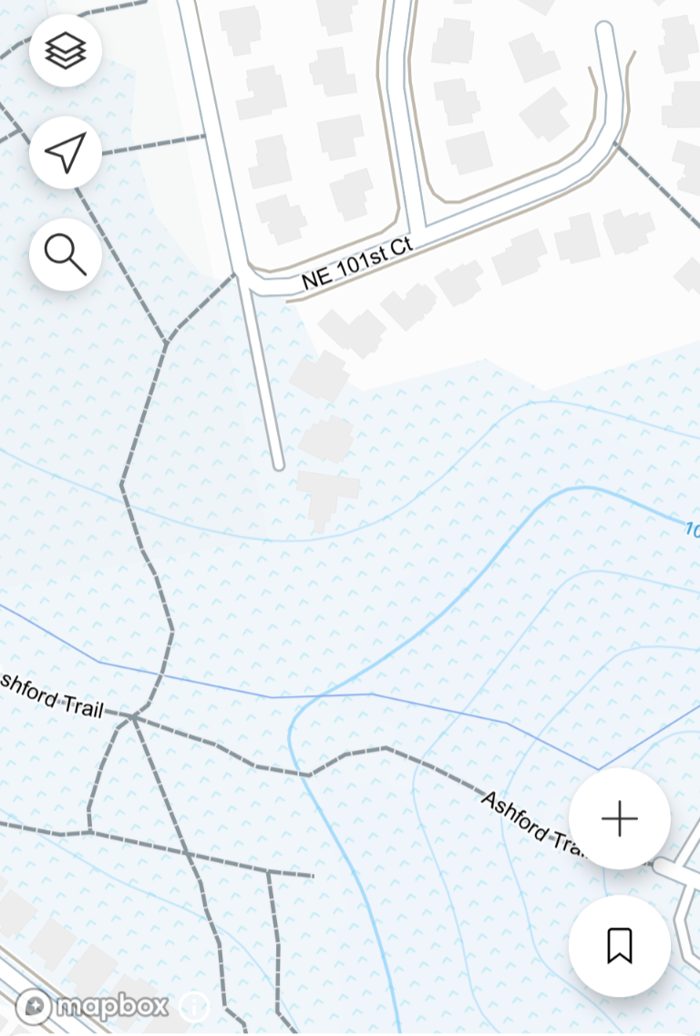
Only trails are visible but sidewalks are hidden:
What that means is that Suunto can tell the difference between sidewalks and trails, can render them differently, and can hide them differently. Also, please note how crisp and contrast the map rendering is and how well trails are visible!
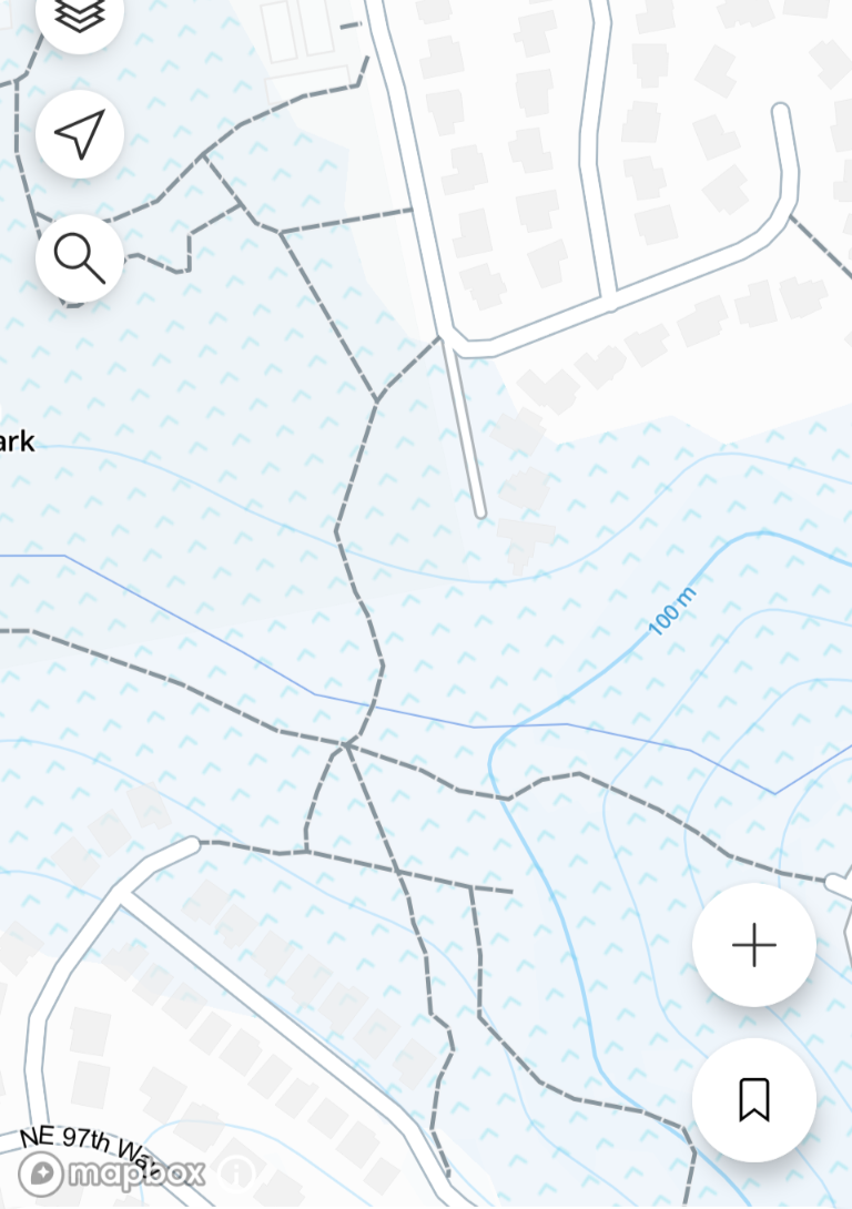
Now, the same exact area shown on the watch, also using the “winter” map style:
Before I took this screenshot and looked at it magnified on a laptop screen, I didn’t realize that trails are actually shown on the winter map. In fact, there are trails, but shown with such poor low contrast choice of colors, that it couldn’t possibly be worse. Can you see them? Also, strangely enough, buildings are very contrast and easy to see, even though they almost irrelevant, while trails are nearly impossible to see. Also, what we can see is that both trails and sidewalks are shown the same way.If the goal was to declutter the map in a city, it would be sufficient to hide only sidewalks while leaving trails visible just like it is done in Suunto App. It sounds like this should be possible to fix. If we have something that looks like the Suunto App screenshots above, I’d be super happy - that would be the best high contrast map style!
Also, I wonder if the new winter maps have been tested at all? I mean, trails are practically invisible on this map style at any zoom level. How comes that someone at Suunto has looked at this and decided that this is acceptable?
-
@sky-runner I’m not totally sure what the purpose of the “Winter” map theme is. Maybe trails are supposed to look like they’re under snow
 .
.I agree that it would be nice to have a better distinction between foot trails and sidewalks. The issue, however, is that OpenStreetMap data is behind all of this. And OSM is basically Wikipedia for maps, but with far less oversight. And there are many different ways to tag a simple path (path, footpath, sidewalk, cycle path, bridle path…) and then hundreds of different sub-tags for each of those designations (surface, access, direction of travel, structures, incline, smoothness, stroller access, and on and on and on…).
On top of all that, a whole lot of these paths are mis-tagged, especially outside of major population areas where there may only be one or two OSM contributors. Or the map data simply hasn’t been updated in years. And what’s more, different regions of the world tag similar paths differently! So what some might label a foot path, others will label a sidewalk.
Trying to boil all of this down into a clean, simple, easy to read map that works well on a watch screen has to be a terrifically hard job. I think Suunto has done pretty well to do this. (I wish the maps would be updated more frequently, but that’s a different topic.)
I 100% agree that trails should always be high contrast, either completely white or completely black, no gray. That’s why I use the “Dark” theme which has trails marked as white against a darker background.
Vertical Ti / S9PP Ti / S9P Ti
Hello! It looks like you're interested in this conversation, but you don't have an account yet.
Getting fed up of having to scroll through the same posts each visit? When you register for an account, you'll always come back to exactly where you were before, and choose to be notified of new replies (either via email, or push notification). You'll also be able to save bookmarks and upvote posts to show your appreciation to other community members.
With your input, this post could be even better 💗
Register Login