Resources used to be better
-
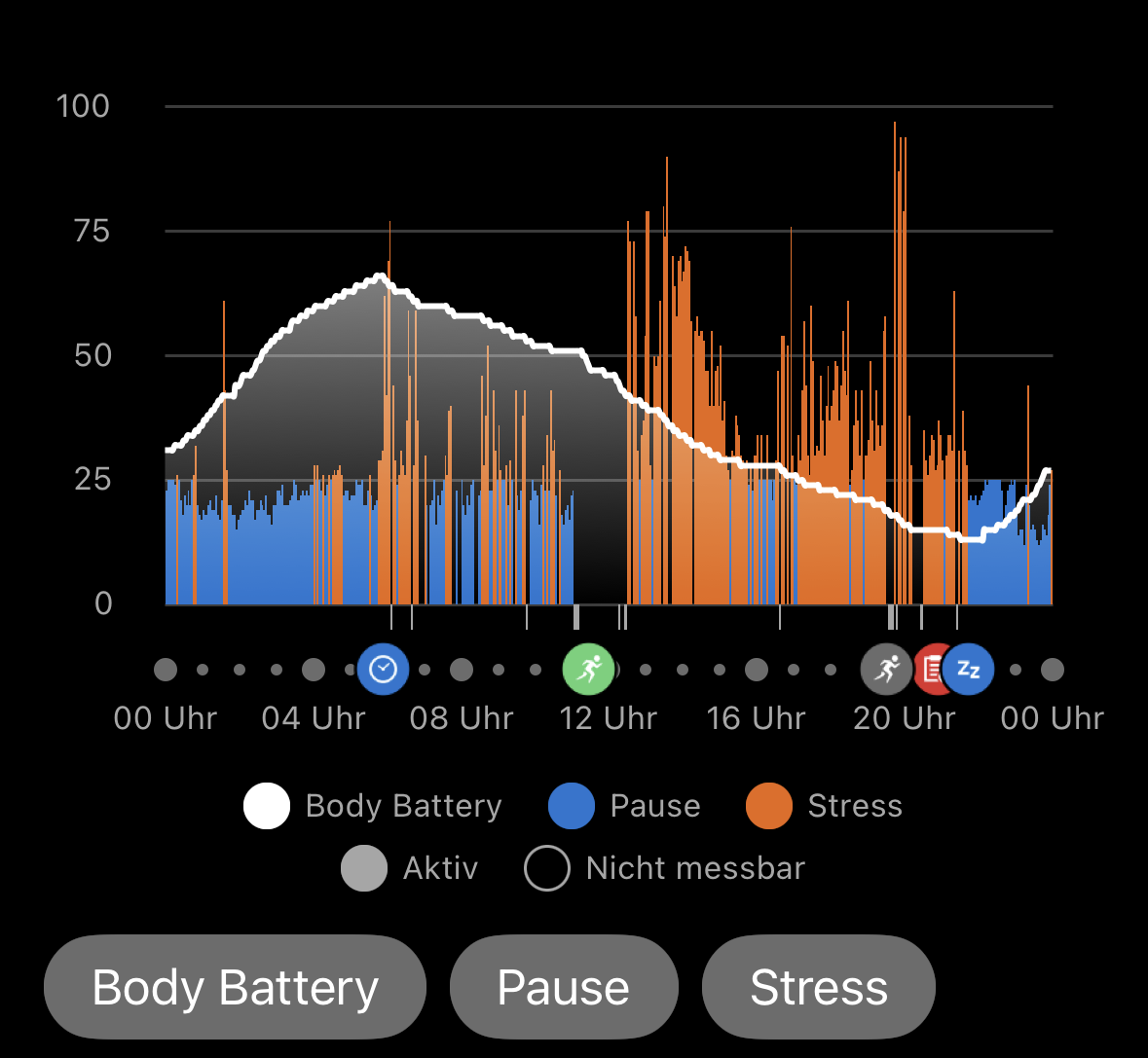
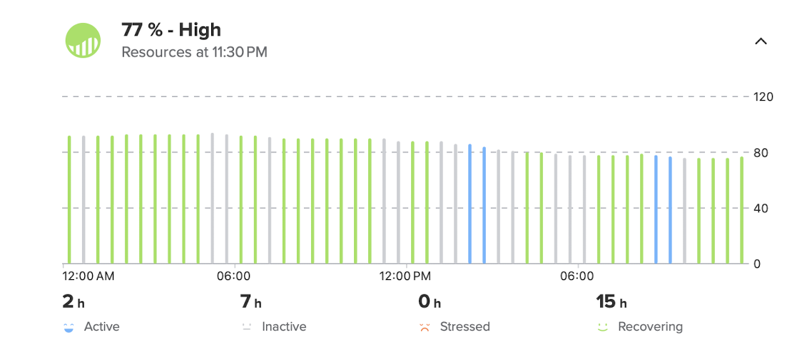
@2b2bff Here are my resources while my body fought Covid (a few weeks ago) and I had fever:
I wonder why I didn’t go for a run?
By the way, why does the graph vertical scale goes to 120?
Suunto: Ambit, Ambit 3 Peak, 9 Baro, Race S, Race Ti, Vertical 2 Ti
Garmin: Forerunner 210, Forerunner 610, Fenix 6X, Fenix 7X Ti -
@sky-runner
 okay
okay -
@sky-runner said in Resources used to be better:
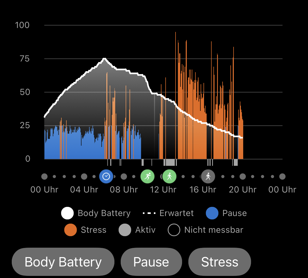
By the way, why does the graph vertical scale goes to 120?
Because it looks better that way. If it would only go to 100, it would look rather compressed. But it is not helpful that the graph doesn’t scale the same all the time, but sometimes up to 90 or so, if your resources are low enough…
Suunto Race S
Garmin Epix Pro -
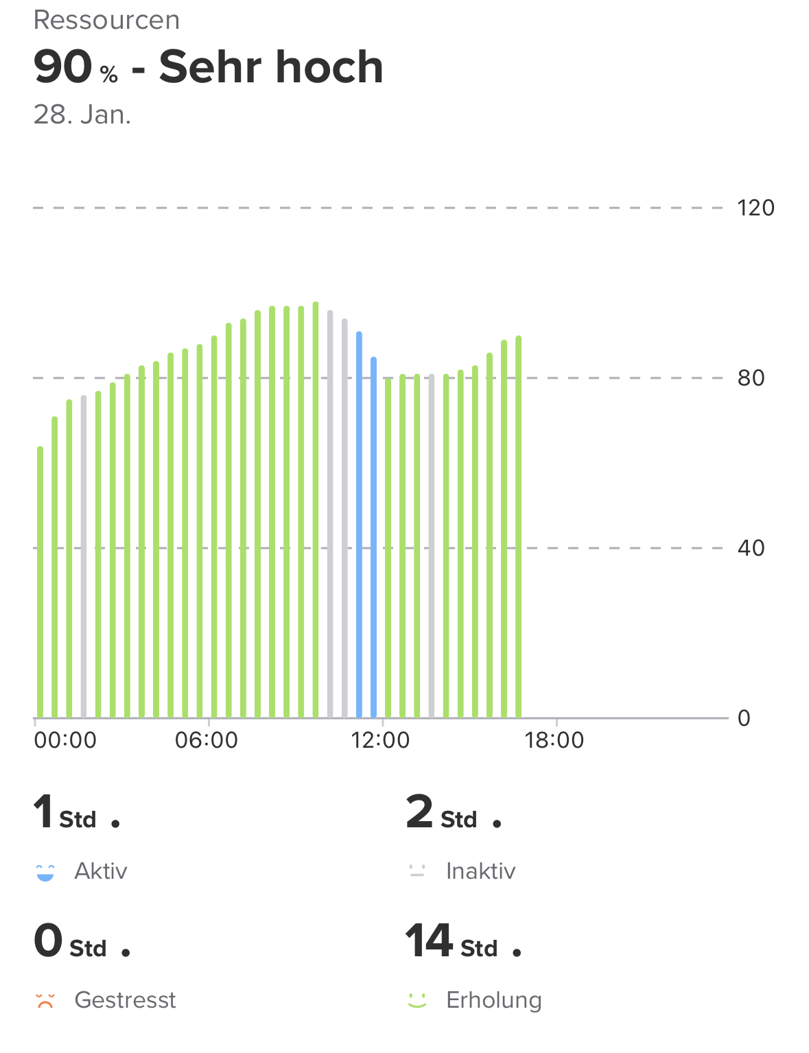
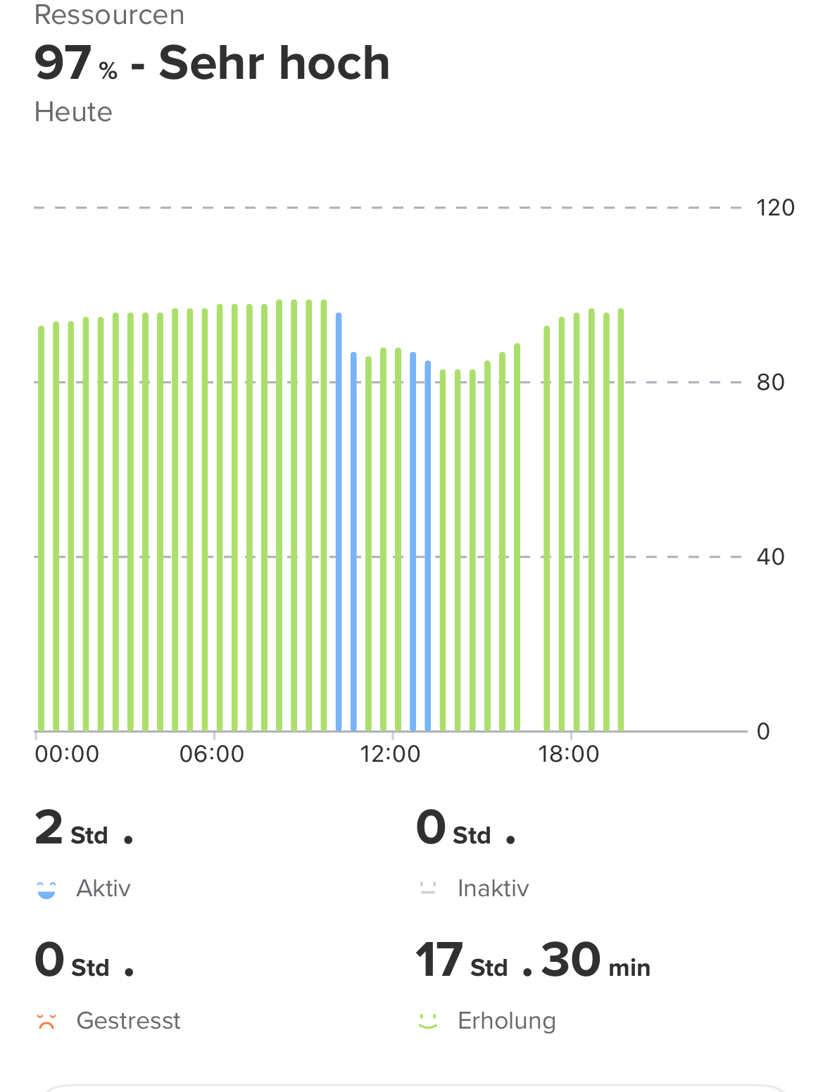
The resources are an interesting topic.
I experienced some Changes since january for resources. I think around the time from the q4
Update. Before the Update over Night the resources recharged to around 90% . Now it get only to about 45-55% over night. In the Evening around 10% .And that with enough sleep, Good sleep quality and Good HRV.
For example yesterday it was down at 12 am to around 10% and stayed there the whole day. in the the sleep it got to around 50%. this Morning at 7:30 am o started my day and around 9:30 am resources Are down to 20%. No Sport, only breakfast and driving to the baker
That are my Experiences in a nutshell this january with resources.
-
@sky-runner don’t know if you are on iOS or Android. I’m on Android and the scale of the plot goes always from 0 to 100 in my case (not been always like that, I think it was introduced in a recent app update)
Suunto Race 1 and SuuntoApp on Android 13.
-
@SergioB said in Resources used to be better:
I’m on Android and the scale of the plot goes always from 0 to 100 in my case (not been always like that, I think it was introduced in a recent app update)
Okay, that’s an improvement. Hopefully it will come to iOS as well…
-
I have been super surprised how similar my Garmin and Suunto have been in this area. The Training Readiness and Recovery have been a few points from one another in the am and the Body Battery and Resources have stayed a couple points from one another during the day on my Epix Pro 51mm and my Vertical 1. I had not paid it as much attention before, but in the last month they have been step in step for me.
-
@2b2bff said in Resources used to be better:
Because it looks better that way. If it would only go to 100, it would look rather compressed.
No, it is actually more compressed when the scale goes to 120. If the scale went to 100, it would be more stretched out vertically. As a thought experiment, imagine the scale going to 1000 while keeping the vertical size of the graph the same - would that make the graph less compressed as you say?
And if the concern is having some space on the top of the graph, that can be achieved by having some margins above the graph rather than by having a wasted space inside the graph.
-
@SergioB said in Resources used to be better:
I’m on Android and the scale of the plot goes always from 0 to 100 in my case (not been always like that, I think it was introduced in a recent app update)
Indeed, on Android it goes to 100. My screenshot was taken on MacBook running iOS app.
-
@sky-runner I’m sorry, I didn’t mean the graph would look compressed, rather the complete UI would, as it would reduce the whitespace below the headline. If you look at the Android representation, you have a 100 line, but whitespace over the line. TBH I think it looks better with the 120 line and the whitespace. My problem is that the range is shifting around on iOS…
-
Hi there, mine race s have problem with the reading also as example resources before restarting the watch 51% but after restarting the resources become 70% and never change.
-
@LUIS-RAZORMAX 70% after restart is normal. It is the baseline the Watch assumes until it gets different data.
I found that it seems to matter how I wear my watch. If I wear it too tight, it won’t register any changes. Maybe because of the watch is held in a different spot? If I wear it more loose it works better and actually declines.