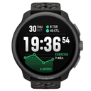
New stupidly ugly watch face
-

Possibly the worst one so far. Just spotted for my Run 2. Has it been there the whole time or was this just added?
Suunto really do themselves as disfavor writing this cringe slop copy.
-
Ouh…

I hope and waiting for Run2 default watchface on Race/Vertical models.
-
@GratefulDeadpan I agree… it looks terrible lol. This was for a sponsored athlete too lmao… wonder what he thinks
Suunto:
Race 2 TiOther Brands:
Fenix 8 Pro
Apex 4 -
oh God, ugly

-
Oh 🤮🤮🤮🤮🤮🤮
Windows Paint?
-
@strain oh yes

-
@strain I bet he’s stoked that he can just glance at his watch and be reminded of all the miles that shaped him across everyday runs on familiar streets to the start lines of major marathons whilst also be reminded to bring his signature sunglasses.
-
Different people have different tastes.
-
Man, that’s tough to watch. Unfortunately, times are changing, and most of the money is in street running and cool running clubs.
-
I mean, it’s a choice … we don’t have to use it if we don’t like it, right? But still… daaaaaaamn that’s one ugly watchface

-
Good thing we don’t have to use it, but damn indeed, what a waste
-
I know we should not discuss other’s taste, but this is another “waste of memory slot in watch”. Who needs such a crap? There is completely no added value, no usefull data.
-
@pacuro it does not use any space in the watch if you do not install it from the app.
And also regarding the amount of data, taste varies. -
it does not use any space in the watch if you do not install it from the app.
Yes, I know it goes this way. “Waste of memory slot” was metaphor.
And also regarding the amount of data, taste varies.
Taste is about how it looks. Poor amount of data fields with tiny font is usability - we saw this before, and before, and before. Another dragon/christmas tree/lion/whale/shark/mountain. When it comes to use it to get more data without diving into menu, it just fails. That is why it is just another ordinary watch face. Someone there spends lot of time and resources to prepare something we saw before. What is the point?
-
it does not use any space in the watch if you do not install it from the app.
Yes, I know it goes this way. “Waste of memory slot” was metaphor.
And also regarding the amount of data, taste varies.
Taste is about how it looks. Poor amount of data fields with tiny font is usability - we saw this before, and before, and before. Another dragon/christmas tree/lion/whale/shark/mountain. When it comes to use it to get more data without diving into menu, it just fails. That is why it is just another ordinary watch face. Someone there spends lot of time and resources to prepare something we saw before. What is the point?
the point is, that someone is liking and using it.
Some people wear watches with leather or metal straps, some like festive watch faces.
You don’t I understand this.
I personally know someone who loves to have the moon watchface just for it’s looks.
Not data needed on the watch face for her.So the point is, that there’s different people with different needs.
-
@Egika to your point, some road runners like me love the new watch face, celebrating the 2nd fastest American in the marathon ever , with his iconic glasses 🥸







Hello! It looks like you're interested in this conversation, but you don't have an account yet.
Getting fed up of having to scroll through the same posts each visit? When you register for an account, you'll always come back to exactly where you were before, and choose to be notified of new replies (either via email, or push notification). You'll also be able to save bookmarks and upvote posts to show your appreciation to other community members.
With your input, this post could be even better 💗
Register Login