Navigation arrows on the map - can this be improved (see the photo)?
-
If the route is complex and includes multiple different loops of out-and-back sections it becomes difficult to figure out which way to go by looking at the map.
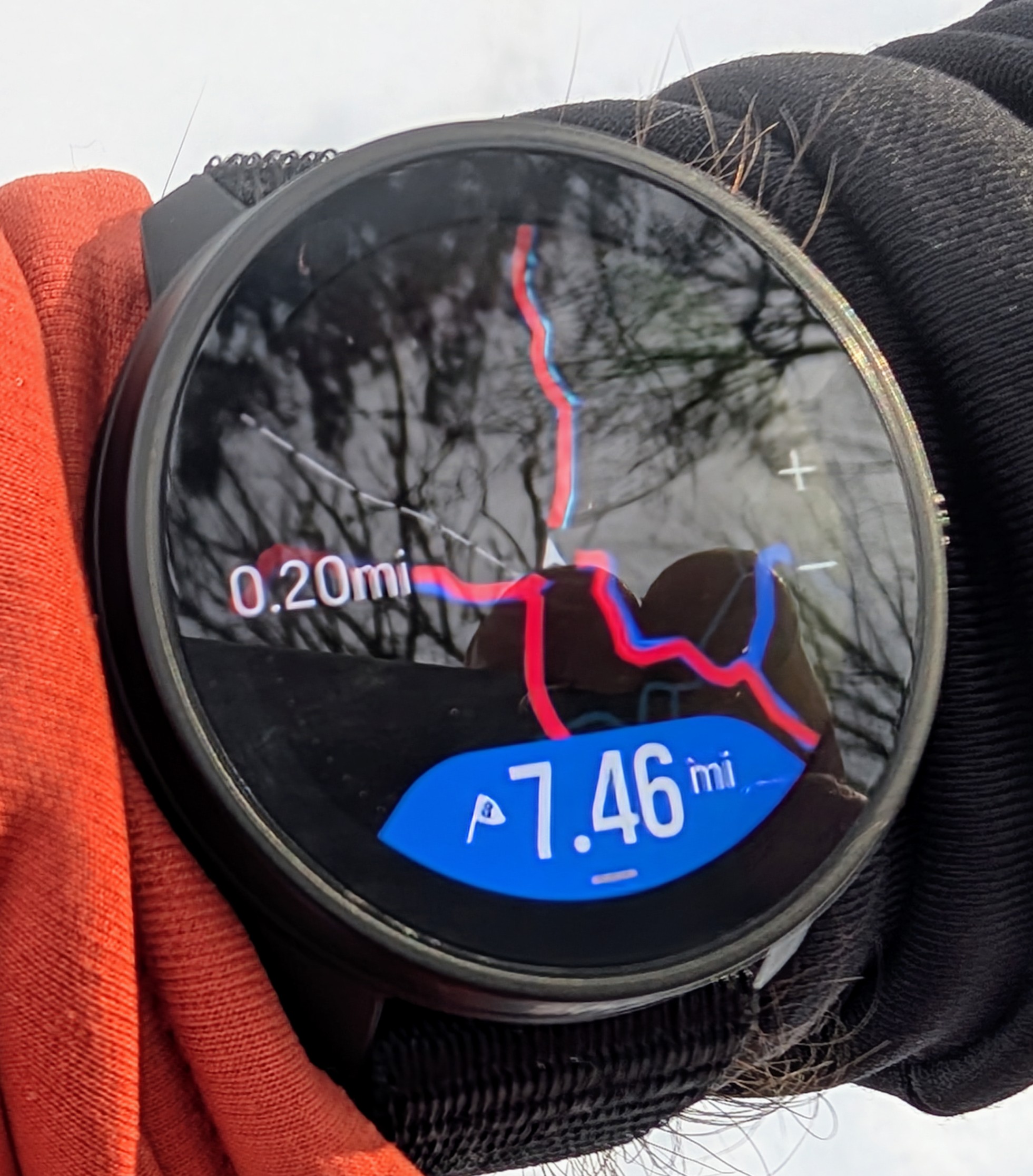
Which of the 4 ways should I go? It is nearly impossible to tell by glancing at the watch. If I take a more careful look I can see the light blue arrows behind the red breadcrumbs track, but it is hard to see.
Perhaps this could be improved. Perhaps the blue arrows should be rendered on top of everything else.
Any thoughts or comments about this?
Suunto: Ambit, Ambit 3 Peak, 9 Baro, Race S, Race Ti, Vertical 2 Ti
Garmin: Forerunner 210, Forerunner 610, Fenix 6X, Fenix 7X Ti -
@sky-runner I don’t often go over my tracks but yes, that looks problematic. I will copy the photo and ask about this.
Vector/T6c/Vertical 2 Ti
-
@sky-runner I like blue arrows on top, voted!
-
I would love to have such a small arrow icon in the navigation view on my 9PP instead of this “thing” that somehow occupies 1/4 of the screen (slightly overexaggerated).
-
It’s much clearer than that on the 9PP (and the 9P and 9B before it).
Partly because the breadcrumb track is shown by a dashed white line. I’m guessing that was changed for watches with maps so it doesn’t get confused with other map elements (paths?).
But also because I’m almost certain it puts the blue route/direction line on top of the breadcrumb when you loop back. Though I don’t do looped courses that often, so I’d need to check to be sure. -
@MKPotts I get it that the interface was rewritten because of maps and amoled. I’m just asking for a small arrow instead of a big blob obscuring the view

-
@Łukasz-Szmigiel
Sorry, my reply was meant to be directly to the OP’s complaint about the breadcrumb track obscuring the planned route - which isn’t a problem that I’ve ever noticed on the 9PP - it looks to have been introduced as part of the maps and/or Amoled redesign.On the 9PP position arrow specifically, I like it as it is. If it was much smaller I’d find it hard to use as a direction indicator to make sure I’m facing the same way as the watch, which is very helpful at path junctions. The one in the picture on the race S looks too small for me, but maybe that’s ok with a larger, brighter, higher resolution screen.
-
@MKPotts I don’t think the OP was complaining about the size of the current location arrow but more that the path direction arrows are now buried under the red “track” line
-
@stromdiddily
I know. That’s what my first reply was about - saying that it seems to be specific to the new watches (or the Race S), because that isn’t the case in the 9PP or the 9P/9B before, so should be something Suunto can fix.Then @Łukasz-Szmigiel replied to me about the position arrow size on the 9PP, which I hadn’t made any previous comment about.
I seem to be causing confusion so will just say that I completely agree that the breadcrumb covering the planned route as shown on the race S is a problem and should be corrected.
-
@sky-runner Yes, fully agree. On-map directional arrow should always be on top.
Similarly, if you have turn notifications active for a route that crosses over itself, the turn symbols that appear on the map do not update when crossing back. So if you’ve got an out and back route with a right turn on the way out, it will still show a right arrow on the way back when it should be a left. Presumably the correct left arrow symbol is buried behind the right arrow. (Hard one to explain. I’ll see if I can get a picture for reference.)
-
@MKPotts rereading your posts, your position is clear now. It is I causing confusion
-
@MKPotts said in Navigation arrows on the map - can this be improved (see the photo)?:
But also because I’m almost certain it puts the blue route/direction line on top of the breadcrumb when you loop back. Though I don’t do looped courses that often, so I’d need to check to be sure.
In this particular case I had two different loops with a little bit of overlap. Some of these paths were covered once and some twice. I ran into a similar issue when doing an out-and back routes.
To clarify another comment, the main complaint here is that the route gets buried under the red track, and it is worse when going over the same route more than once.
By the way, I wanted to mention that otherwise I really like the high contrast map rendering pictured in my post. It has just enough level of details in most cases. However, I’d prefer trails to be a bit thicker.
-
@Brad_Olwin said in Navigation arrows on the map - can this be improved (see the photo)?:
@sky-runner I don’t often go over my tracks but yes, that looks problematic. I will copy the photo and ask about this
Thank you, Brad!
-
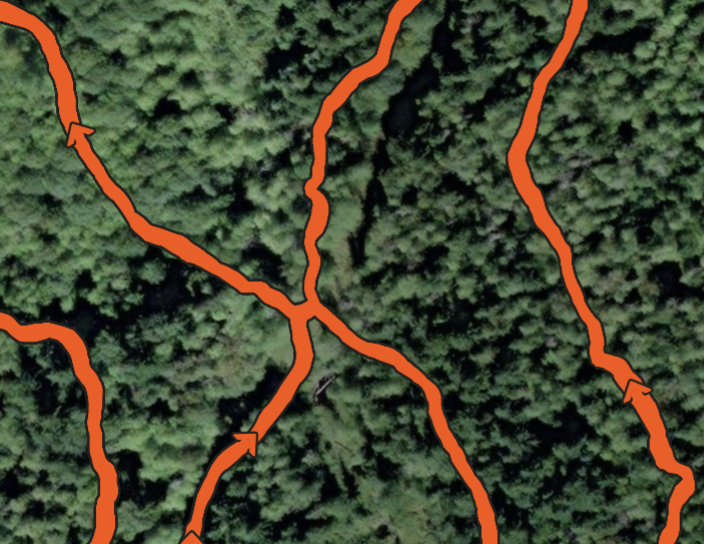
I wanted to add one more example of misleading navigation guidance. In this case not only the blue arrows are rendered behind the track but also the watch fails to recognize that I moved forward and still renders the blue arrow behind of where I am.
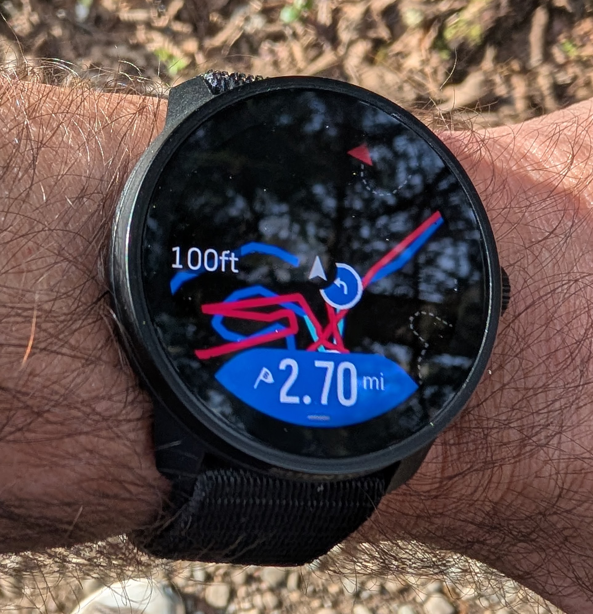
This was at a crossroads of trails where I tried to figure out where to go next, and the guidance provided by the watch was misleading. In reality I was supposed to continue on that dark blue with no red part of the track.
Also note the poor accuracy of following the trail. As far as I can tell the map was accurate but the tracking was not. This was using dual-band GNSS.
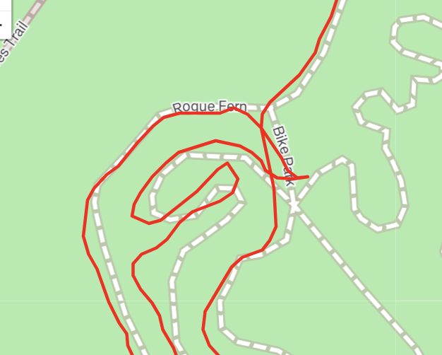
Also, what it actually has recorded looks different from what was displayed on the watch:
Perhaps the watch should not simplify the track at a high zoom level to help with navigation. There are situations when this might be confusing.
-
One year later this issue still exists. I did a 50K trail race today that consisted of 3 laps. The arrows were absolutely invisible behind several tracks from multiple laps.
There were at least a couple of tricky 4 way trail junctions on the race course where the arrows would be helpful, if they were visible.
I didn’t have time to take a picture of my watch because I was racing but here are fragments from the recorded activity: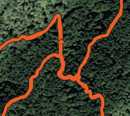
Please give this simple fix a priority!