New watch faces 2025 | Q2 +2
-
@safari I really like the lunar, have been using that for a month on all watches, and using that on my own watch since yesterday
-
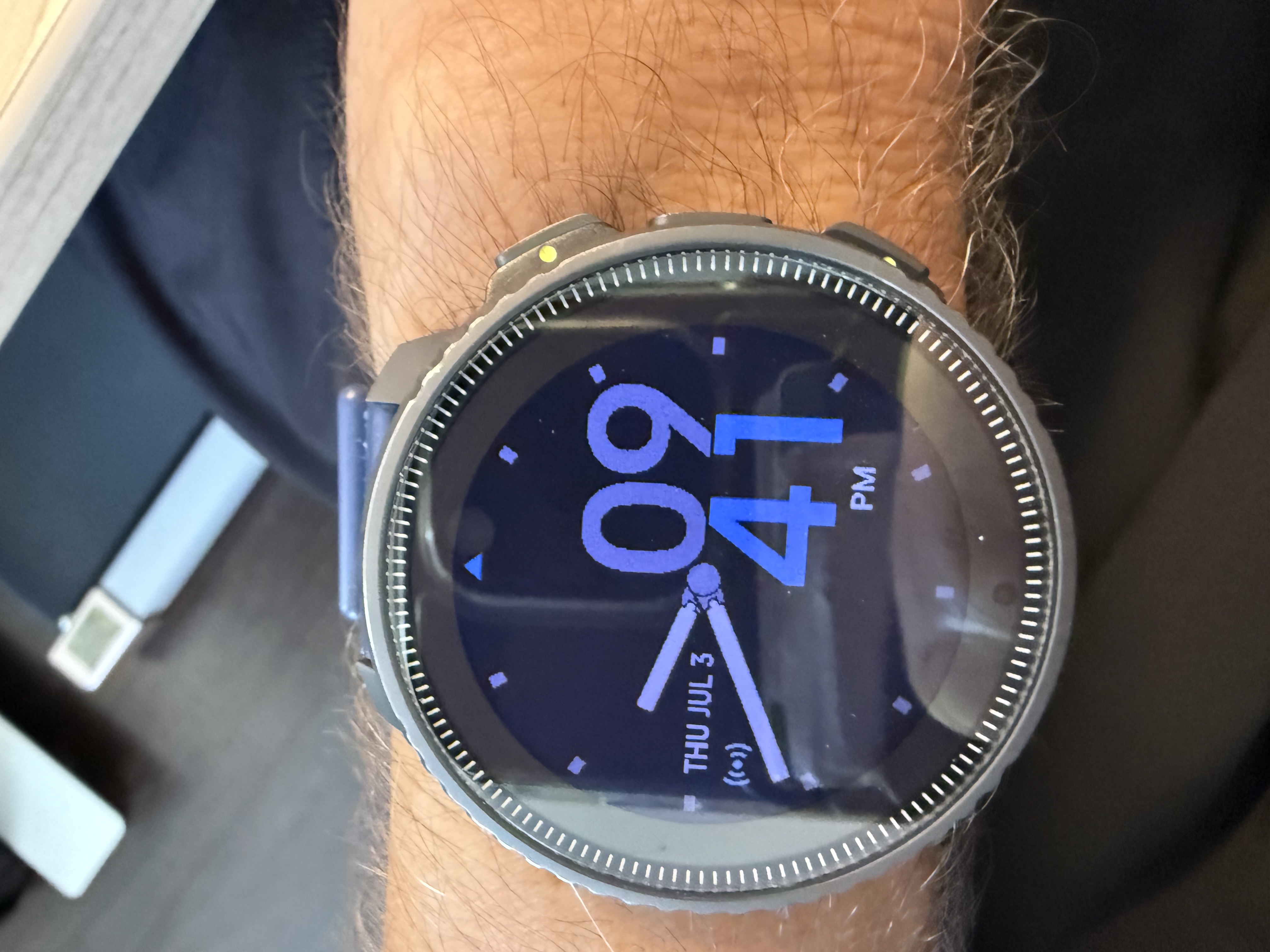
@isazi Yes, I’m not saying anything for Lunar. It goes well with a suit. We just tested it on another watch that it looks really good on AMOLED watches. But the other one didn’t look good on MIP, and there’s also an “AM” “PM” error.
-
I isazi moved this topic from Suunto Vertical on
-
@safari reported
-
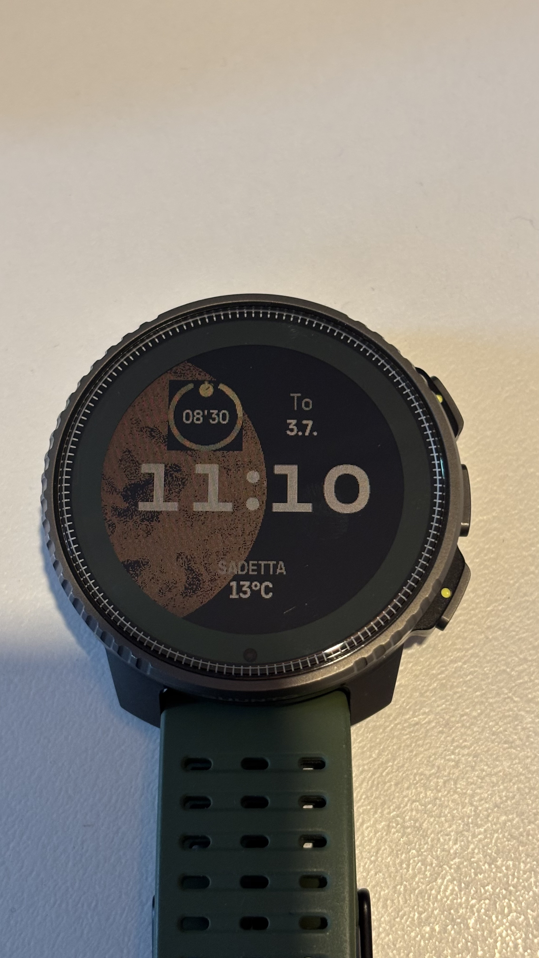
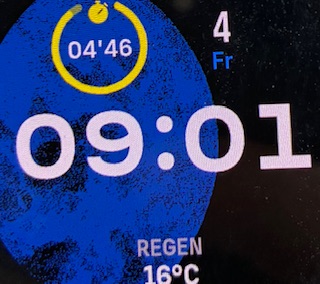
Just noticed that on Lunar WF timer will overlap the moon. Otherwise I like it.
Suunto Vertical Titanium Forest
Suunto Vertical 2 Titanium Sage -
@isazi thank you

-
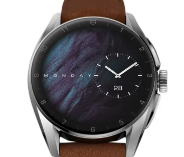
I like the Stride watch face. Could make another version—the opposite layout? A larger digital font on the left side and a smaller analog version on the right.
Example, Tag Heuer watch face below. small analog at the right side
-
@safari It’s probably a matter of preference and I don’t imagine they will distinguishing their watch faces between MIP/AMOLED screens. Having said that, after some testing of the new watchfaces I always come back to the good-old Outdoor layout which works very well on all my MIP Suunto devices.
-
@kriskus hello
i definitely agree.
i do the same. today i tested “lunar” all day long.
but i prefer “classic analog” in classic and “Athletics” in sports and mountains.
and the shape of suunto that i like is also with classic dress and sports.
this is not in garmin for example -
Just noticed the same issue on my Race.
 Bild Link)
By the way. Didn‘t expect to like the Lunar Watch Face, but I do.
t6, Ambit, Traverse, Spartan Sport WHR, Suunto 7 (2 month! then sold it!, loved the watch but UI was pointless),Suunto 9, Garmin Fenix 6pro, Suunto 9 Peak Ti (it‘s a beauty), Garmin Epix Gen2, Suunto Race Ti
Core Brushed Steel (Most beautiful watch ever)
-
@HoBart I also reported this one
-
I like the Stride a lot and think it actually looks great on the Vertical MIPS screen! Love the simplicity.
-
@HoBart can confirm the same issue.
-
Just pure curiosity.
Does the lunar Watch Face change according to the actual Moonphase? -
@HoBart yes.
-
@Jugger already fixed as of today
-
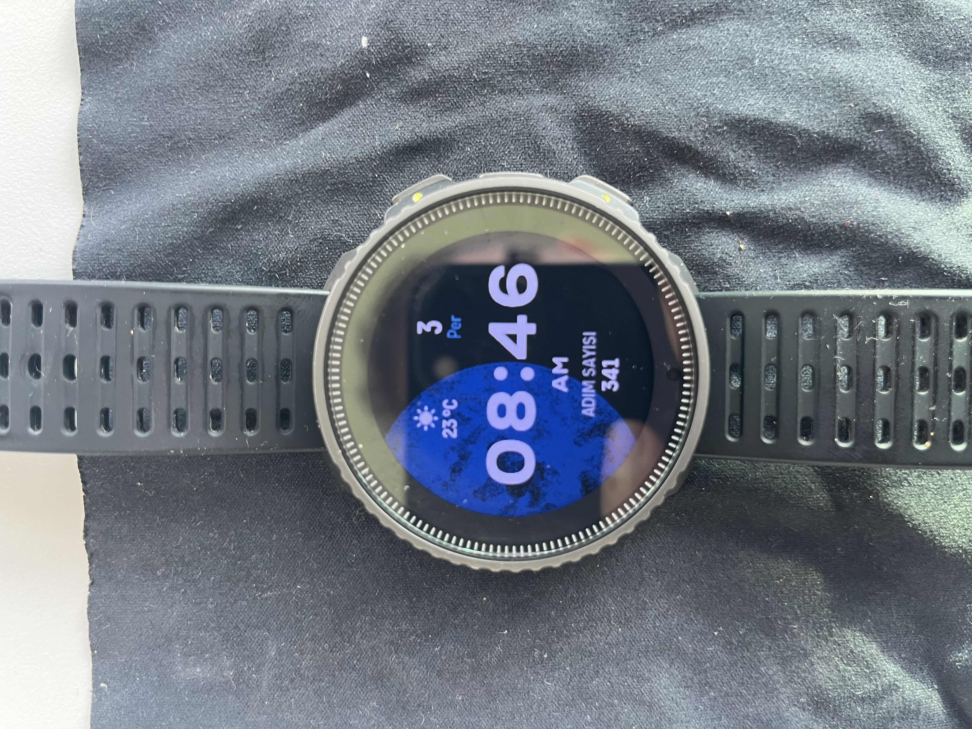
@Egika Wow, live moon phases!!! This lunar watch face will be the one to displace the whale as my favourite. I love it with the copper colour. I think Suunto can just stop developing new watch faces and focus on other stuff now
")
-
@mando haha - nice!
The white accent color imo looks best with the moon -
@Egika I criticized it at first but I started to like it.
It looks good with casual clothes.
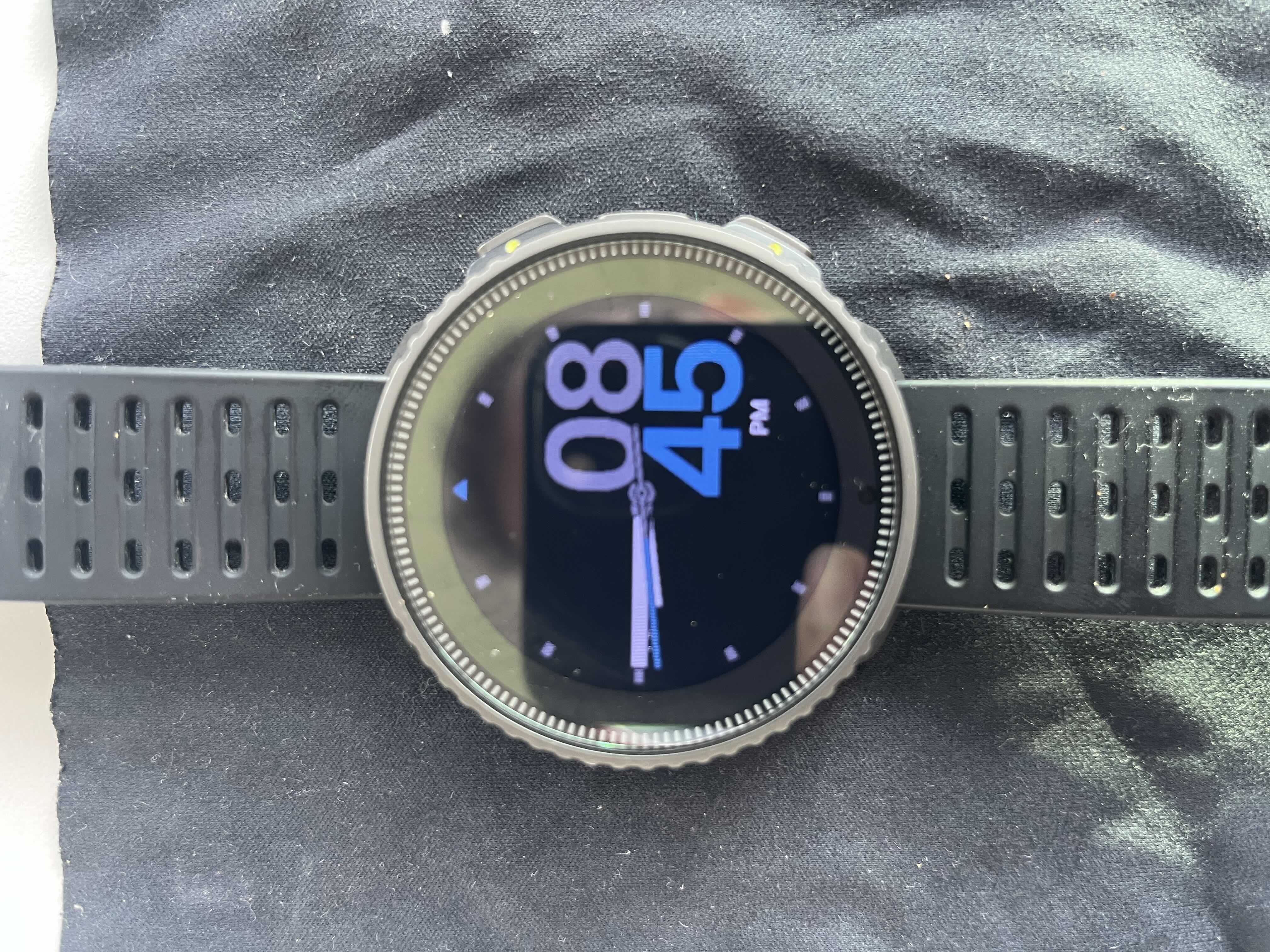
I guess the AM PM distinction in “Stride” has not been corrected. It’s not that important. -
@safari Actually, I’ve also kept the Lunar watchface longer than expected and will keep using it. The ‘live’ background is great.
-
When using Lunar watchface on my Race I can see screen flickering on Always On Display. Is this normal?