Map Rendering and Trail Visibility after Software Update 2.43.8/.12
-
@duffman19 said in Map Rendering and Trail Visibility after Software Update 2.43.8/.12:
I 100% agree that trails should always be high contrast, either completely white or completely black, no gray. That’s why I use the “Dark” theme which has trails marked as white against a darker background.
Do you have Vertical? On Suunto Race or Race S, none of the map themes display trails well with a high contrast combination of colors. I think that perhaps maps are limited to the 64-color palette of colors that is available on MIP displays, and on AMOLED Suunto doesn’t take advantage of a much higher number of colors, and mapping of MIP colors to AMOLED colors seems to be poor. For example, the background of the map on the on the light theme is often green (when running in a park or a forest), which is way too vivid.
-
Light theme: trails are usually dark green on bright green, which is a fairly low contrast. I stopped using this theme after the first few tries. Also at some zoom levels (e.g. 0.2 mile) I can still see individual building outlines but no longer can see trails - what these maps are optimized for? Overall this theme looks really nice, but unfortunately it is quite useless for trail running.
-
Dark theme: trails are usually green on dark green background, which is similarly low contrast or perhaps even worse contrast, than in the light theme.
-
High contrast theme: this is what I use most of the time, but even in this case trails are grey on black, which isn’t the best possible contrast. Also, trails are similarly thin to other map themes, which makes them difficult to see at the 500ft zoom level, especially if the screen has finger smudges or if there is a sun glare. Also, I should mention, that restricting trail visibility at higher zoom levels forces me to pan the map more with my fingers, which makes the screen dirty from smudges and makes the map visibility even worse. Normally, I never pan the map, but with this recent map changes I am forced to in order to see what’s ahead!
-
Winter theme: I don’t even understand why Suunto bothered to add this theme at all because in my opinion it is completely unusable. Trails are displayed as light grey on slightly lighter shade of grey. The contrast is so low I didn’t realize that trails are displayed at all until yesterday when took a picture of my watch and enlarged it on a laptop. Maybe it is supposed to show winter trails such as backcountry ski or snowshoe trails.
-
-
@sky-runner Sorry, yes, I have a Vertical and that’s what I am referencing. I didn’t realize that the themes were that different between the two watches.
-
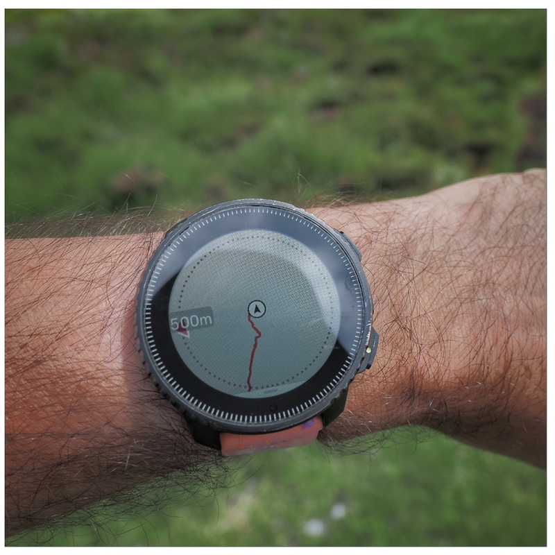
@sky-runner That dotted circle is the best feature that I have ever seen on an outdoor watch. It makes it much easier to see the distance from actual position than the small scale at the bottom on other watches. Suunto: never ever think of removing that dotted circle. Thx:)
-
@szleslie Without this dotted circle, you also know what the distance is because it is the edge of the screen.
-
@maszop Mmmm yes. You are right after all. I do not mind that circle. On the contrary, I need it.
-
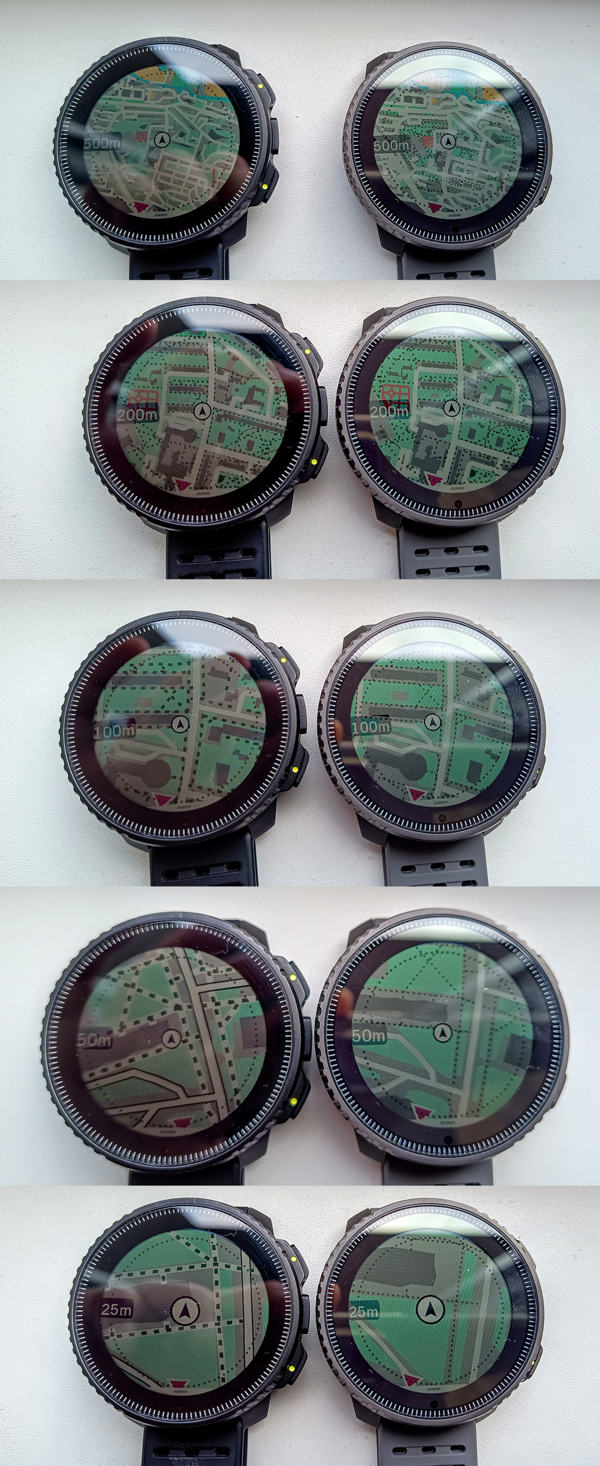
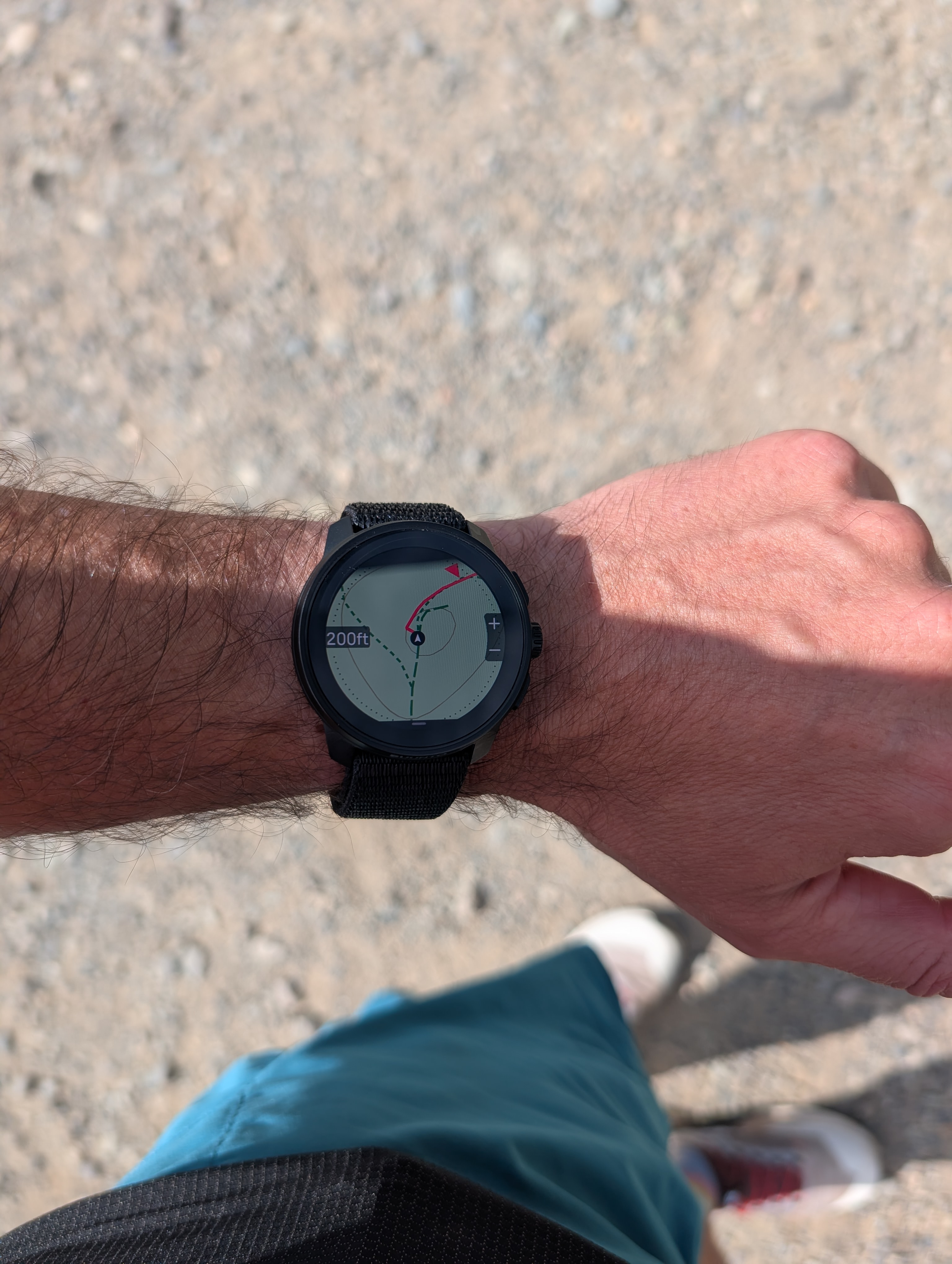
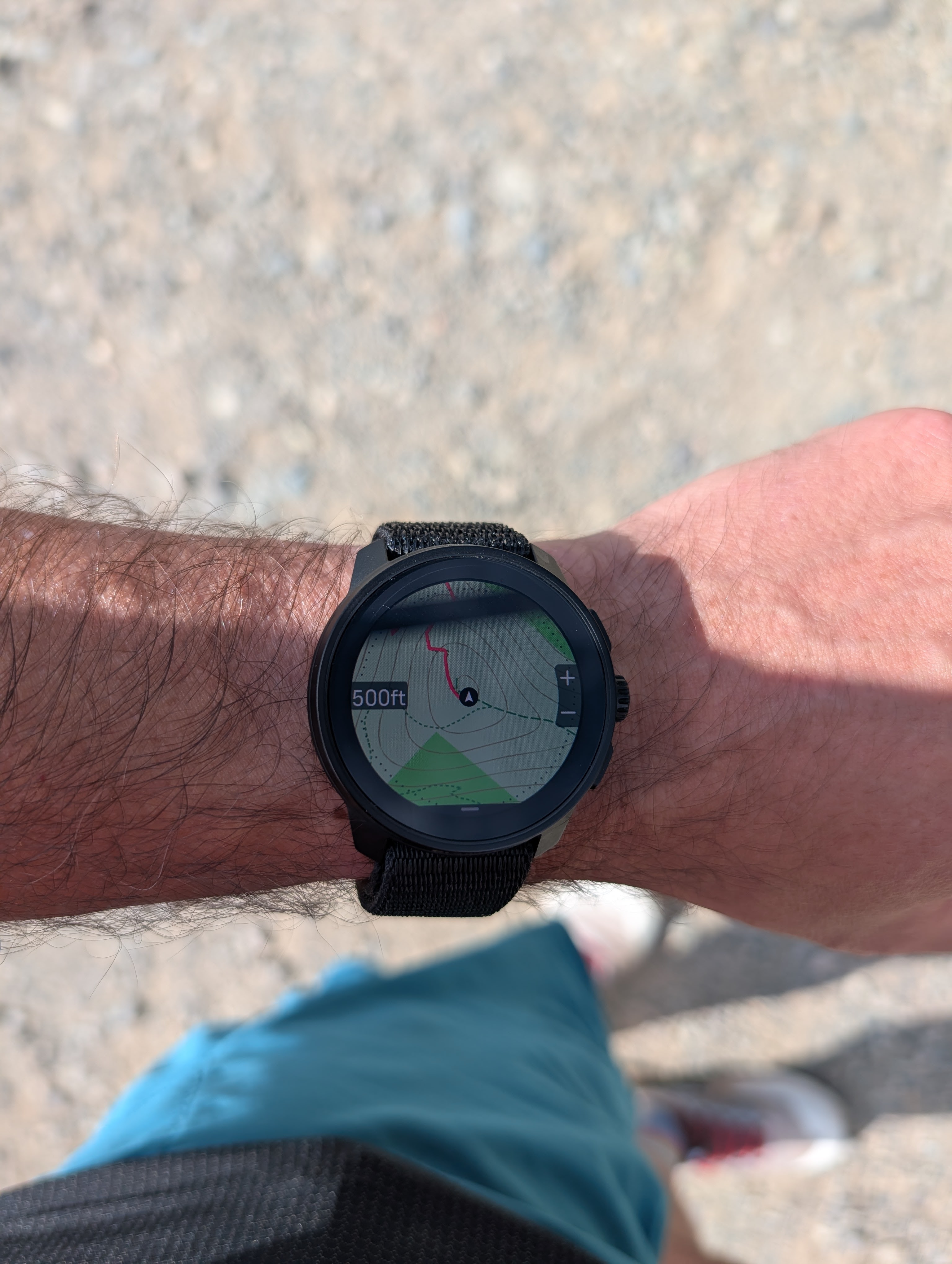
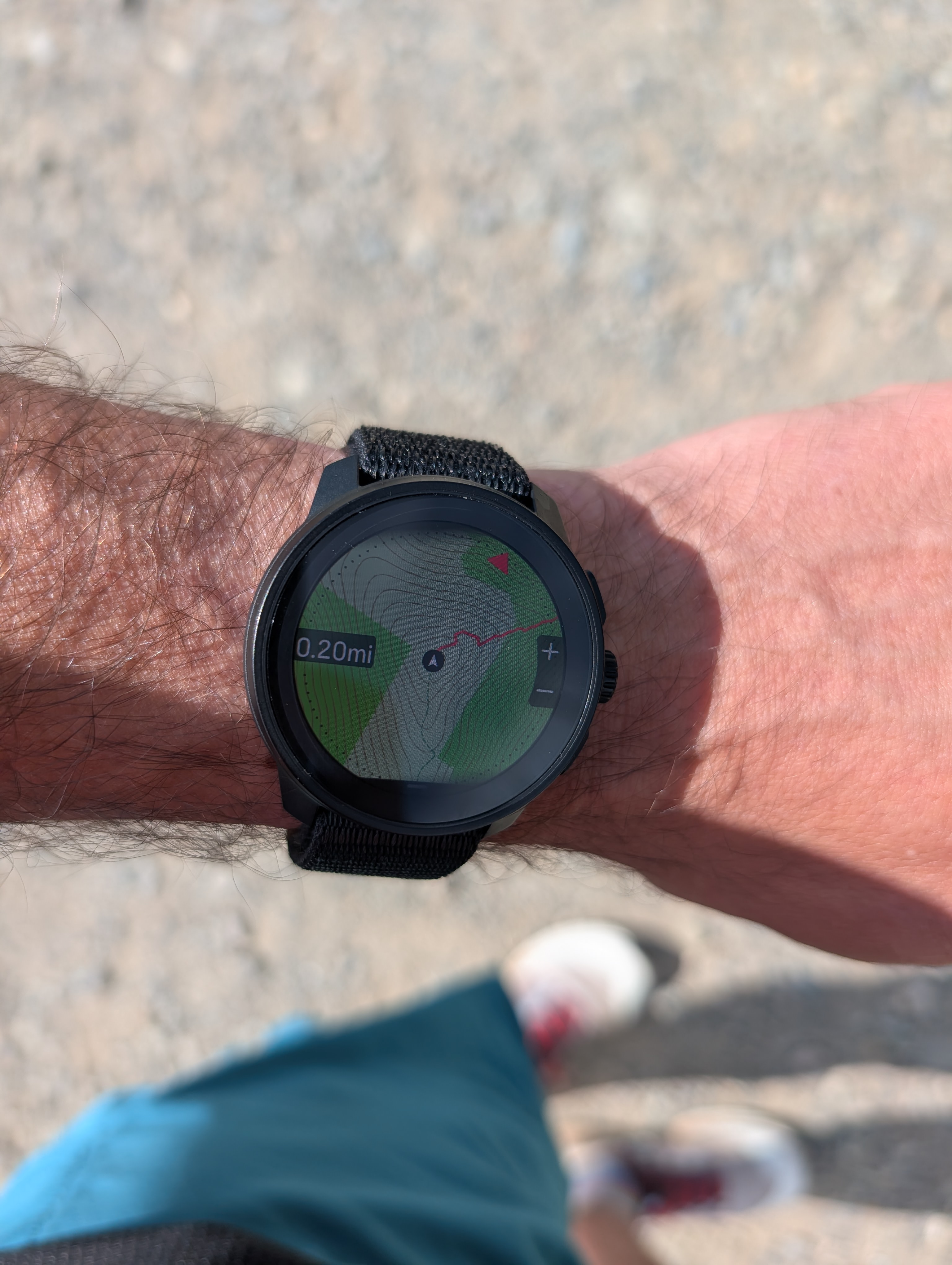
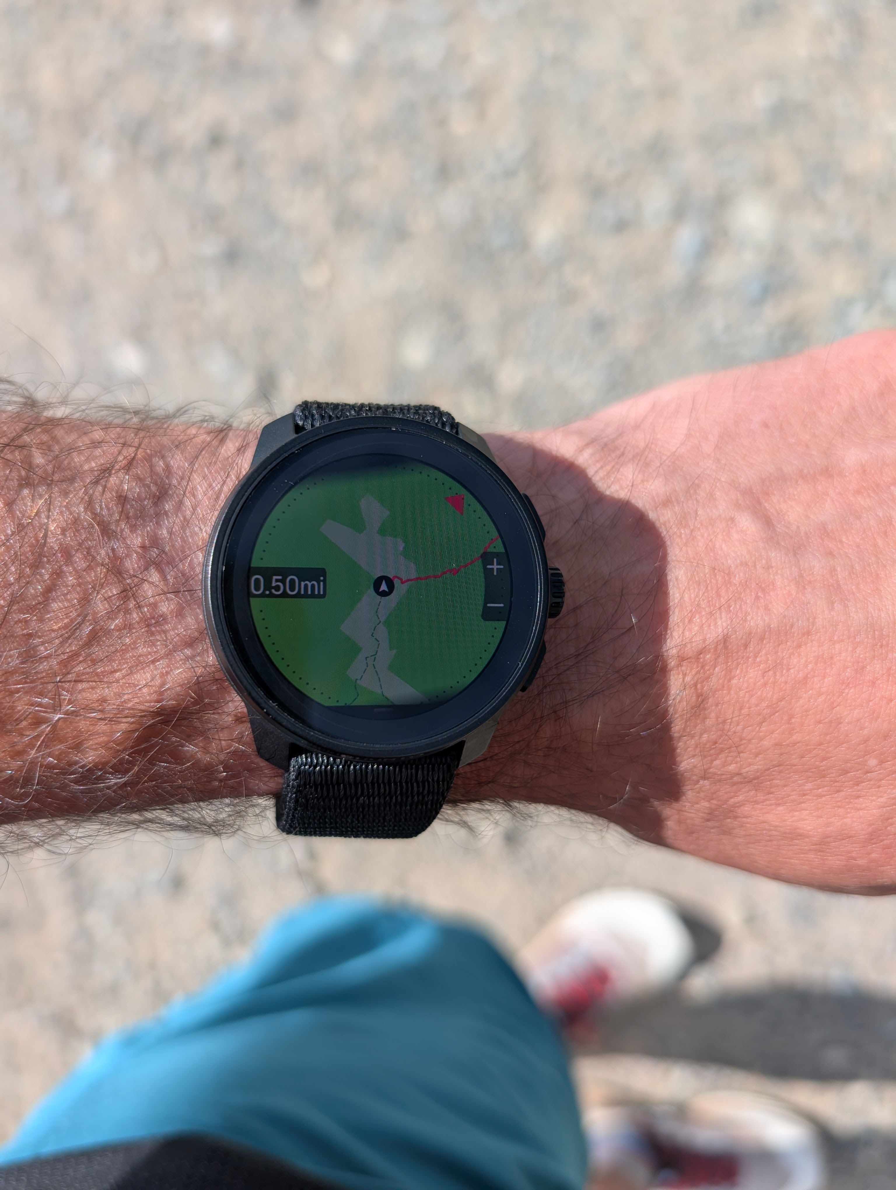
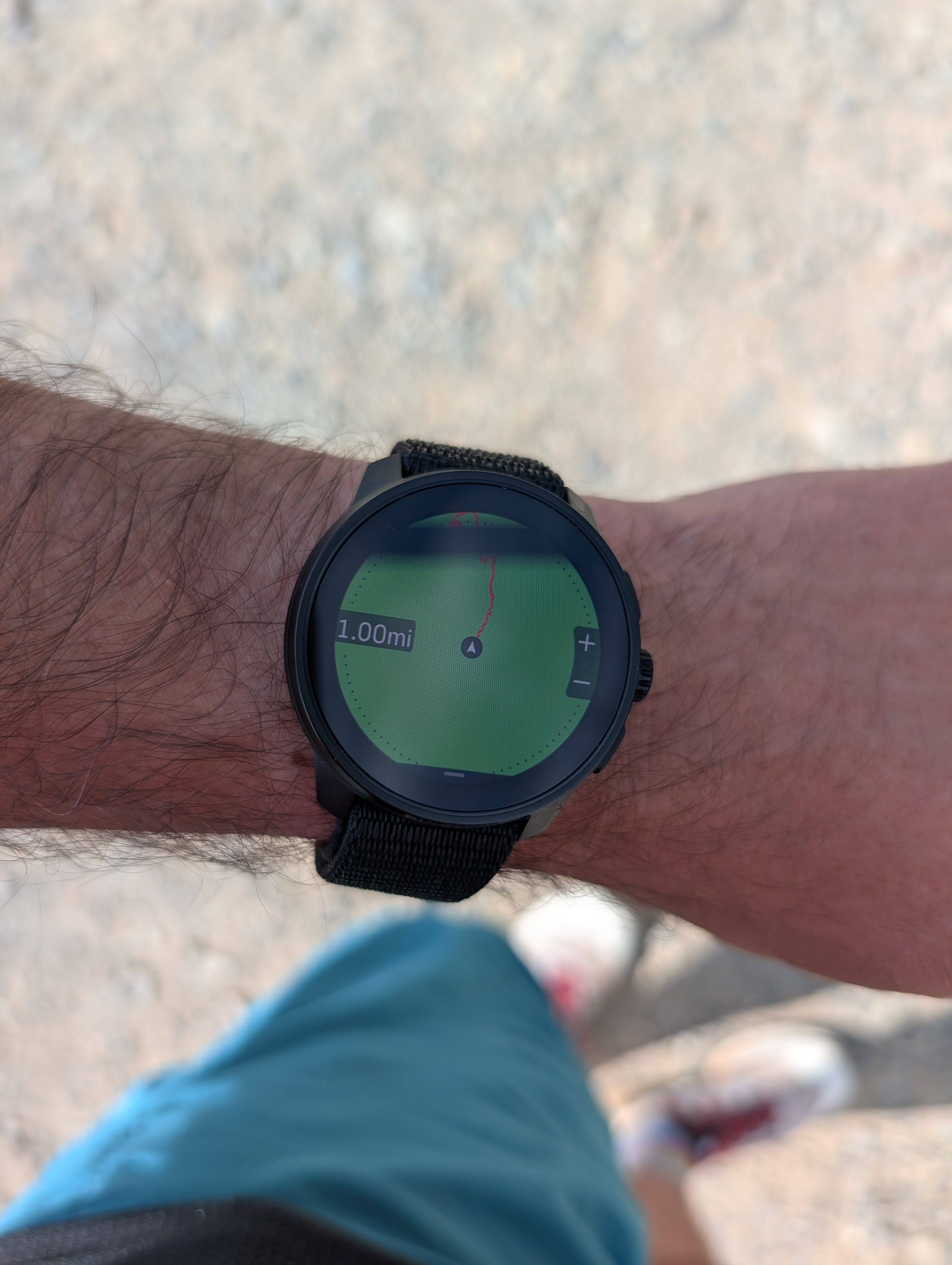
I know I am beating a dead horse, but wanted to share these pictures of map rendering on Race S at different zoom levels - this is using the Light map theme and imperial units. All pictures were taken at the same place. The reason I emphasize imperial units is that I think the situation with trail visibility is worse for users who use imperial units because of the choice of zoom levels for imperial units vs. metric units.
100 ft (=30m): This zoom level isn’t practically usable in my opinion - it is too zoomed in so it covers only 10-20 seconds of movement. The lowest level when using metric units is 50m, which is more practical.
200 ft (=60m): This should be the lowest zoom level. Trail readability is good, but this is still too much zoomed in to be usable when trail running, except in rare cases. This is how I think trails should appear in all zoom levels.
500 ft (=150m): This level (or 0.2mi) is what I’d use in most situations when I need to make frequent turns. What you can see here is that trails are quite thin and difficult to see, especially when in a forest (on the green background). The gravel service road has a bit better visibility.
0.2 mi (=320m): This is perhaps what should be the most usable zoom level as it still covers roughly 2 minutes of running from the center to edge. However, trails are no longer rendered and even the service road is hard to see.
0.5 mi (=800m): The service road is still visible but only against a lighter background. I think trails should still be visible at this level if this watch is targeted at trails runners and hikers.
1 mi (=1.6km): What’s even the point? Also, the green background color for the forest area is way too saturated, which unnecessarily reduces the map contrast (when it does show trails). 90% of my trail running involves running in forested areas, so this is the kind of background that I see on Suunto Race or Race S most of the time.
-
@sky-runner at least for Vertical you can choose 25, 50, 100, 200, 500 m and 1, 2, 5, 10 an 20 km. I find 25 m very handy e.g. while geacaching.
-
@Milan-Šádek said in Map Rendering and Trail Visibility after Software Update 2.43.8/.12:
@sky-runner at least for Vertical you can choose 25, 50, 100, 200, 500 m and 1, 2, 5, 10 an 20 km. I find 25 m very handy e.g. while geacaching.
The same for the Race and Race S, and 25m zoom is useful for me in case of consecutive forks and/or complex terrain topology. Actually, trails visibility is often challenging, unless you are following a route, since they are way thicker!