[Vertical 2, 2.53.42] Map and Navigation features are greatly improved but there are still a lot of old issues and also new bugs introduced in the latest update
-
@Joaquin said in [Vertical 2, 2.53.42] Map and Navigation features are greatly improved but there are still a lot of old issues and also new bugs introduced in the latest update:
@Stefano-M64 agree…this presentation is in Spanish for spain but It would be great to have something like this globally, as many of the complaints I sometimes see here or other forums, would be resolved.
Hi, since I found your document very useful, I took the liberty to translated it to english. It’s mostly based on automatized Google Translate function, but I had to edit some parts by myself, hope everything is correct;
-
@Stefano-M64 said in [Vertical 2, 2.53.42] Map and Navigation features are greatly improved but there are still a lot of old issues and also new bugs introduced in the latest update:
Hi, since I found your document very useful, I took the liberty to translated it to english. It’s mostly based on automatized Google Translate function, but I had to correct some parts by myself, hope everything is correct;
SUPER THANKS!!!
-
@Joaquin having such a document at the release of such a big update would be great. At least it was not available in this forum.
-
I think Suunto should do a better job themselves – precise presentation, description, and instructions. Same thing happened with the Vertical 1. For a long time, potential buyers could mostly find reviews of the very limited launch software – before the updates that turned it into a completely different watch. Quite a weird strategy.
The latest updates are potentially excellent marketing material. Particularly given the low number of new releases and the existing models on the market.
-
@maszop right.
Have you seen Janne’s extensive videos of the new features in January and then last week? -
@Gunnar full agree…we are working for the future
-
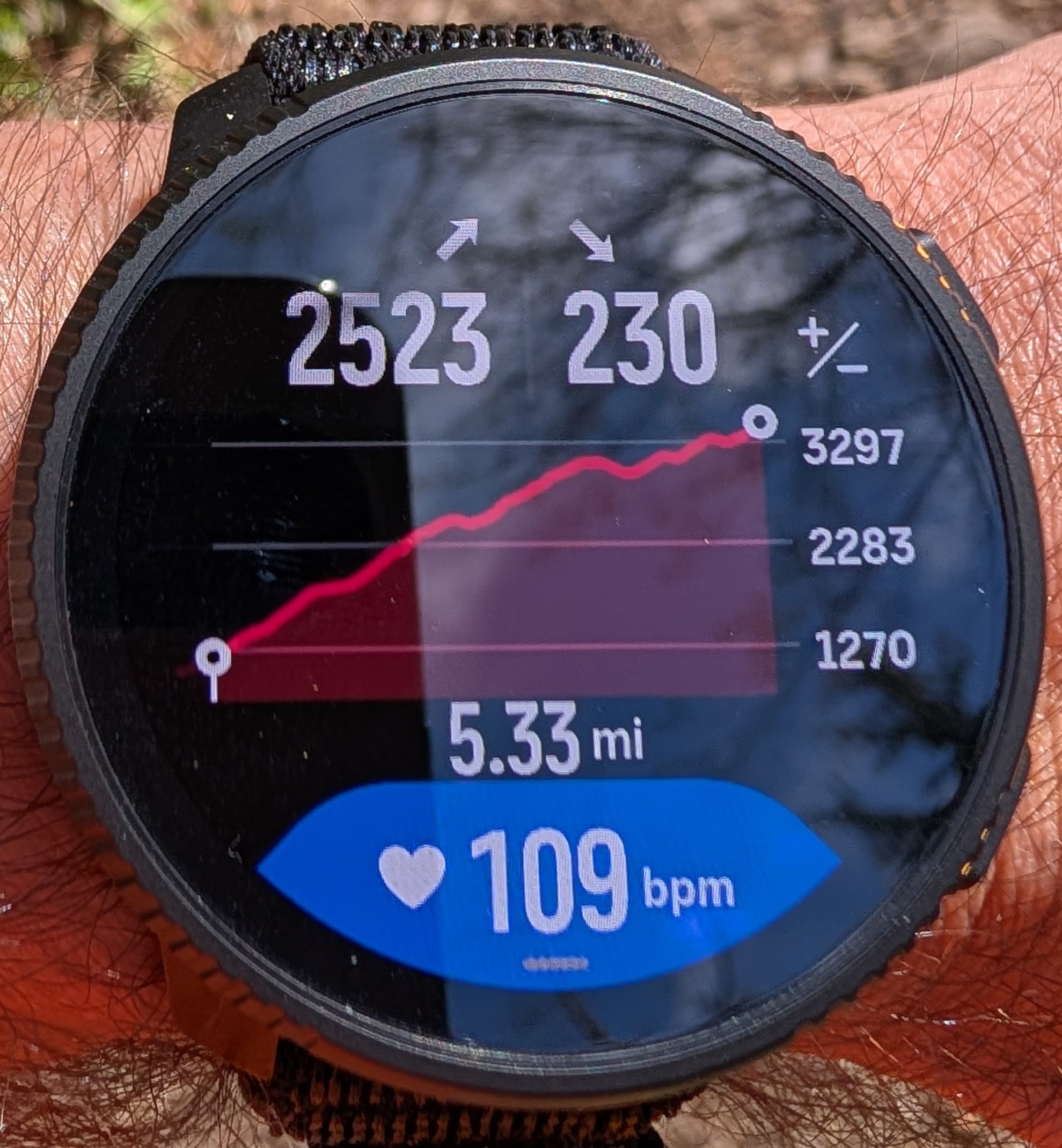
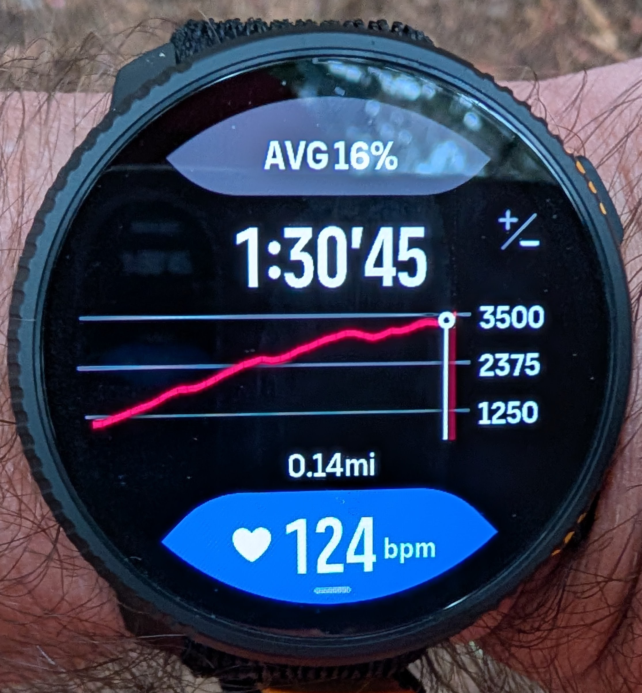
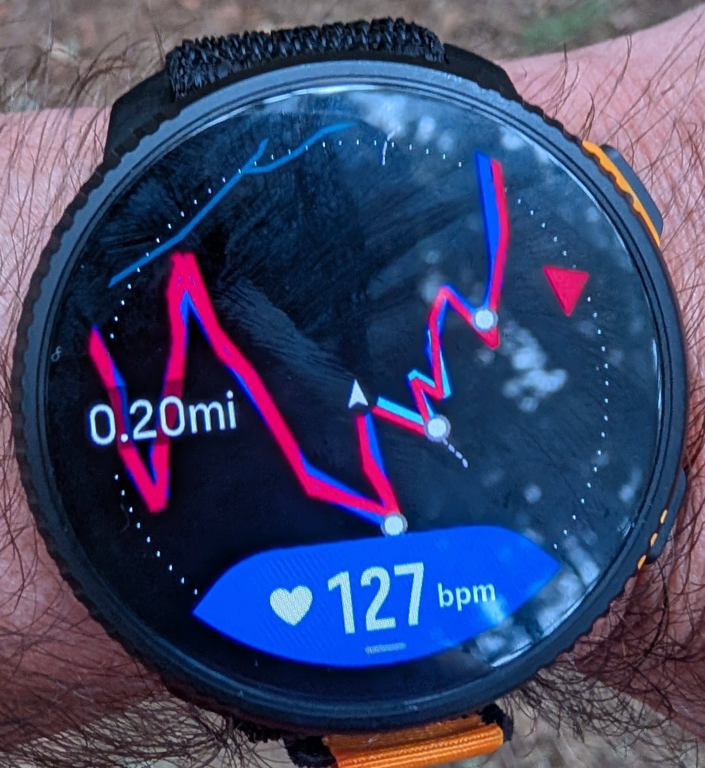
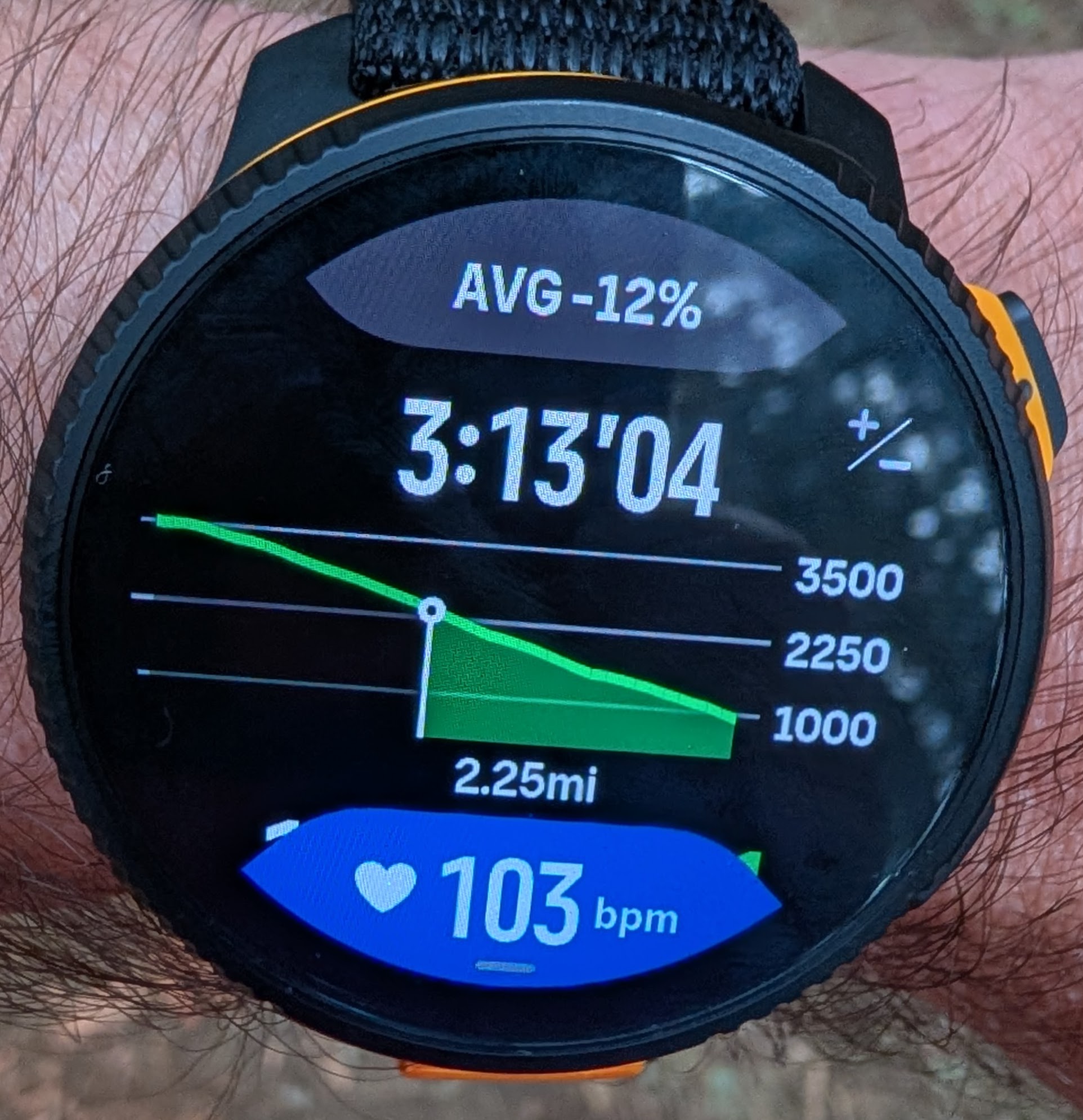
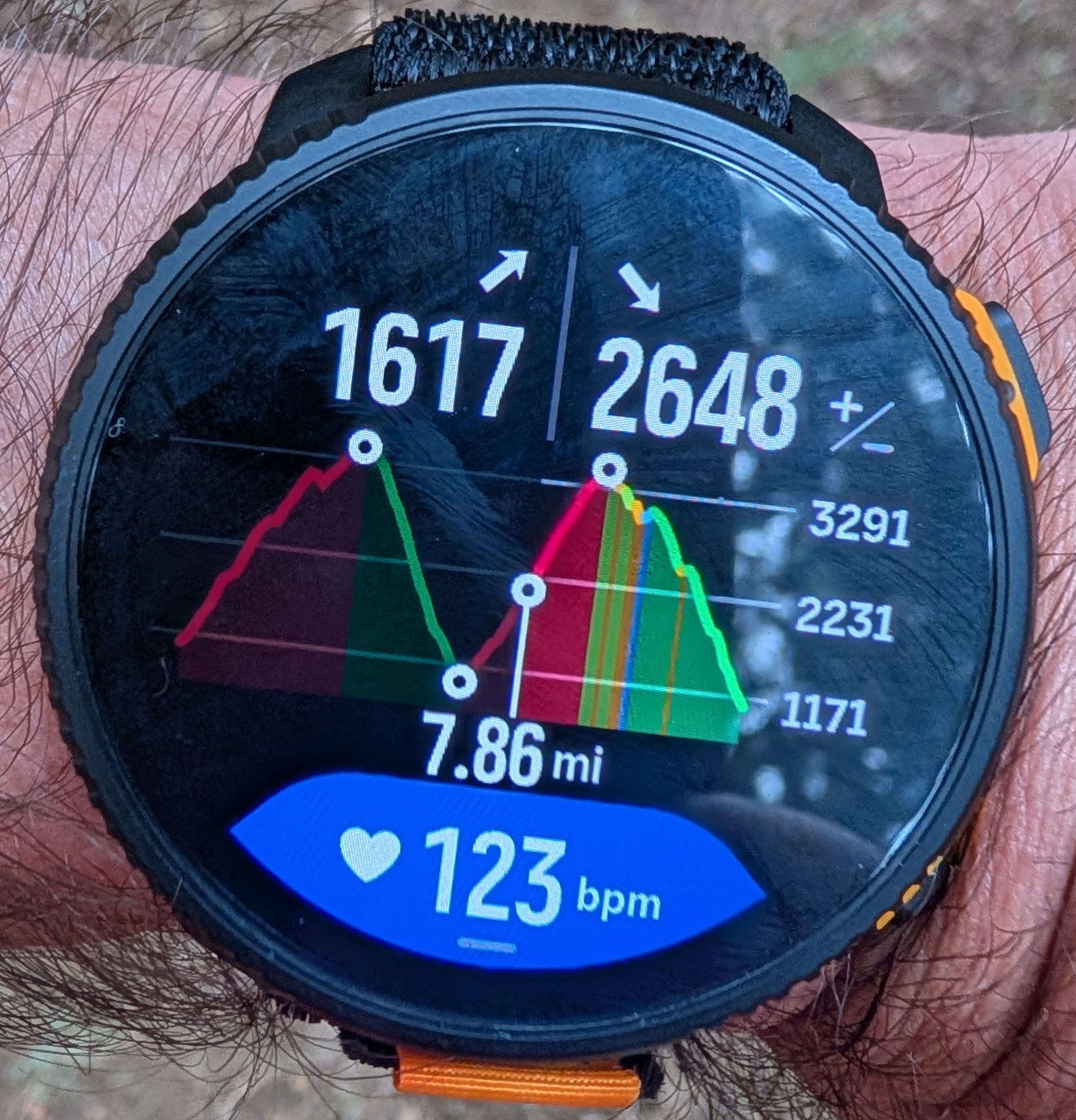
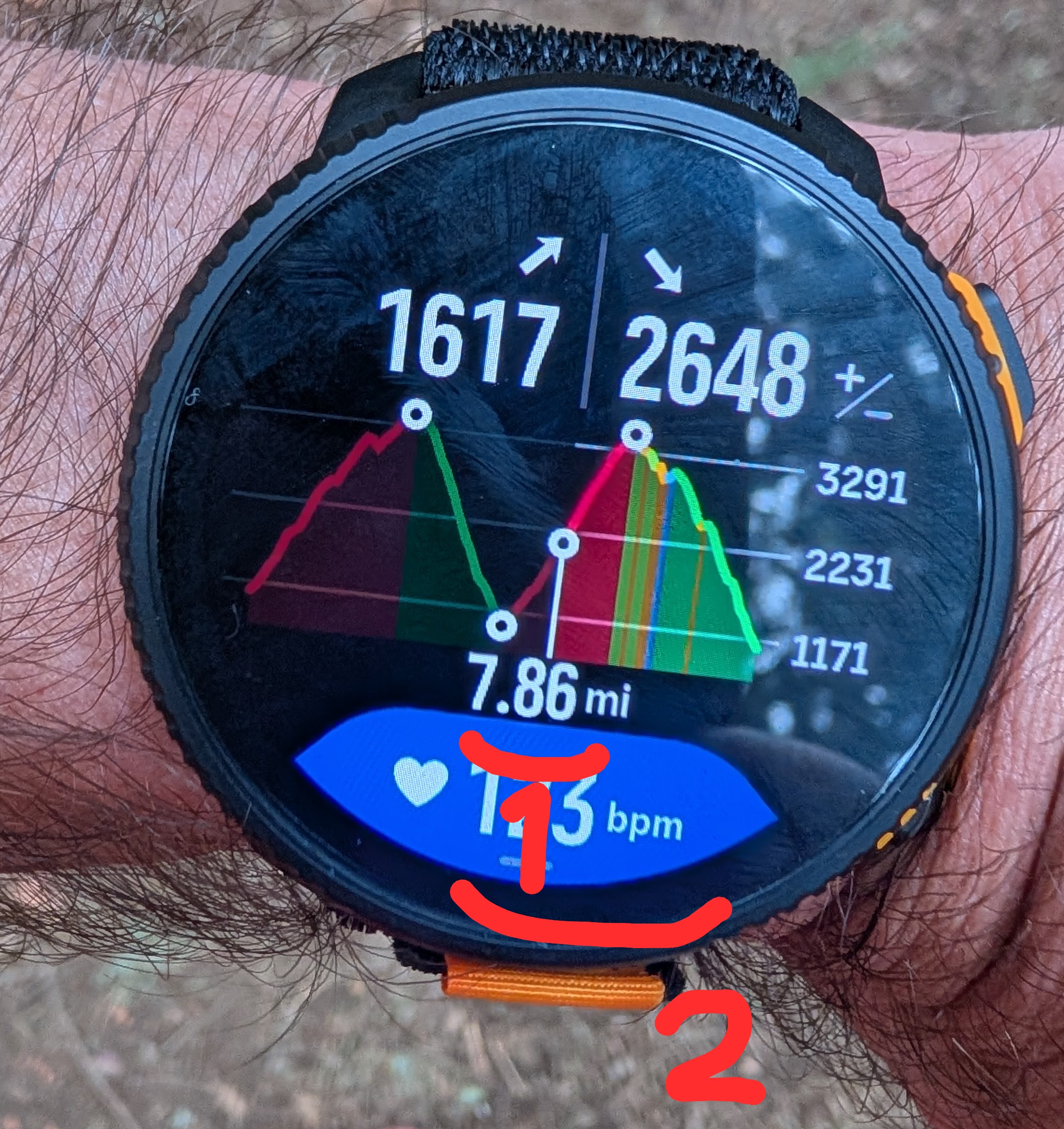
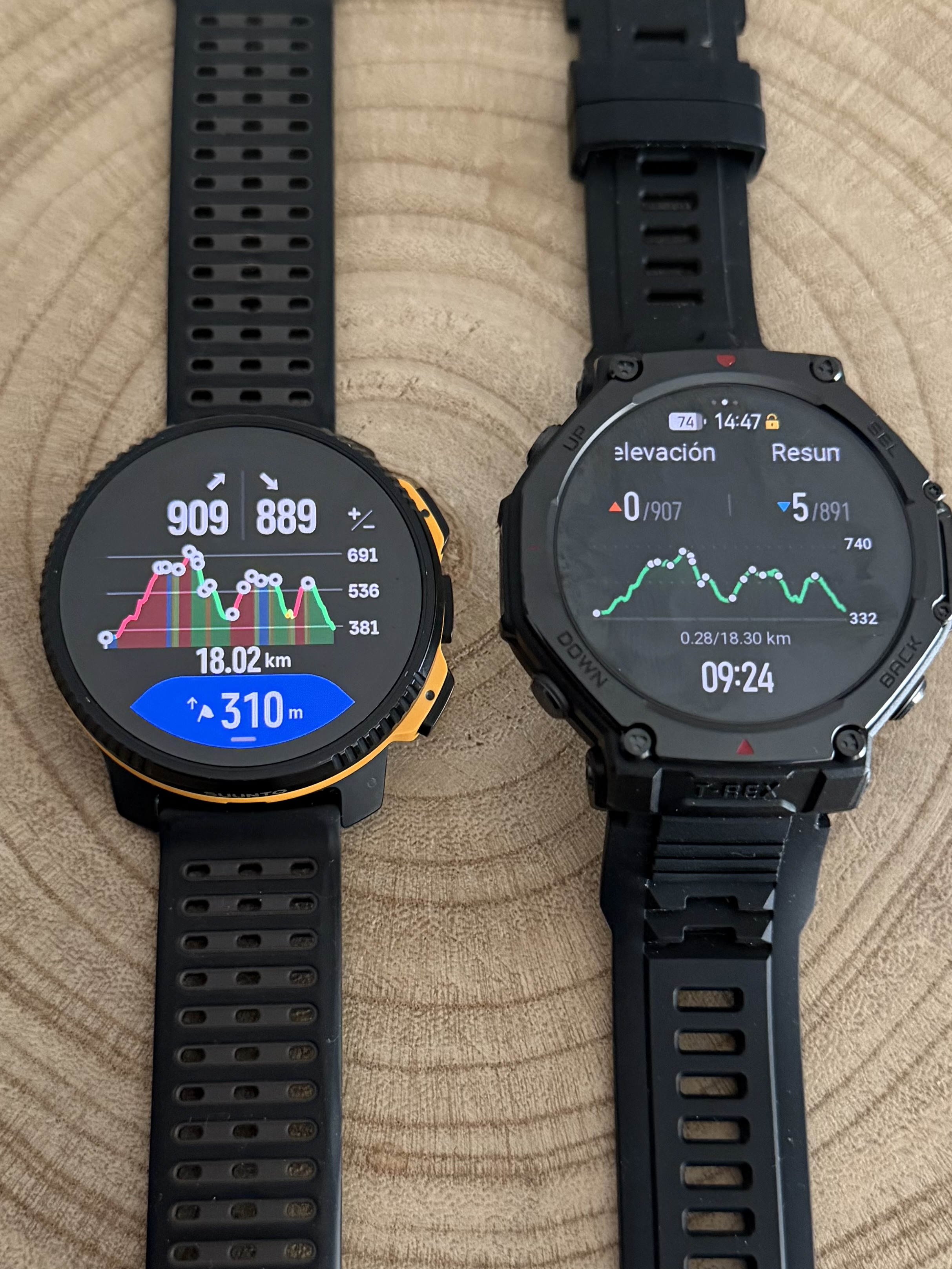
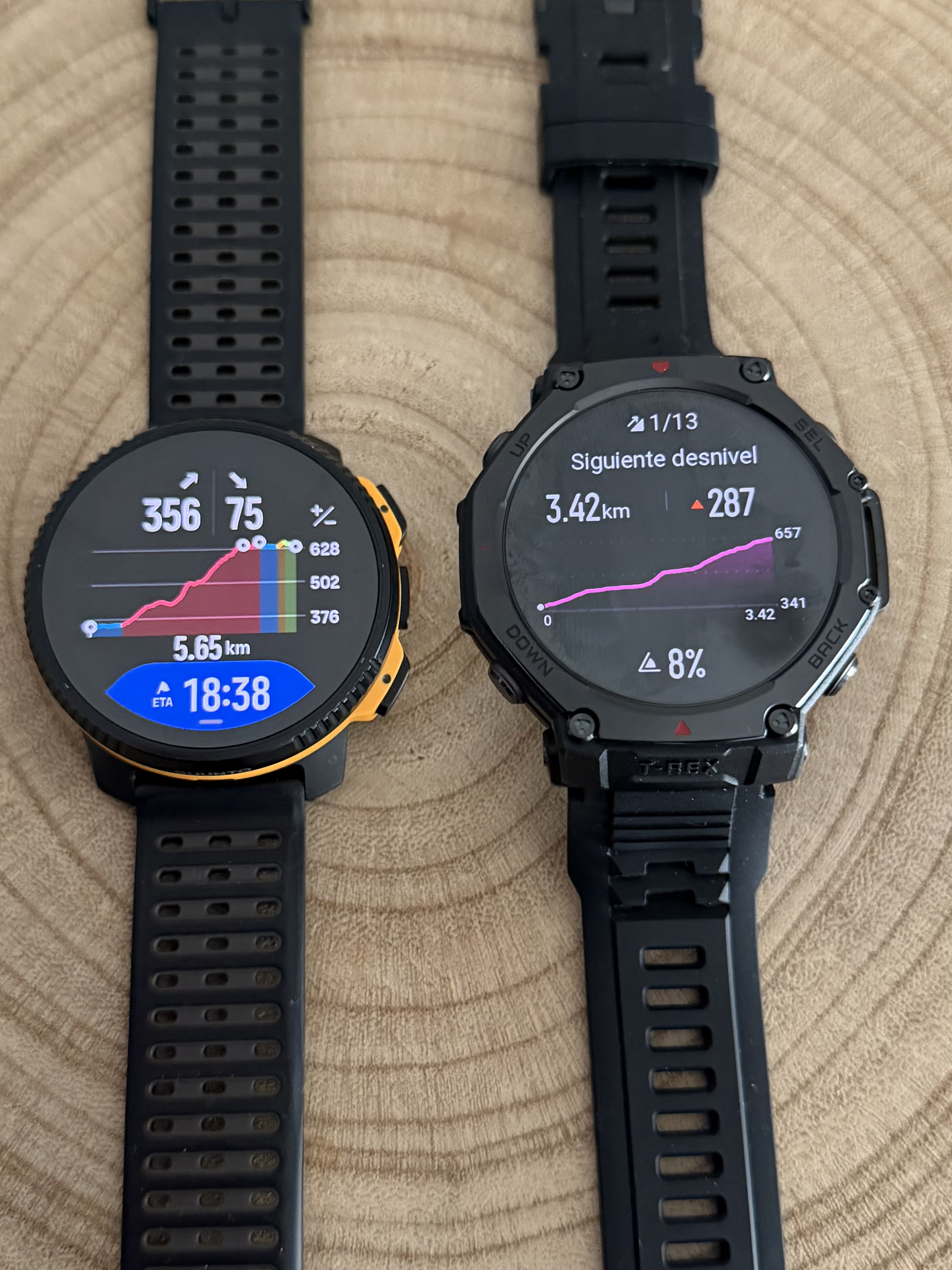
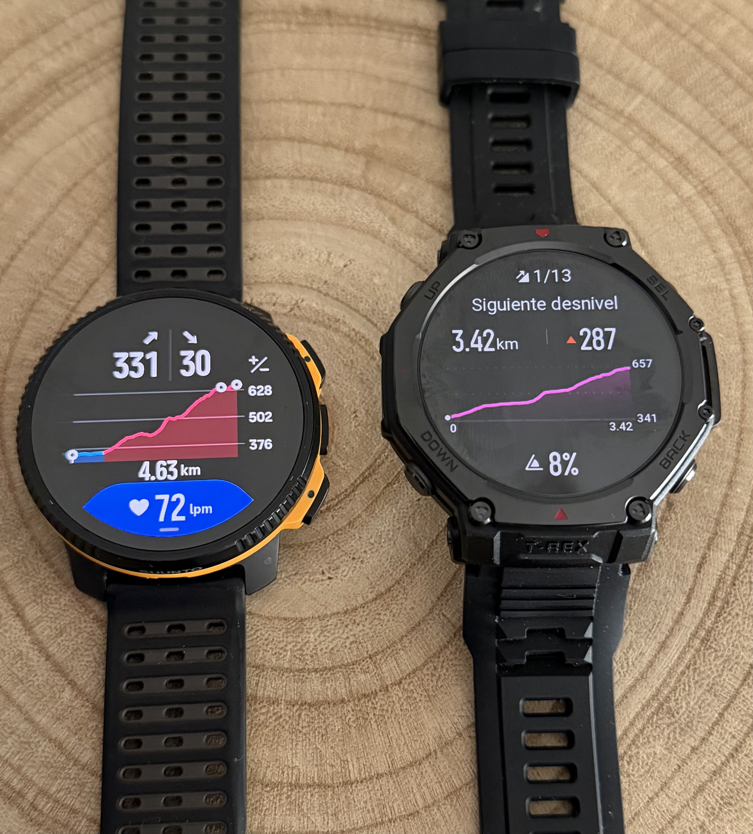
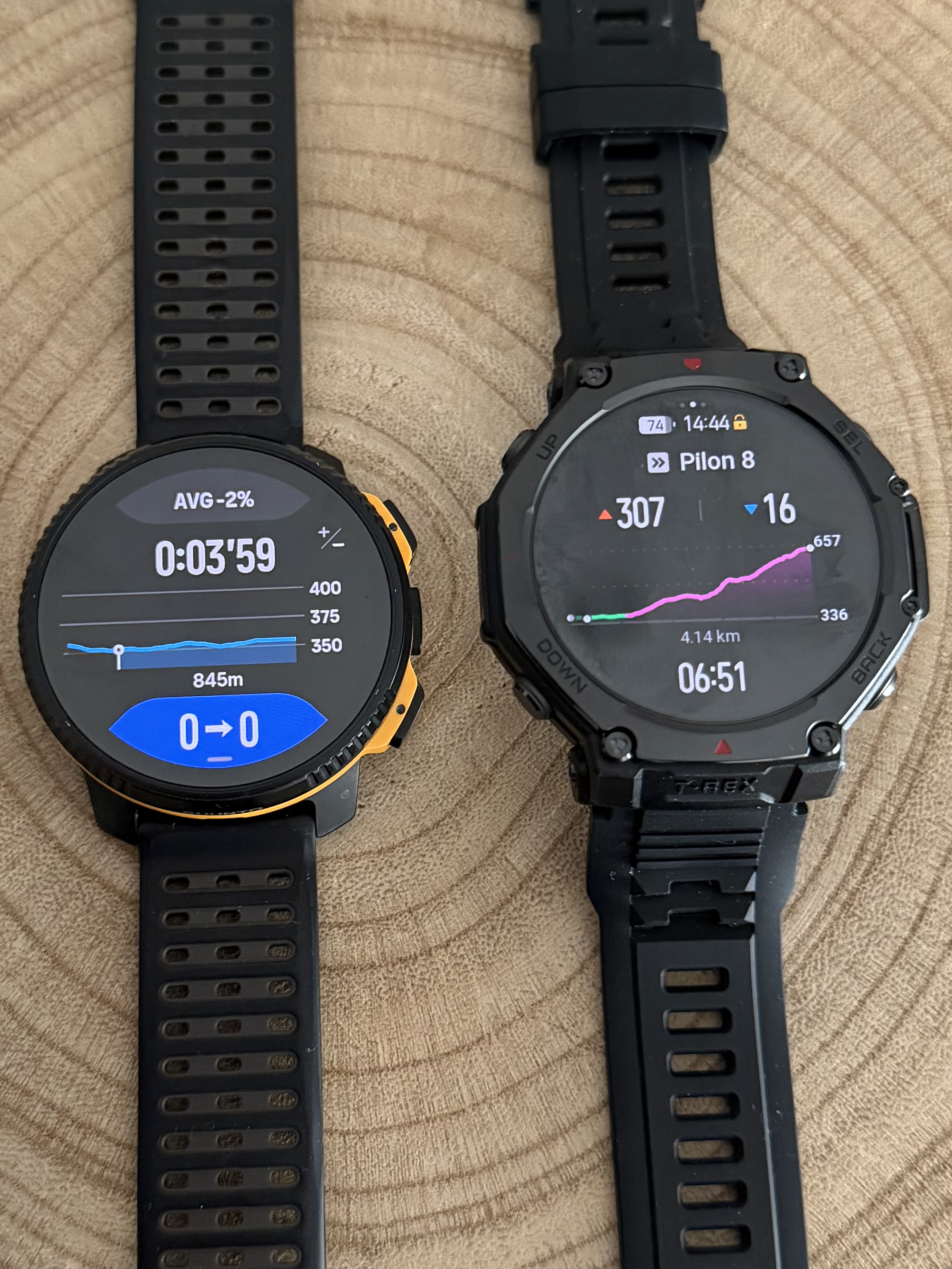
@dreamer_ Since you mentioned another brand that also uses climb guidance, I took the time to take a few photos for you.
Here you can see how we display routes with waypoints and how other brands present them. I am not here to say who does it better or worse, only to show how we approach it.
One thing I really appreciate is having five dedicated screens for Climb Guidance. This allows you to always understand exactly where you are on the climb and what still lies ahead.
The customizable data field is also a real differentiator. At any moment I can display heart rate, gradient, estimated arrival time to the next waypoint, remaining ascent to the next waypoint, ascent or descent of the current segment, and much more depending on the activity.
That is why I mentioned this earlier today. Suunto Climb Guidance is not perfect and there is always room to improve. We should always push for better. But honestly, the new Climb Guidance is already an incredibly powerful tool.
You are going to enjoy it a lot


-
@Joaquin said in [Vertical 2, 2.53.42] Map and Navigation features are greatly improved but there are still a lot of old issues and also new bugs introduced in the latest update:
@dreamer_ Since you mentioned another brand that also uses climb guidance, I took the time to take a few photos for you.
Here you can see how we display routes with waypoints and how other brands present them. I am not here to say who does it better or worse, only to show how we approach it.
One thing I really appreciate is having five dedicated screens for Climb Guidance. This allows you to always understand exactly where you are on the climb and what still lies ahead.
The customizable data field is also a real differentiator. At any moment I can display heart rate, gradient, estimated arrival time to the next waypoint, remaining ascent to the next waypoint, ascent or descent of the current segment, and much more depending on the activity.
That is why I mentioned this earlier today. Suunto Climb Guidance is not perfect and there is always room to improve. We should always push for better. But honestly, the new Climb Guidance is already an incredibly powerful tool.
You are going to enjoy it a lot
Thank you so much @joaquin . At this moment I’m very convinced about Suunto’s approach about being FAR superior than every brand of the market.
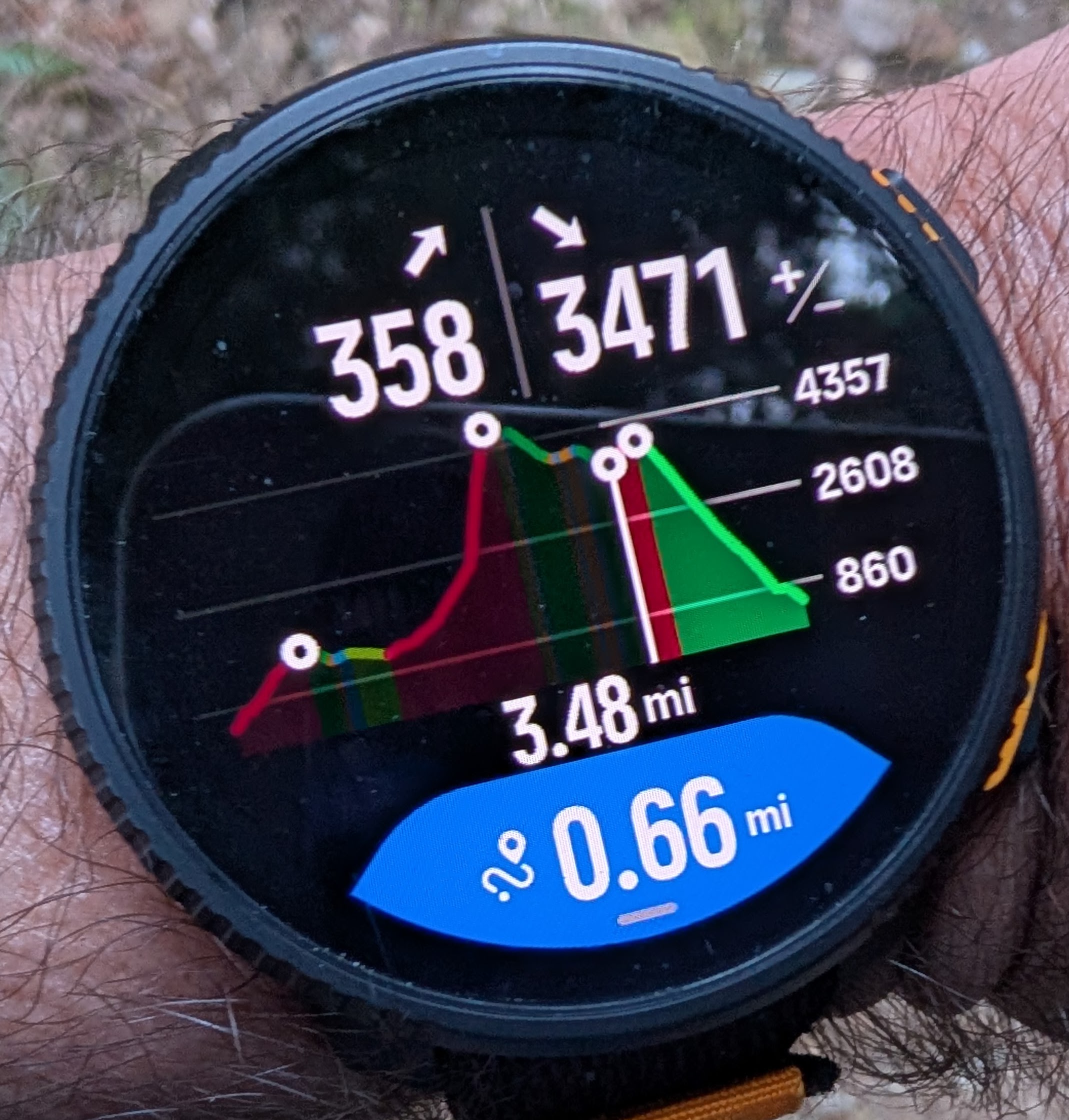
I have a bit of doubt with just one thing, and that is the profile between checkpoints I posted (AID stations). That is the most important Climb screen in my opinion. When you are in an ultra race with many hours in your legs , that is exactly what you’d like to see. Altitude/descent and profile until the next checkpoint. That’d make everything just perfect.
And a little minor improvement too. If you look at the comparison shots, the checkpoint dots should be smaller to avoid overlapping when there are many. Everything will be cleaner with just that slightly minor change.
But I need to test It yet (and play with the zooms to see everything), thought.
Pretty excited about this guys. This is very good work. -
@dreamer_ said in [Vertical 2, 2.53.42] Map and Navigation features are greatly improved but there are still a lot of old issues and also new bugs introduced in the latest update:
Thank you so much @joaquin . At this moment I’m very convinced about Suunto’s approach about being FAR superior than every brand of the market.
I have a bit of doubt with just one thing, and that is the profile between checkpoints I posted (AID stations). That is the most important Climb screen in my opinion. When you are in an ultra race with many hours in your legs , that is exactly what you’d like to see. Altitude/descent and profile until the next checkpoint. That’d make everything just perfect.
And a little minor improvement too. If you look at the comparison shots, the checkpoint dots should be smaller to avoid overlapping when there are many. Everything will be cleaner with just that slightly minor change.
But I need to test It yet (and play with the zooms to see everything), thought.
Pretty excited about this guys. This is very good work.Thank you so much for the thoughtful feedback, I really appreciate the level of detail in your observations.
In the example I shared this situation happens mainly because the route contains a very high number of waypoints. In that specific test route I placed 16 waypoints in just 18 km, which is actually far more than what you would normally see in a real race course. I intentionally exaggerated the number to stress test the system.
Even in those situations you will still be able to clearly see all the key information from your current position to the next waypoint or aid station. Distance, ascent and descent remaining, and the elevation profile up to that point are all visible and easy to interpret during the activity.
About the waypoint dots, you are absolutely right that when there are many checkpoints close together they can overlap visually. In normal race routes this tends to be less noticeable because there are usually fewer checkpoints, but your suggestion about slightly smaller dots makes sense and would definitely improve visual clarity.
As I mentioned before, the system is not perfect and there is always room to improve. Personally I would also love to see the waypoint name displayed in the blue data field in the future. That could make aid station navigation even clearer during ultras. Let’s see how it evolves.
In any case I am really happy to hear you are excited about it. Enjoy testing it and playing with the different zoom options. I think once you try it during real activities you will see how powerful it is.
-
Now this is great post. Thank you for all the feedback.
Community Manager / Admin @Suunto
Creator of quantified-self.io - sync Garmin and COROS activities to Suunto, import Suunto routes, deliver Suunto routes to Garmin courses, and analyze training data in one private dashboard. -
@Joaquin Since you seem to be connected to the Suunto development team, I wanted to share one additional piece of feedback about the elevation profile and climb guidance - the colors.
What I find inconsistent is the coloring scheme that I suspect is based on cycling climb categories rather than the slope grade %. That may make sense for cycles because that have gears, in which case climb categories represent the amount of work, but these colors may be quite misleading for running and other similar activities. I’ve seen many examples where an easily runnable 3% uphill slope is shown in red color just because it is longer, but at the same time a fairly steep 12% grade slope can be shown as yellow just because its length is just below the threshold to make a higher grade category. That is often misleading, especially in longer distance races where even short but steep climbs are not runnable. Furthermore, by design yellow ascents can never be long because once they get longer the multiplication of distance and grade brings them into the red category.
Here is what Garmin does - when you look at the end-to-end profile, it is broken into major climbs and descents, and the colors represent the climb categories. But once you zoom in, there are a few more colors (shades) and they now represent the grade, so in a single climb you may see multiple colors to give a more exact information. Those different colors are not separate climb segments but rather visual representation of grade within a single longer climb or descent. I find that fear more usable that Suunto’s approach. Also, Garmin’s approach mostly avoids slicing rolling terrain into dozens or sometimes even hundreds of tiny short ascents, descents, and flat sections - those segments are often so short (sometimes around 100 meters) that the watch can’t even track them correctly.
Suunto: Ambit, Ambit 3 Peak, 9 Baro, Race S, Race Ti, Vertical 2 Ti
Garmin: Forerunner 210, Forerunner 610, Fenix 6X, Fenix 7X Ti -
@Dimitrios-Kanellopoulos yeah, @sky-runner always provides valuable input. The problem is no time to read all feedback
-
S slash1111 referenced this topic on
-
D dreamer_ referenced this topic on
-
@sky-runner I agree, the average gradient is nice for the current climb, but it would be even better to also have sectioned gradients to know whats coming because the small graphed line is hard to tell when gradients change
-
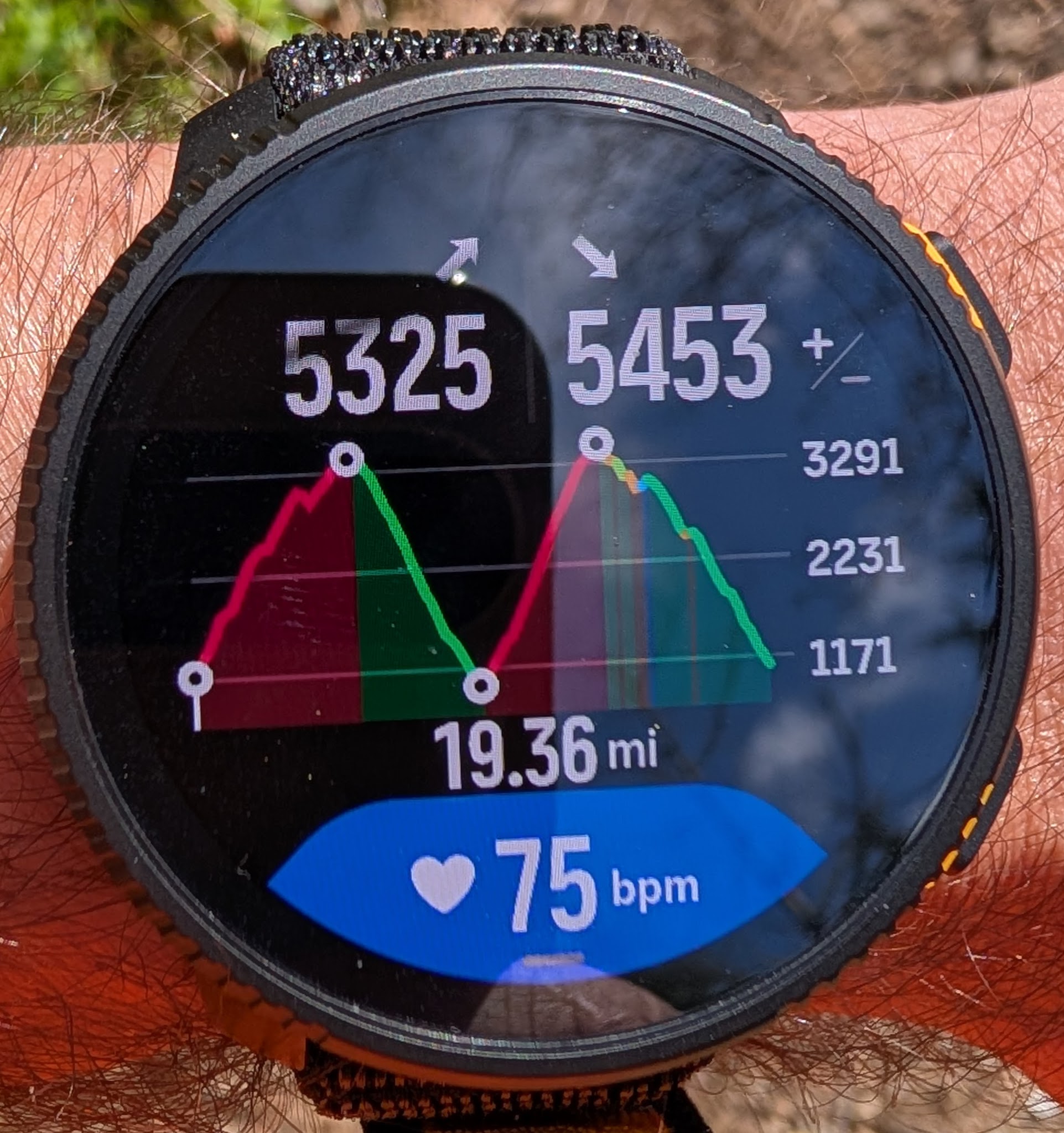
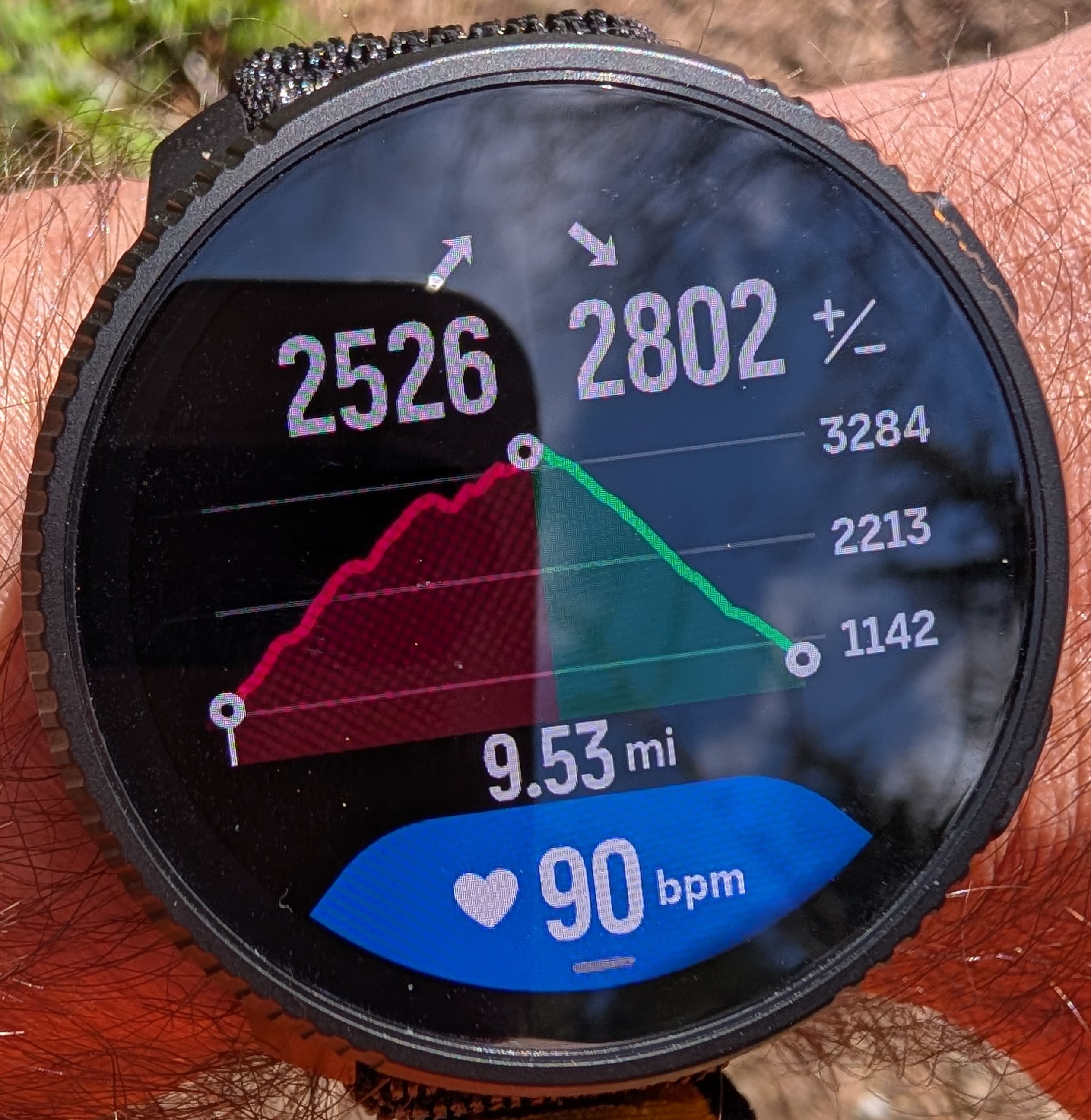
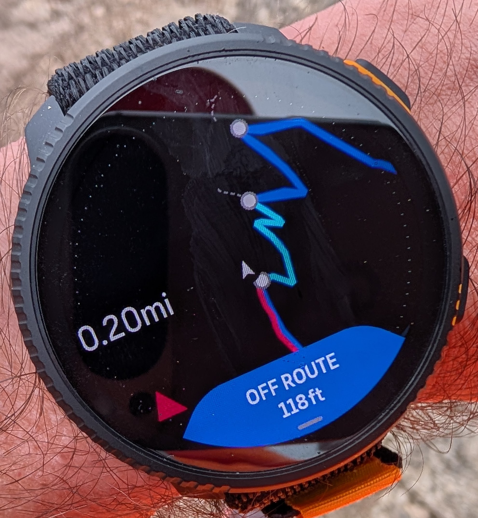
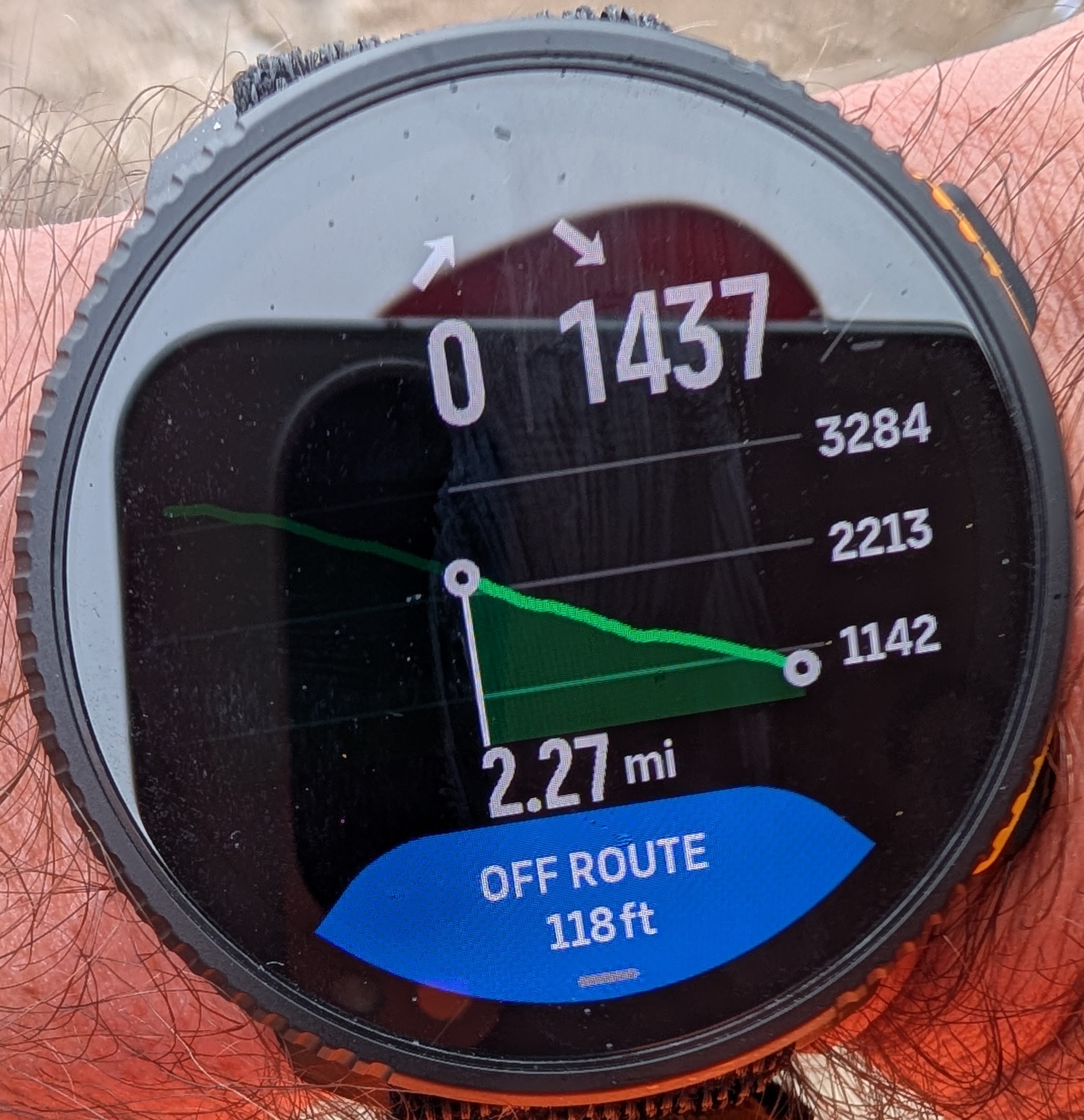
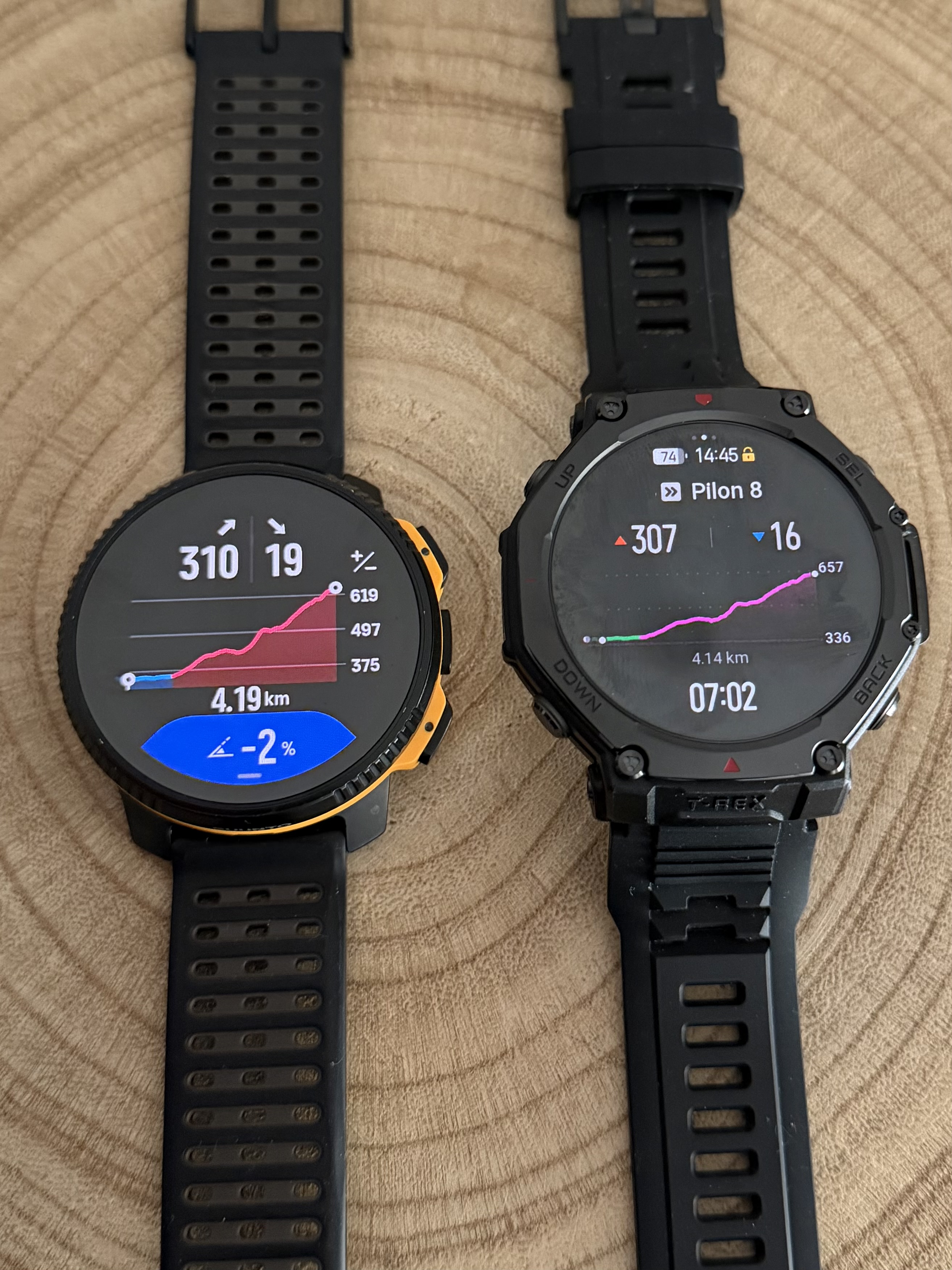
The issue with the incorrect zoomed in individual climb guidance. In a short period of time I have already experienced it twice.
Here you can see that I have transitioned from a descent to a climb as visible at two different zoom levels:
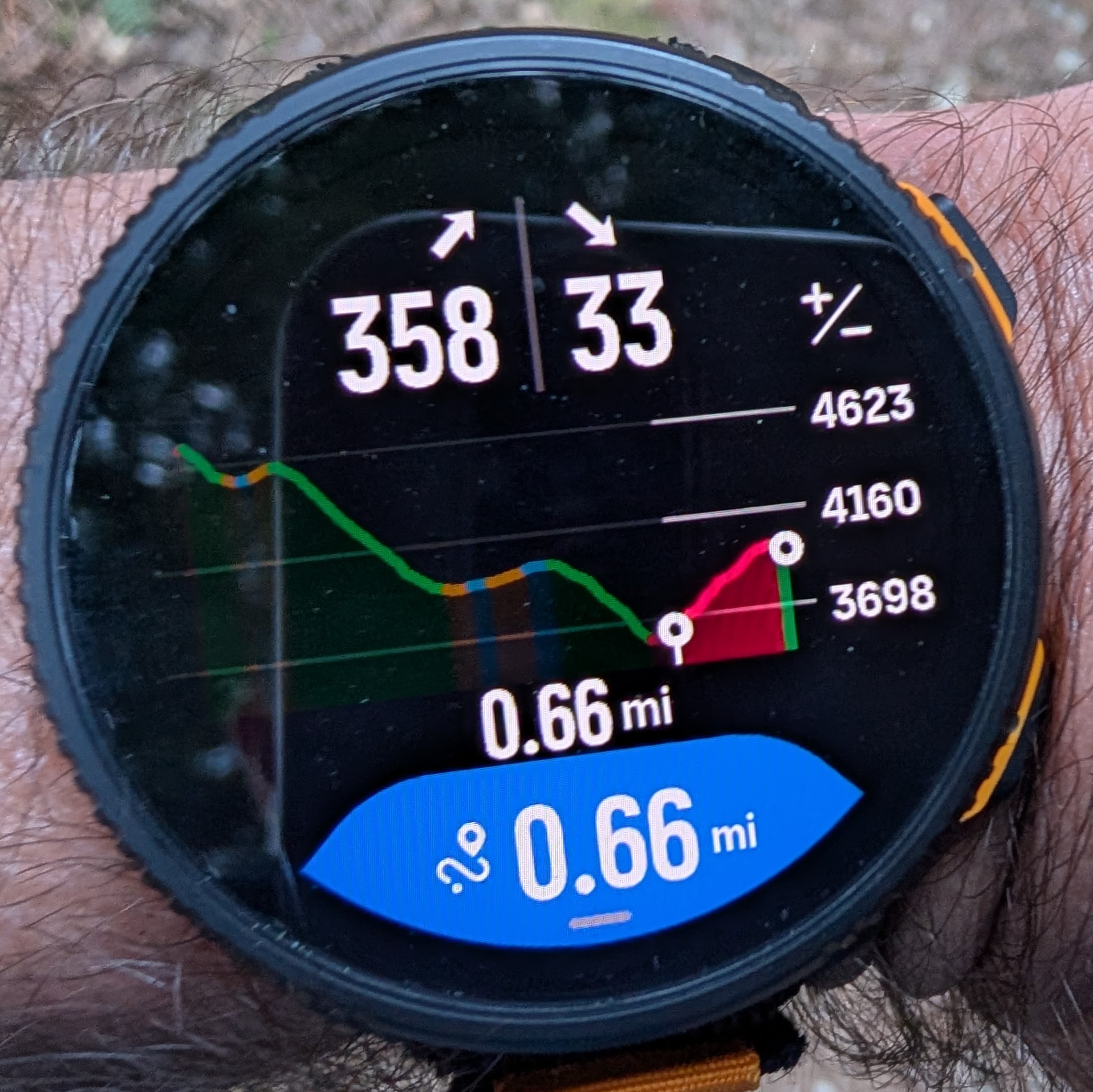
But if I zoom all the way in, it shows me at a descent, and that seems to be the previous descent that I’ve just finished:
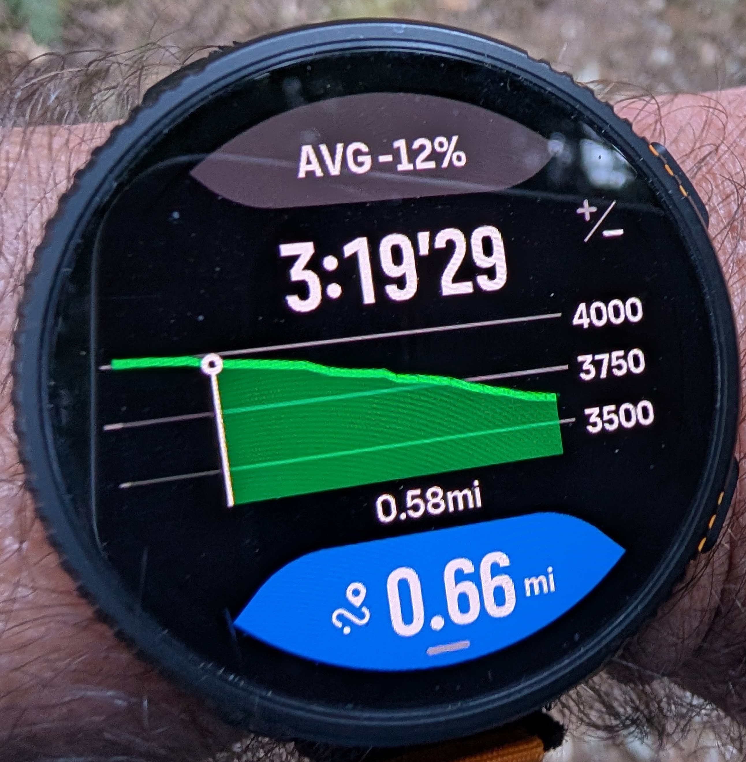
I hope it doesn’t require another year for this to get fixed! Also, as mentioned above, fix the layout so that it actually shows how much climb or descent is remaining and increase the font size for the remaining distance because it is quite difficult to see.
-
-
-
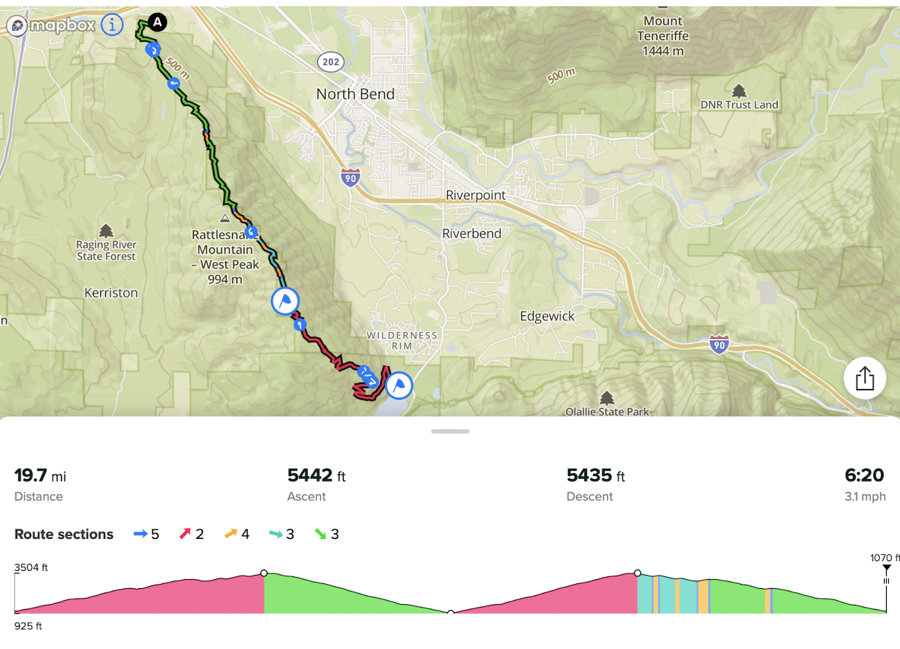
A bit of follow-up:
Today I did a local 50k race which includes 3 different loops to the top of the mountain with a shared descent, a shared aid station at the top, and a shared aid station at the bottom.
Here is how it looks like.
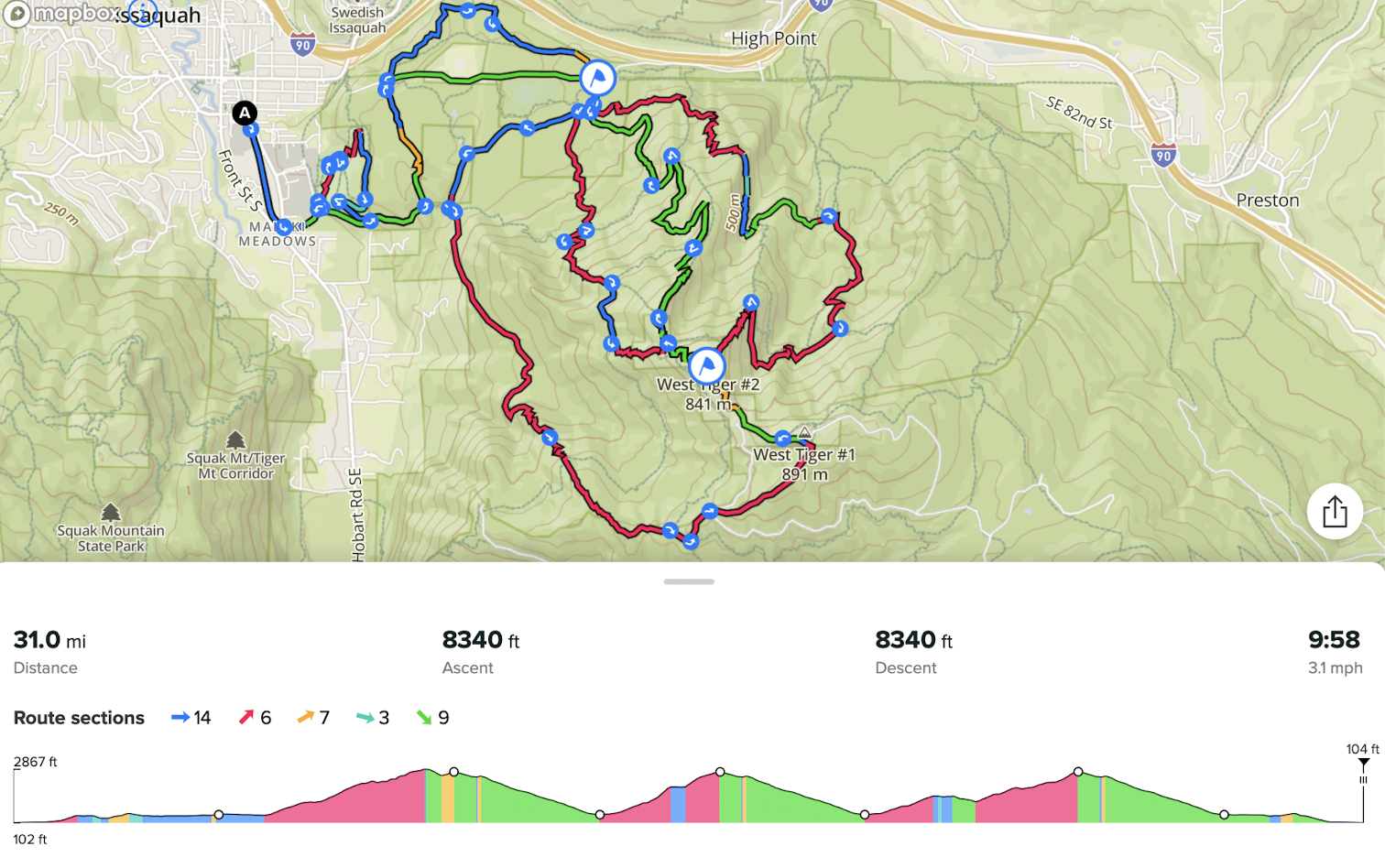
Obviously, I wanted a single GPX route for the entire race to track the climbing and not have to mess with the watch during the race. Also I wanted to track the distances to the aid stations.
Overall, Climbing guidance v3 worked satisfactory and was helpful but it wasn’t without issues:
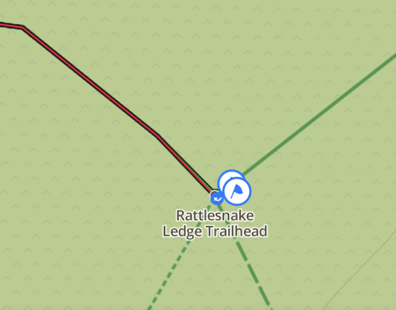
Issue #1. When I imported the the GPX file from the race website, I was unable to place waypoints on the route so that a single waypoint covered multiple distances The waypoint (aid station) at the bottom is visited 4 times at various distances and the waypoint at the top is visited 3 times at various distances. I just couldn’t make that work. Whenever I tried to place a waypoint it was inserted for just one randomly picked distance on the route.
Finally I decided to just re-draw the entire route from scratch in Suunto App, and only after that placing a single waypoint would make it match multiple distances as shown on the elevation profile above. That’s what I wanted from the beginning.
I don’t know what is the difference, but I suspect when a route gets imported it probably gets simplified and loses resolution (the number of points along the route). It seems that there is no interpolation of segments between route points, which would explain this issue. I saw some evidence of the low resolution because some parts of the imported route looked like straight squiggly lines, but when I create the same route in Suunto App it looks far more precise. By the way, that isn’t a problem in Strava. When I import the same GPX route in Strava, it doesn’t lose resolution.
Issue #2 - The same as already covered above. When Suunto App finally managed to insert waypoints, when that applied to turnarounds, it ended up creating multiple waypoints at a short distance (a few meters) from each other. As I explained above, that was a problem for zooming the elevation profile, which now didn’t work as expected. It is nearly impossible to insert a single waypoint at a turnaround because the app simple doesn’t have enough precision.
Issue #3 - For the most part the watch was able to stick to the planned route even thought the route is very complex with multiple shared parts. However in the beginning of the 3rd loop it decided to switch me to another loop - the one that I had already finished. I am pretty sure I followed the route perfectly, so there was absolutely no reason for it to switch. I could see that because it notified me about a wrong climb (the wrong climb elevation gain). Then, after I continued on the correct loop - the one that was planned in the route - after a few minutes the watch corrected itself.
Issue #4 - The most zoomed-in climbing guidance view - the one that shows individual climbs - was messed up again. I didn’t normally look at it during the race, but at least on one occasion it showed me on a descent when I was in fact climbing. This issue has already been discussed above.
-
I’ve noticed black panels of missing map areas sometimes when using the watch (vertical 2) which seems inconsistent in terms of at what zoom level it occurs, how long it takes to fill in the missing areas and when it happens. This can occur during an activity or when accessing maps from the menu. Hopefully this can be resolved in future updates. I’m sure I read of someone else having the same issue but can’t find that post anymore.
Update - I read online about clearing the map cache with a soft reset which seems to have worked. I’m not sure how much map usage it will take to fill up the cache again and cause this issue to reappear. If practical, perhaps in a future firmware update the cache could automatically be cleared of older map data or all map data after a certain time period to prevent this issue from happening and not require the user to have to manually soft reset the watch every so often.
-
[FEATURE REQUEST]
I forgot to suggest a navigation thing that I find very useful.
This is from when I had the Fenix 8. But I have a Forerunner 935 bought in 2017 that does have the navigation arrow there.
I find useful having it in data screens and without jumping to the map.
-
@dreamer_ I used the navigation arrow on Garmin Fenix 6 and 7 watches - the one that goes around the data screen.
I thought about suggesting the same for Suunto watches but I think it won’t fit the design because there is already intensity zone dial around most data screens on Suunto watches, and it has its own arrow. Having two different arrows would be confusing.
And besides, in my experience that navigation arrow didn’t work that well at running speeds. Often, it would delay pointing me in the right direction until after I was already past the turn if I wanted to go quickly without stopping, so in many situations it was adding to the confusion rather than helping me to navigate.
-
@sky-runner said in [Vertical 2, 2.53.42] Map and Navigation features are greatly improved but there are still a lot of old issues and also new bugs introduced in the latest update:
@dreamer_ I used the navigation arrow on Garmin Fenix 6 and 7 watches - the one that goes around the data screen.
I thought about suggesting the same for Suunto watches but I think it won’t fit the design because there is already intensity zone dial around most data screens on Suunto watches, and it has its own arrow. Having two different arrows would be confusing.
And besides, in my experience that navigation arrow didn’t work that well at running speeds. Often, it would delay pointing me in the right direction until after I was already past the turn if I wanted to go quickly without stopping, so in many situations it was adding to the confusion rather than helping me to navigate.
I’m not that sure. The thing is the arrow we already have for the intensity zone is always is in the other direction, pointing to the datafields. Perhaps that arrow, instead of being white, should have the color that matches the intensity zone. But doing that, red is still invalidated.
So, much better, change the arrow for something else that is not an arrow and problem solved (I.E, a double T).
This is only the idea . The design could be made a lot better, so the problem is not really there.
In the other side, I see an scenario where having the arrow in the datafields is more than nothing. I still remember an ultra running at night with fog and deep forest following that arrow in the datafields. That was several years ago, and also with a Fenix 6 Pro and navigation is much better now. But watches are also a lot more reactive for the arrow.
It’s just an idea, of course. The how, if possible, should be thinked much better than this.
Suunto Vertical 2 Titanium Sage, Suunto Run
-
@dreamer_ Personally, when I am running an ultra or doing a long training run, 90% of the time I am either on the map screen where I can already see what’s coming in terms of navigation or I am on the elevation profile climb guidance screen. Now with data fields at the bottom, that’s all I need. And I can also see upcoming waypoints on the these two screens.
The extra benefit of staying on these screens is that I can’t accidentally pause the recording.
Hello! It looks like you're interested in this conversation, but you don't have an account yet.
Getting fed up of having to scroll through the same posts each visit? When you register for an account, you'll always come back to exactly where you were before, and choose to be notified of new replies (either via email, or push notification). You'll also be able to save bookmarks and upvote posts to show your appreciation to other community members.
With your input, this post could be even better 💗
Register Login