Software Update 2.30.32
-
Hi guys! I remember that I saw topic about this or someone talked about it in other topics but I add my question here because it’s Peak Pro.
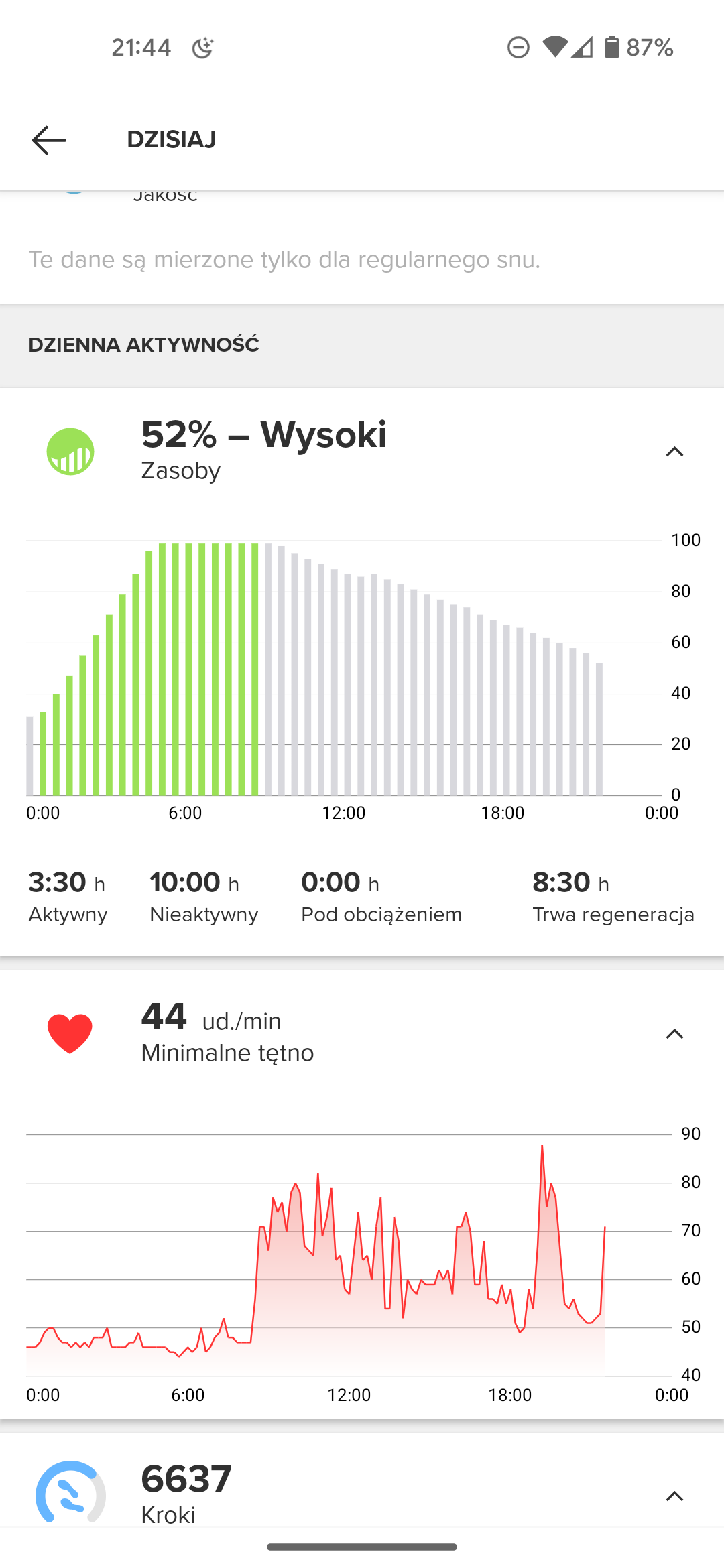
I’ve noticed before update that my Suunto app dashboard step widget shows different amount than my Peak Pro watch widget. New update didn’t change that.
Is there any way to make them match because it bothers my perfectionist mind? I’ve restarted Peak Pro and installed Suunto app again but it didn’t help. Turning dashboard widget off and back on again didn’t help either.
-
@Timothy1 said in Software Update 2.30.32:
Hi guys! I remember that I saw topic about this or someone talked about it in other topics but I add my question here because it’s Peak Pro.
I’ve noticed before update that my Suunto app dashboard step widget shows different amount than my Peak Pro watch widget. New update didn’t change that.
Is there any way to make them match because it bothers my perfectionist mind? I’ve restarted Peak Pro and installed Suunto app again but it didn’t help. Turning dashboard widget off and back on again didn’t help either.
although for me steps are the last thing to worry about, here they match

-
@robis I’ll agree with you… Would be nice to see detailed list of bug fixes.
-
Not a fan of the new pin-one-widget design, love the shortcut feature. Now hoping the HRV will be useful for me.
-
@Francesco-Pagano said in Software Update 2.30.32:
Loving the “edit distance” option after a treadmill activity!
Ciao Francesco! I don’t seem to find the edit distance option you mention… could you please give some details? You find the option right after ending the recording or accessing to it through the logbook?
Thaaaanks! -
@Dimitrios-Kanellopoulos , did the PP get the new sleep algorithm (total sleep time) from the Race or is it the old algorithm? The Race was giving me the same sleep time consistently as the Apple Watch, but the PP with the 2.30.32 update showed less than an hour of sleep last night whereas Apple Watch correctly showed 6+ hours.
And yes, all the physiologic metrics are set the same for my Race and PP and I wore it starting 6pm, so couldn’t have missed the sleep window which has been set to 10pm-6am.
Thanks.
-
@fv4500 hi! Yes right after you end the activity, when scrolling through the summary (nice UI update by the way!) and you are on “distance” you should see the option
-
Love the new UI! Thanks Suunto!!!
-
Anyway to pin more than 1 widget? Also where is my recovery time in hours? Quite like the new interface other than those nitpicks!
-
@ShailCaesar I´m wondering the same thing! Where is this information now?!
-
@ShailCaesar there’s no way to pin more than 1 widget. Recovery time is in one of the new widgets, recovery or training, I think.
-
@Александр-Даниленко I only want to see sunset time. I know when the sun sets today and this till what time I can mountain bike.
-
Now I have found a new bug:
In the Logbook widget the calculation of training hours for the week is incorrect.
In fact, it coincides as if from this Monday to Thursday the time of the activities had been counted twice and today, Friday, was counted appropriately.
Does this happen to anyone else?
-
My resources are going nuts now. Super extra regeneration and very slow loss of resources. Should I adjust resting HR?

-
@Łukasz-Szmigiel Maybe. Bur doesn´t show the cumulative recovery time in hours. And this doesn’t cool me.
-
I don’t really like the new ui.
There is less info too see at a glance per widget when we scroll it.
What is it for an idea to use the half of the screen to give the info. really!
With the version before the screen was fully exploited.
Now we lost many information.
Many characters are smaller too.
That’s an awful user experiment
nevermind about the new functionalities and improvement, I’d like to have the old version back.
Does some knows how to go back to an old version? -
or it would be for me ok if we could pin more than one widget on main screen.
-
I think that the UI changes are because of:
-
Performance
It may be less resource intense to load a streamlined mini widget than a full widget UI. -
Rising number of widgets
There are way more widgets than with the previous version, so it makes sense to show summary first. -
Easier to navigate with the crown
Blame the Race heh heh
I personally would like:
- One widget pinned to the left and one to the right
- 3 to 5 watchface templates with configuration options similar to custom workouts.
Just give me a clean hour with minutes and three fields with custom data (I.e. weather, barometric trend, sunset) and I’m cool.
This really looks like a nice and readable, well designed interface. It no longer feels like a beta (which looked like this since the release of 9PP).
-
-
@cemoi71 I don’t know I find it better now. You can have more widgets and scroll faster through them. You see all the important information at fist glance and if you want to know more details you can have it. But for the most part it isn’t even necessary I think. It depends on the user or course but I wouldn’t say it’s a worse experience.
-
Heart rate is up but calories burned is way down?! Not sure what’s up, I realize that calorie count is the least accurate thing about these toys but why all of a sudden change there? Do I need to resync the app or something?