-
Hello,
I’m back from my holidays on the Dolomites and during that days I was able to check and enjoy the incredible features of my Race.
One thing I found uncomfortable is the small font used for the top field showing the time (Sport Modes), while all the rest of the fields are promptly readable, I have to slow down or even stop to clearly read the time, this is of course affected by the light conditions and also tiredness, but a slightly bigger font would be really appreciated, it seems there is room enough on the display.
Ciao!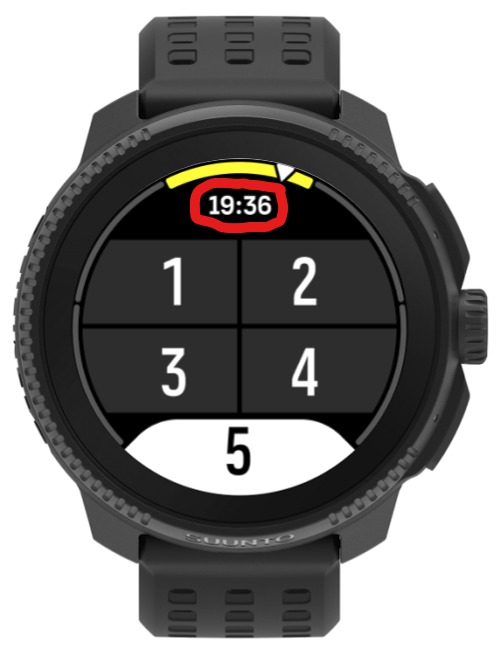
Suunto Vector . Vector HR . Core . Race & Race S
-
I isazi moved this topic from Feature Suggestions on
-
@Stefano-M64 I think it is something that many of us are demanding. Also, if you in the Race find it difficult to read, imagine those of us who have a 9PP. For me, during the activity, 95% of the time it is impossible for me to read the data. In fact I think that, with such a small font, it is more annoying than useful.
-
@enriqueescoms said in Slightly bigger font for the time field on sport modes.:
@Stefano-M64 I think it is something that many of us are demanding. Also, if you in the Race find it difficult to read, imagine those of us who have a 9PP. For me, during the activity, 95% of the time it is impossible for me to read the data. In fact I think that, with such a small font, it is more annoying than useful.
My biggest problem with the 9PP. Otherwise, I love it
-
@Stefano-M64 Yeah, this is rather small - not much other screen real estate available for bigger numbers.
What you can always do: design you own sport mode and choose time of day for one of the fields. It will be nice and big
")
-
@Egika yes, this could be a workaround …
however, the time is shown on the top of any display and this quite useful, it’s a just pity that it is hardly readable, as I wrote it’s plenty of room for a slightly bigger font
Suunto Vector . Vector HR . Core . Race & Race S
-
@Stefano-M64 there is not really much more room.
You can find out, if you choose the other data fields so that one with a symbol is sitting at the top. It actually would obstruct the time display and thus the time is not shown in some configutations.
There are some threads about the disappearing time here in the forum")
t6, S6, Elementum Terra, Ambit 3 Sapphire, Spartan Ultra Copper, Traverse Alpha, S7 Graphite LE, S9B Ambassador, S9P Granite Blue Titanium, S9PP Titanium Sand, Vertical All Black, Race Titanium Charcoal, Race S All Black / Titanium Courtney, Run Lime
-
@Stefano-M64 I find it pleasant and readable and also one of the best features of Suunto vs competitors
Of course this is me and my eyes but maybe some color inversion over the field would work better rather than increasing the fonts? -
@Egika ok, this not a main issue for sure, nevertheless the problem in my modest opinion is an unbalanced distribution of areas dedicated to the different fields, on “real” Race the difference is even more pronounced than in the rendering I posted before, it would be enough to reduce 1 dot the other fields and add 2 or 3 dots to the time field (ehi, it’s a watch!
 ).
).@EzioAuditore I can read it without problem when sitting comfortably on the sofa, but it becomes hard to read outdoor, when climbing up or down steep paths, between the lights and shadows into a wood, with the heat, the sweat, and the sunglasses, it is just a bit too small …
-
I find this time field as an extra. I don’t care if it’s small - I know it’s there if I need it, and I rarely need it to be as readable as any other data field.
If I’m going to need to know time often - like actual time, or sunset, etc. I always create a personalized sports mode where the important fields are large enough.