-
While using climb guidance these days I’ve noticed the following:
In the overall climb profile, ascent and descent are at the top of the profile, while the duration is in the bottom
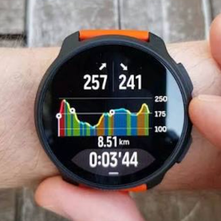
In the zoomed segment, they change position (ascent/descent in the bottom part of the screen and durantion at the top)
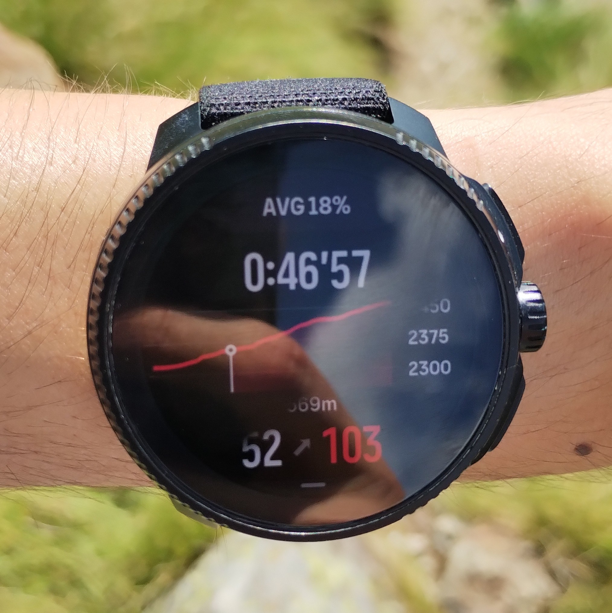
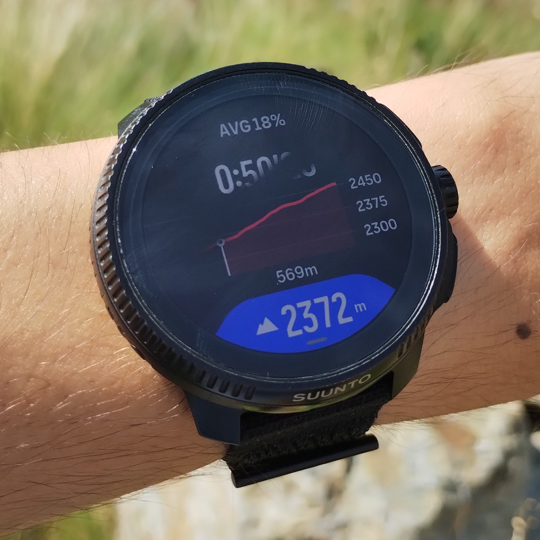
For consistency, I propose to maintain the ascent/descent data always on top of the screen. In this way, when custom data is shown in the blue tooth, ascent/descent data is not covered (as happens now)
What do you think?
-
@SergioB This has already been suggested and seemingly ignored.
Also, the font size for the remaining distance in the zoomed in mode should be increased - it is difficult to see.
And yes, because of the blue labels rendered on top of the screen it is now impossible to see remaining ascent/descent in the zoomed in mode. -
I isazi moved this topic from Feature Suggestions
Hello! It looks like you're interested in this conversation, but you don't have an account yet.
Getting fed up of having to scroll through the same posts each visit? When you register for an account, you'll always come back to exactly where you were before, and choose to be notified of new replies (either via email, or push notification). You'll also be able to save bookmarks and upvote posts to show your appreciation to other community members.
With your input, this post could be even better 💗
Register Login